Opiate-Related Deaths in the US, 1999-2014
Yesterday I had a conversation on Twitter with Josh Zumbrun.
The striking maps he linked to tracked the rise in deaths due to drug-related overdoses over the past 15 years, caused in large part to the surge in use of heroin and synthetic opiates. The details are in the WSJ report on the problem.
In our conversation, I said I thought that a series of choropleth maps might not be the best way to show these (real, and serious) trends, more or less for the reasons I’ve given before. County-level choropleth maps of the US tend to track first the size of the local population and secondarily the percent of the population that’s African-American. Coupled with the fact that a number of very large US counties are very sparsely populated, especially West of the Mississippi, the result can be a map that gives the wrong impression. In this case, a casual reader might think, for example, that the problem was especially serious in the desert southwest in comparison to many other parts of the country, though obviously something serious is happening in the Appalachians, the coastal Deep South, and Florida. To be fair, the fact that there are four maps showing change over time partially mitigates the usual problems with county-level choropleths, because you have some relative change to compare within regions. So it’s not as if this is a terrible way to show the data.
Still, it’s not the only way. I went and pulled the CDC WONDER time series for deaths where the underlying cause is opiate-related overdose or poisoning, but at the state level for all years between 1999 and 2014 inclusive. I divided the states into their census regions and plotted the time series for each state (the dotted lines), as well as the regional trend (the solid lines). Here are the results.
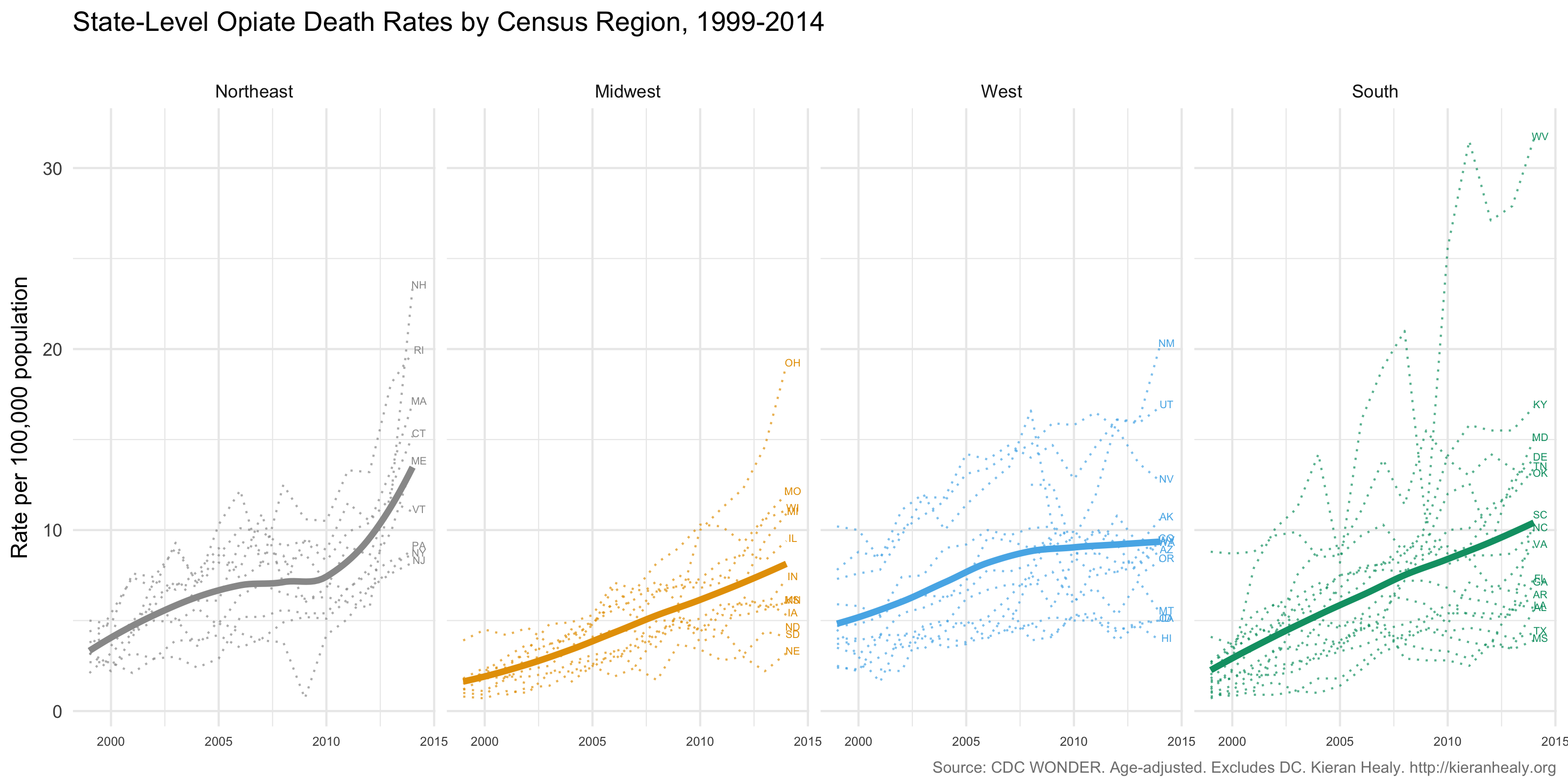
Opiate-related Deaths in the US by State and Census Region, 1999-2014.
(Click or touch the plot for a larger version. A PDF is available as well.)
The plots bring out much of the overall story that’s in the maps, but also shift the emphasis a bit. The unit of analysis is the state rather than the county, so you can see more clearly what’s happening in the Northeast. In particular you can see the climbing numbers in New Hampshire, Rhode Island, Massachussetts, and Connecticut. These states are all smaller in area than any of the ten largest Western counties, many of which have fewer than a hundred thousand people living in them (and some of which have fewer than ten thousand inhabitants). There aren’t many measures where these states do substantially worse than half of the South, as is the case here. You can also see the state-level differences in the West (e.g. between Arizona, on the one hand, and New Mexico or Utah on the other), and the astonishingly rapid rise in West Virginia’s death rate. Elsewhere in the South, while the maps show a lot going on in the coastal Deep South and also in Florida, the state-level trends suggest that this is must be quite locally concentrated. While Florida looks pretty terrible on the maps, in the time-series it’s in the lower half of the distribution. One final thing that the time-series plots bring out quite well, I think, is the diverging trajectories of various states within regions. There’s a lot more variance at the end of the series than at the beginning, especially in the Northeast, Midwest, and South.
There are other ways that the data could profitably be sliced geographically, most obviously by urban vs rural status. In any case, I present this here not to say “Here’s the best way to do it”, but rather just to show an alternative way of looking at the same trends.
The code and data for the figures are available on GitHub.