America's Ur-Choropleths
Choropleth maps of the United States are everywhere these days, showing various distributions geographically. They’re visually appealing and can be very effective, but then again not always. They’re vulnerable to a few problems. In the U.S. case, the fact that states and counties vary widely in size and population means that they can be a bit misleading. And they make it easy to present a geographical distribution to insinuate an explanation. Together the results can be frustrating. Gabriel Rossman remarked to me a while ago that most choropleth maps of the U.S. for whatever variable in effect show population density more than anything else. (There’s an xkcd strip about this, too.) The other big variable, in the U.S. case, is Percent Black. Between the two of them, population density and percent black will do a lot to obliterate many a suggestively-patterned map of the United States. Those two variables aren’t explanations of anything in isolation, but if it turns out it’s more useful to know one or both of them instead of the thing you’re plotting, you probably want to reconsider your theory.
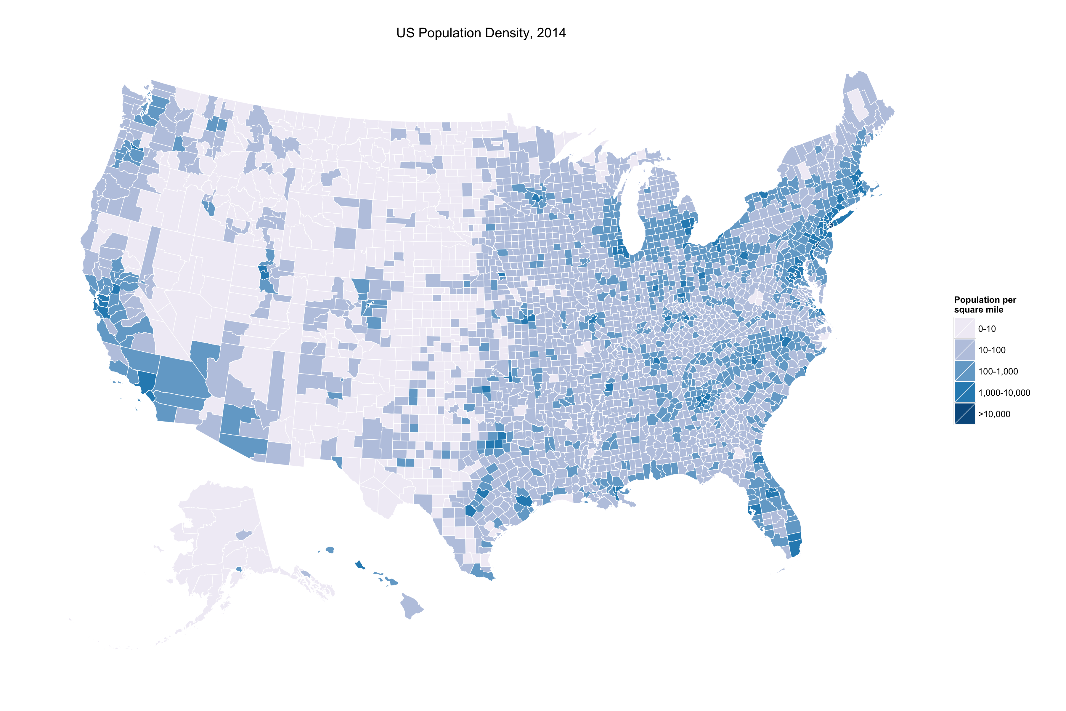
So as a public service, here are America’s two ur-choropleths, by county. First, Population Density.

US Population Density Estimates, by county, 2014. Source: US Census.
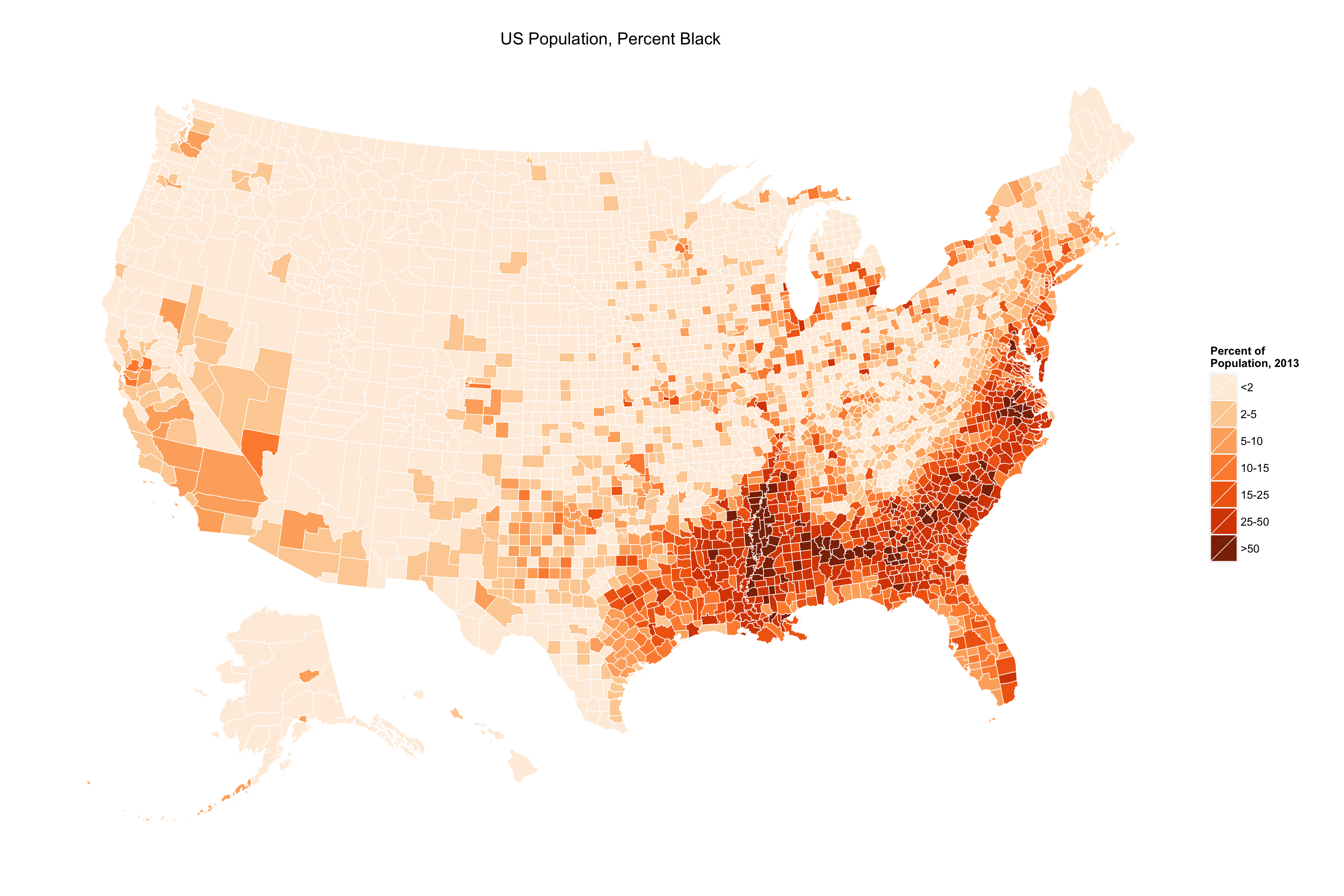
And second, Percent Black.

Percent Black Population, by county, 2013. Source: US Census.
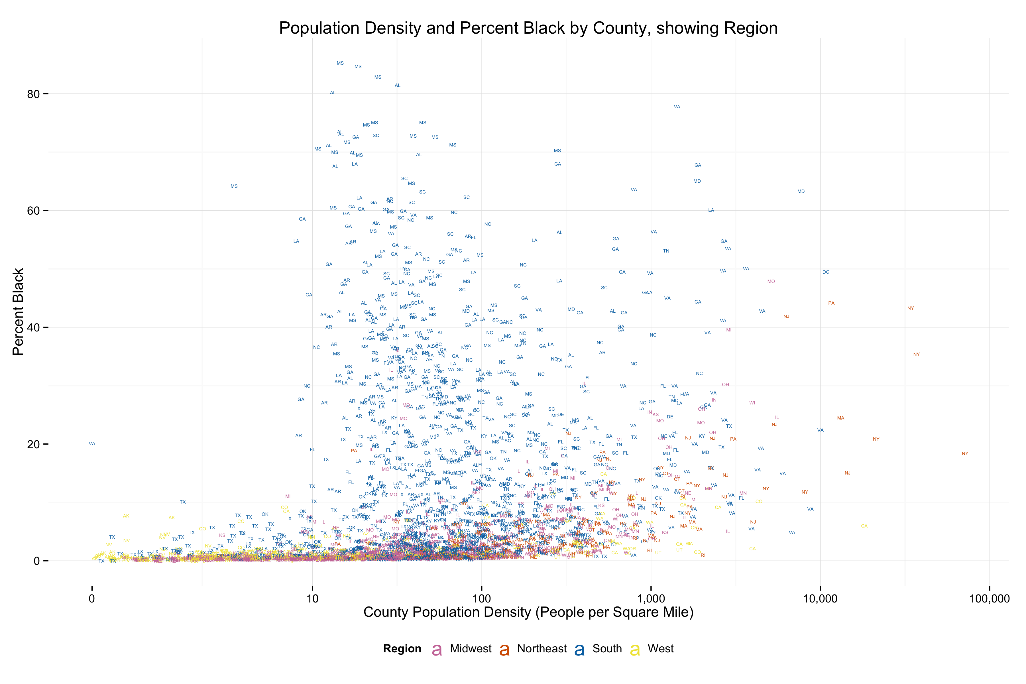
And as a bonus, here are those two variables plotted against each other, with region highlighted.

Population Density vs Percent Black Population. Source: US Census.
If you’re interested in making some maps of your own, the code and data are on github. Thanks to Bob Rudis for his excellent R projection code, by the way.