Flipped Counties in the 2016 Election
I was playing with some county-level data from the U.S. general election, partly out of a spirit of honest inquiry and partly out of a feeling of morbid curiosity. Because I had some county-level census data to hand, I took a look at the results using some extremely basic demographic information—the two variables that structure America’s ur-choropleths, namely population density and percent black. I focused on the counties that flipped from their vote in the 2012 general election. Obviously most of these flipped from Democrat to Republican, but a few went the other way. We can plot all thirty one hundred or so counties, but grey out the ones where the party result didn’t shift. We put population density on the x-axis and percent black on the y-axis. Counties that flipped to the Republicans are shaded red; counties that flipped to the Democrats are shaded blue.
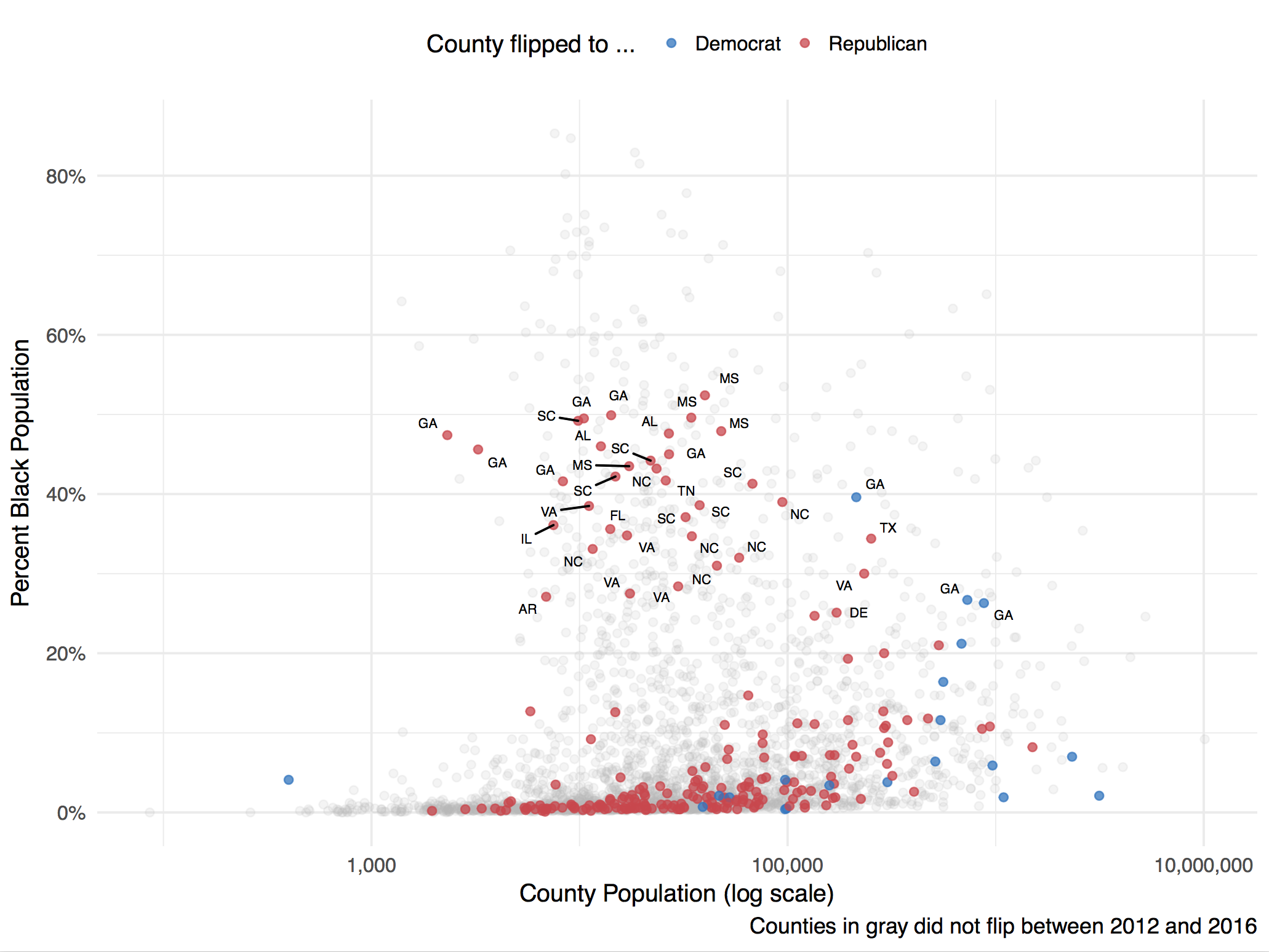
Counties that flipped party majority from the 2012 to the 2016 election.
There are a couple of things to note here. First, and most obviously, a number of counties with a relatively high percentage of African-Americans flipped to Trump. (Bear in mind that, because these data are observed at the county level, we can’t make direct inferences about how individuals voted.) Most of these counties are in the South, where most of the counties with large black populations are anyway. Interestingly, the subset of counties like this that flipped are mostly ones with a black population between thirty five and fifty percent. With the exception of one Mississippi county, nowhere with an extremely large majority of black residents flipped to the Republican side. So there’s prime facie evidence for both the reduced turnout and increased suppression stories.
If you’re interested in the one county way over on the left there with fewer than a thousand residents that flipped to the Democrats, it’s Kenedy County, TX. This is a rural county with a total population of about 416, about eighty percent of whom are Hispanic or Latino.
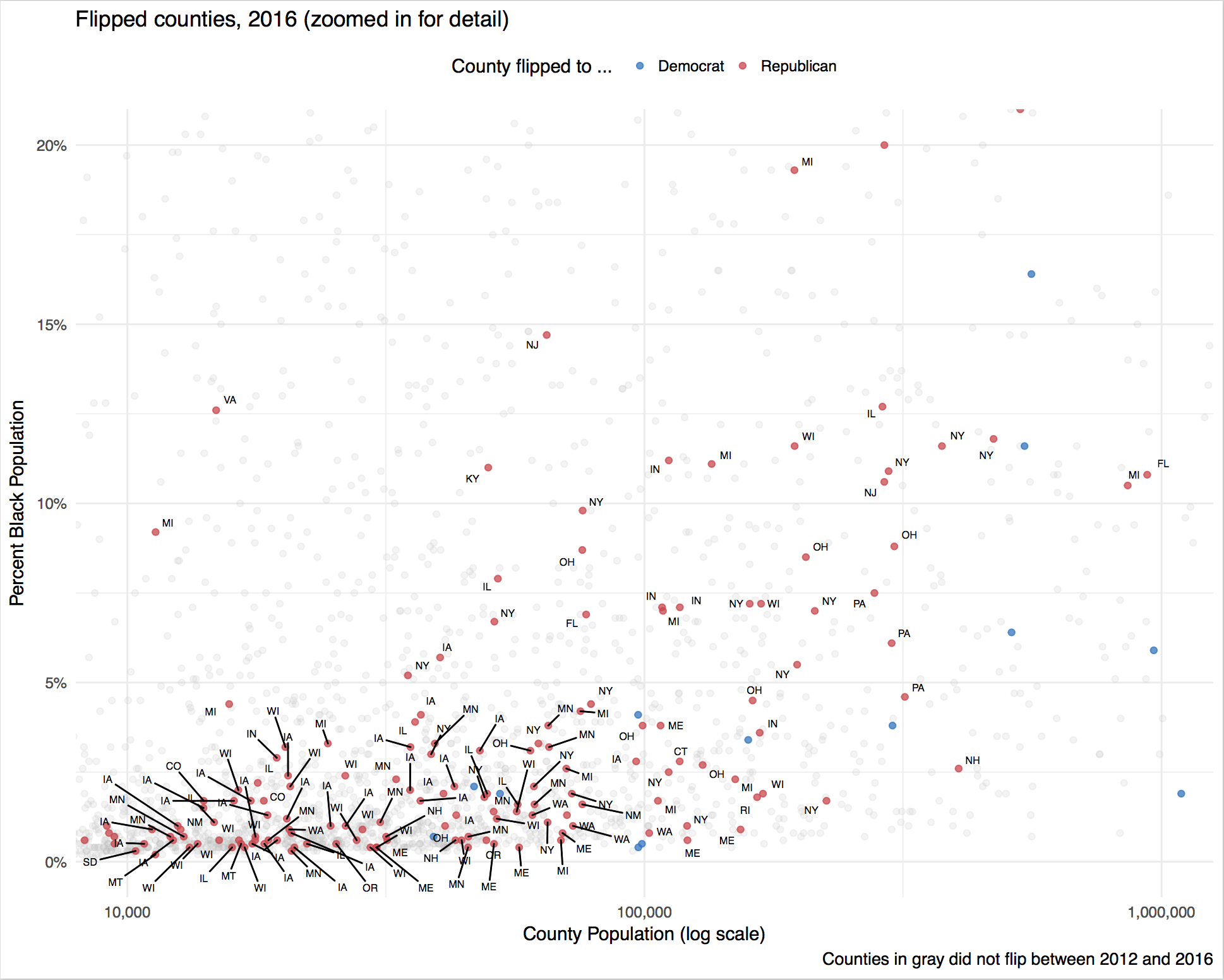
Plot detail—Counties that flipped party majority from the 2012 to the 2016 election, focusing on mid-sized counties with low percent black population.
Second, it’s also clear that an awful lot of counties with relatively small black populations flipped over to the Republicans. We can zoom in on this region and label the states these counties are in as well. Down here we see a lot of counties in Wisconsin, Michigan, Minnesota, Indiana, and Iowa, along with a bunch of rural counties in Maine, New York, and Illinois. Off to the upper right of these areas you can see some of the larger county flips in New York, Pennsylvania, Ohio, and Florida.
Finally, here’s a plot of all counties and flipped counties by percent college (on the x-axis) and median household income (on the y-axis).
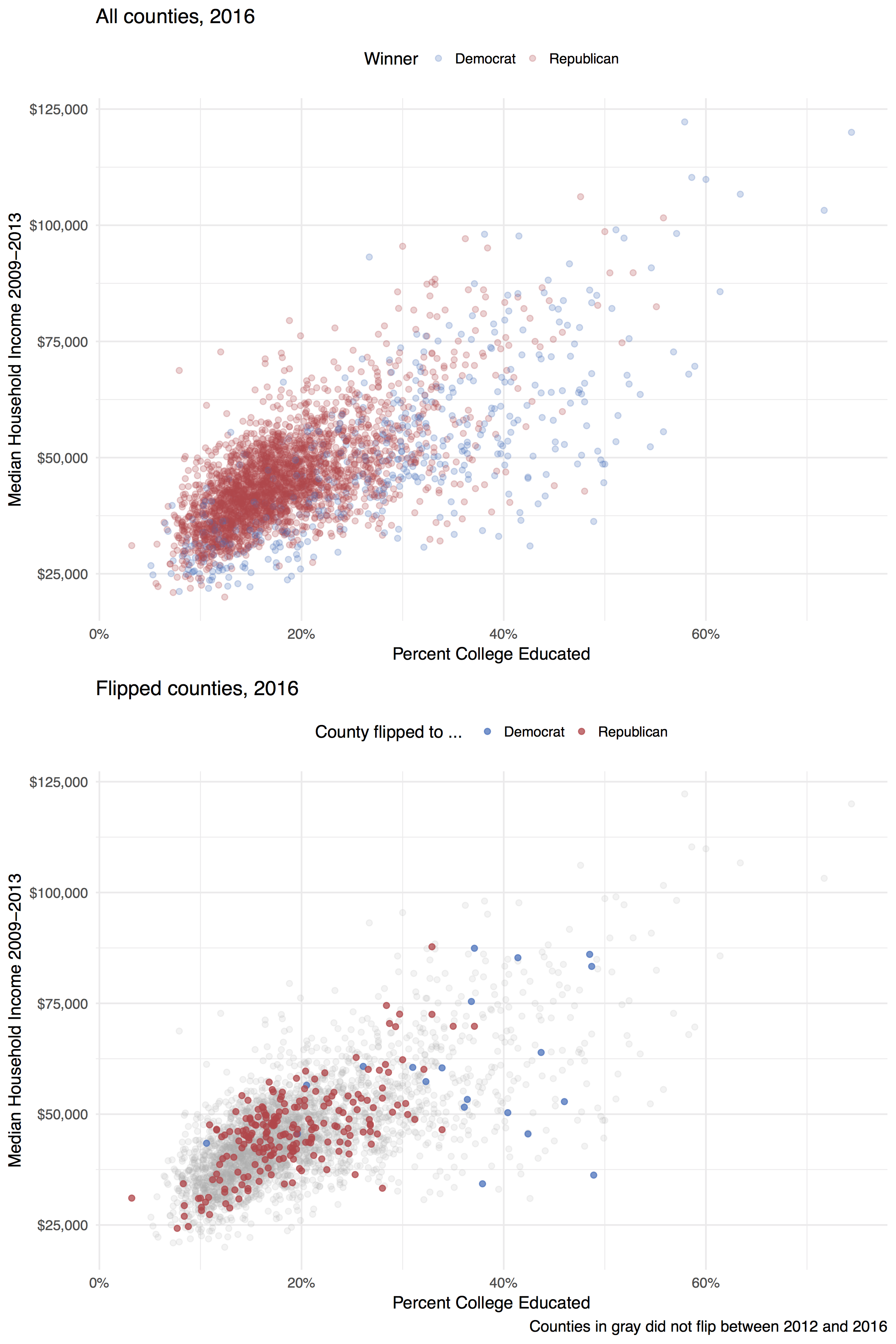
All counties and flipped counties by education and income.