Excess Deaths by Jurisdiction
Although yesterday’s excess deaths plots by cause graph was for the whole of the United States only, the table we made did the same calculations on the whole CDC dataset, so the resulting df_excess table has numbers for all U.S. states and several other jurisdictions, such as New York City.
|
|
This means we can make similar plots for these jurisdictions. Making a multi-panel plot for all the states and all the causes would be a little too much, though. Instead, here are two graphs. First, we can look at excess deaths for a number of causes but just for ten or so states with large populations.
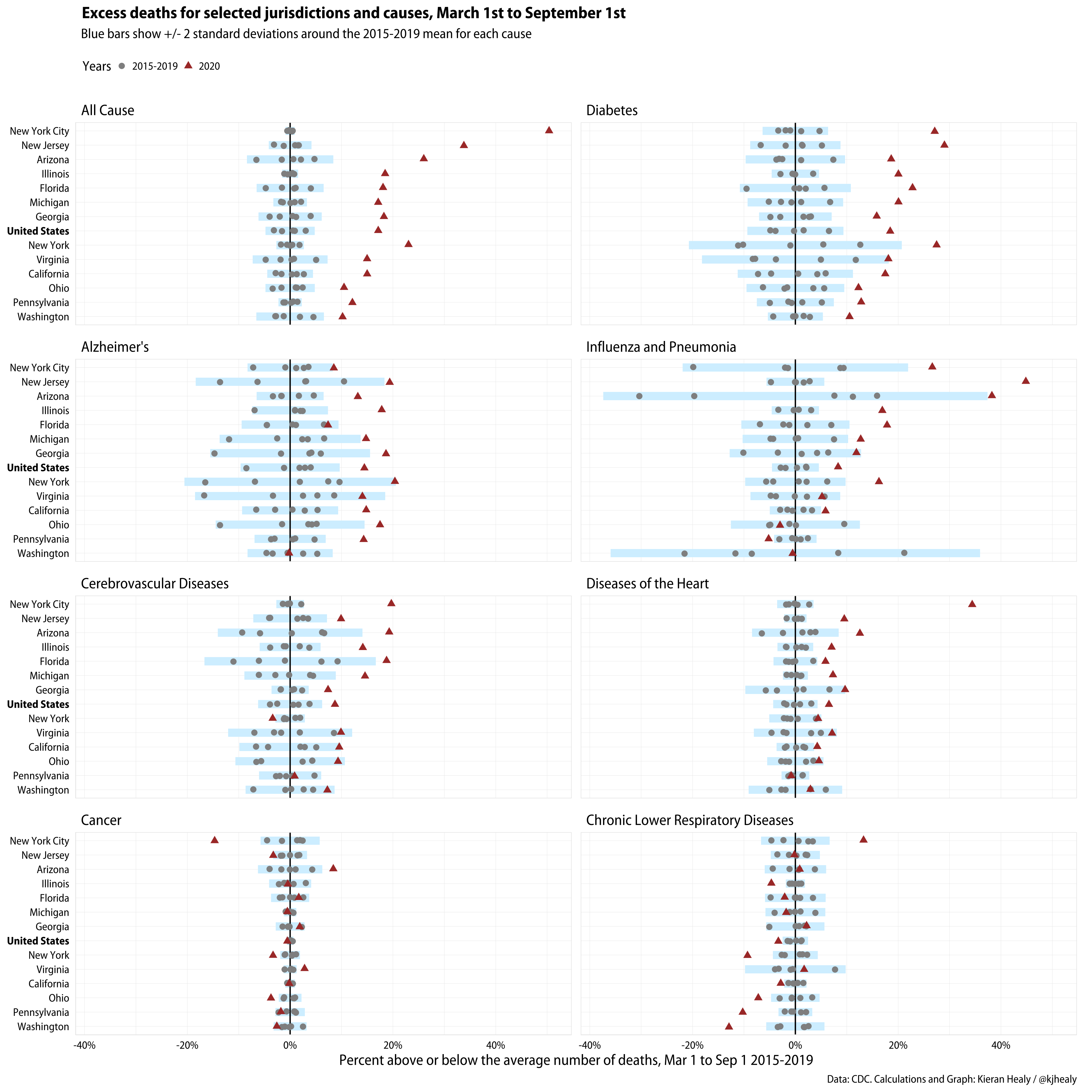
Excess mortality across a number of causes by selected jurisdictions.
I include All Cause mortality, i.e. all recorded deaths, along with the more specific causes.
Next, for all-cause mortality only, here are all the jurisdictions arranged from high to low average total mortality across the period, which is essentially a proxy for overall population size.
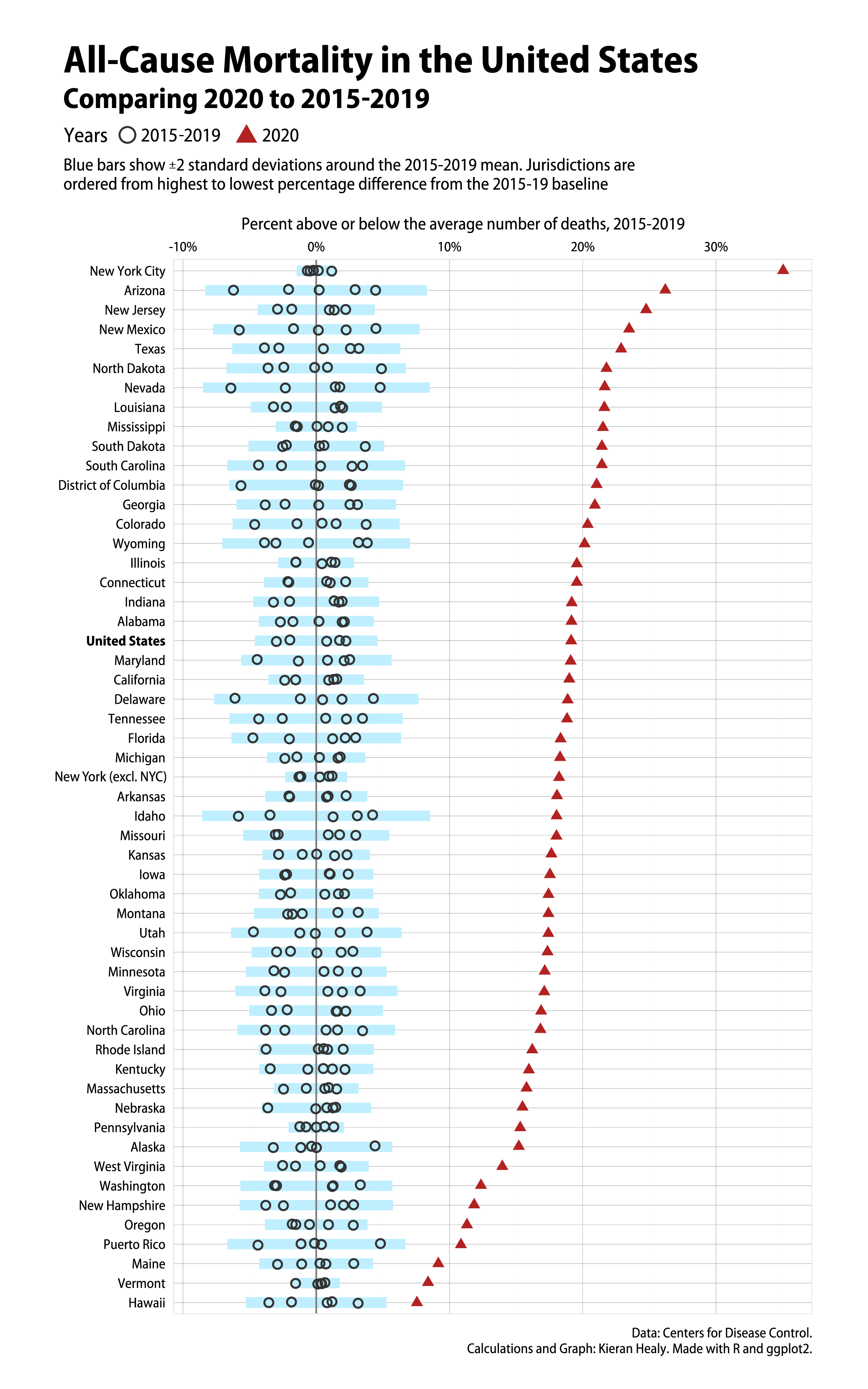
Excess all-cause mortality by jurisdictions.
In addition to the clear patterns for this year, there are a couple of other things to note about the jurisdiction-level numbers. First, the smaller the population of a place the noisier the numbers are going to be, which is why we stick to All Cause mortality. Second, even here there are some issues. Wisconsin, for instance, has some strange periodic dips in its 2015-2019 numbers that clearly seem to be reporting or recording problems. Feel free to tell me what’s happening with mortality reporting in the state if you know. The upshot here is that one of the years has one data point radically below the average number of deaths, which pulls the range of the state way out of line. Second, there are also data reporting issues for this year in at least North Carolina, Connecticut, and West Virginia. These states have been lagging more than average in their reporting of recent deaths since around July or August, and it is artificially suppressing their excess mortality numbers. I expect these numbers to shift as time goes on.
Beyond that though, the devastating impact of COVID-19 on mortality in the United States is absolutely obvious by now. That shock has hit right across the United States, too, though of course much moreso in some places than in others.