Excess Deaths Overview
Update
Jurisdiction figures updated on October 25th with data up to week 37 (ending September 12th).
Updated again on December 4th to include data up to week 45.
Updated on February 24th, 2021.
Updated on March 3rd, 2021.
Recent posts on the CDC data have been getting a fair amount of traffic. This page is an overview of the things I’ve been doing with the data.
Summarizing excess mortality in the United States this year so far

An overview of mortality in the US in 2020
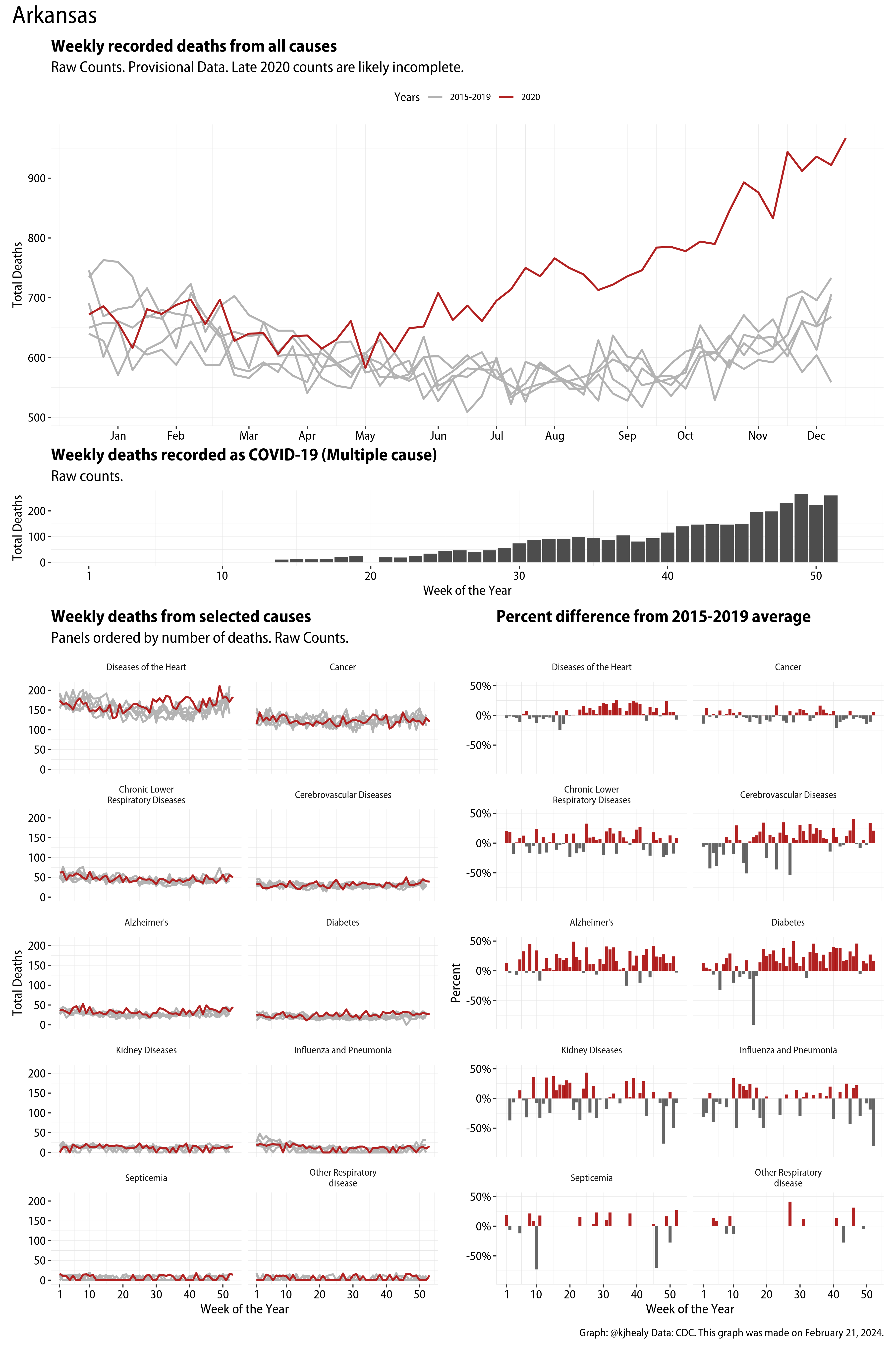
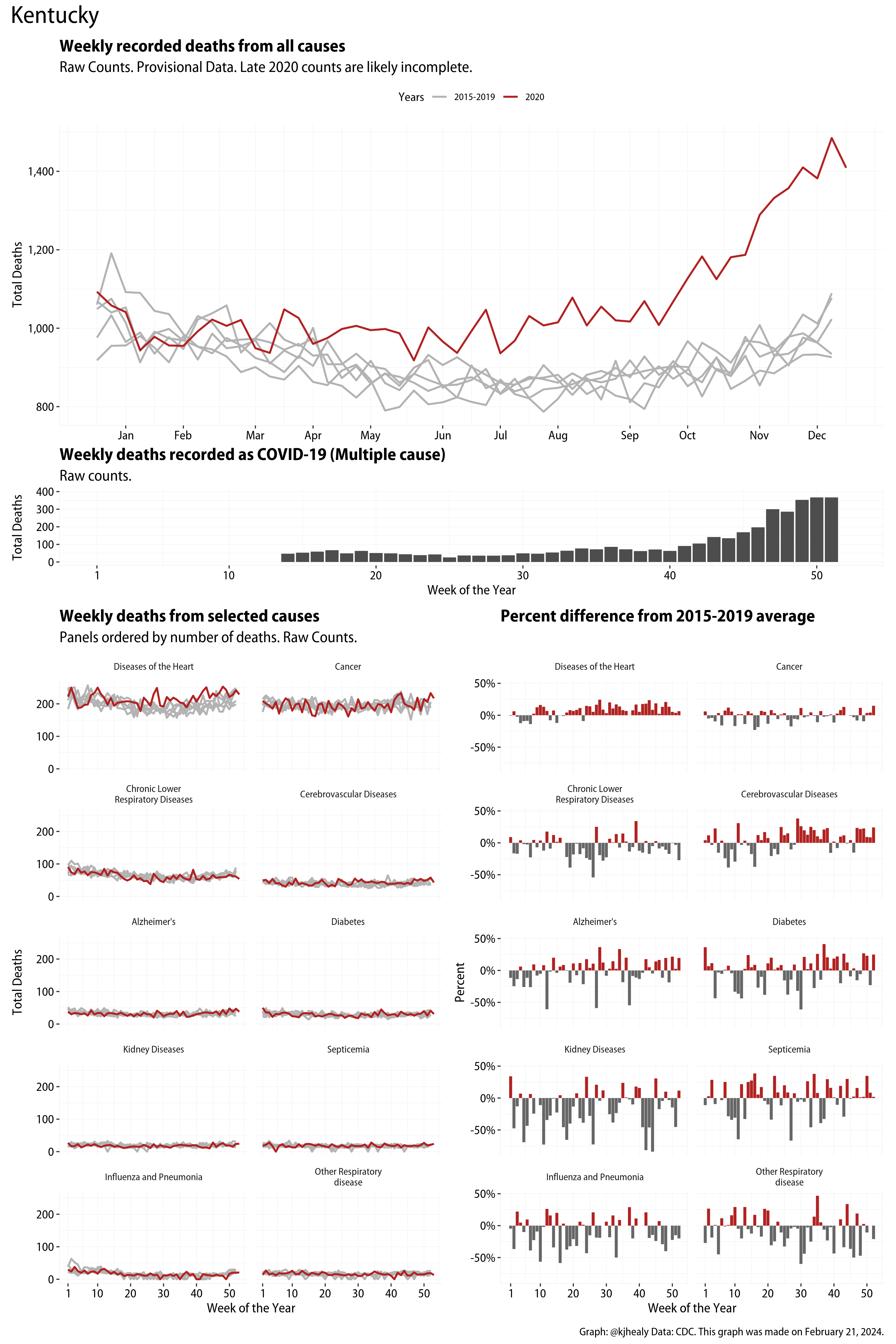
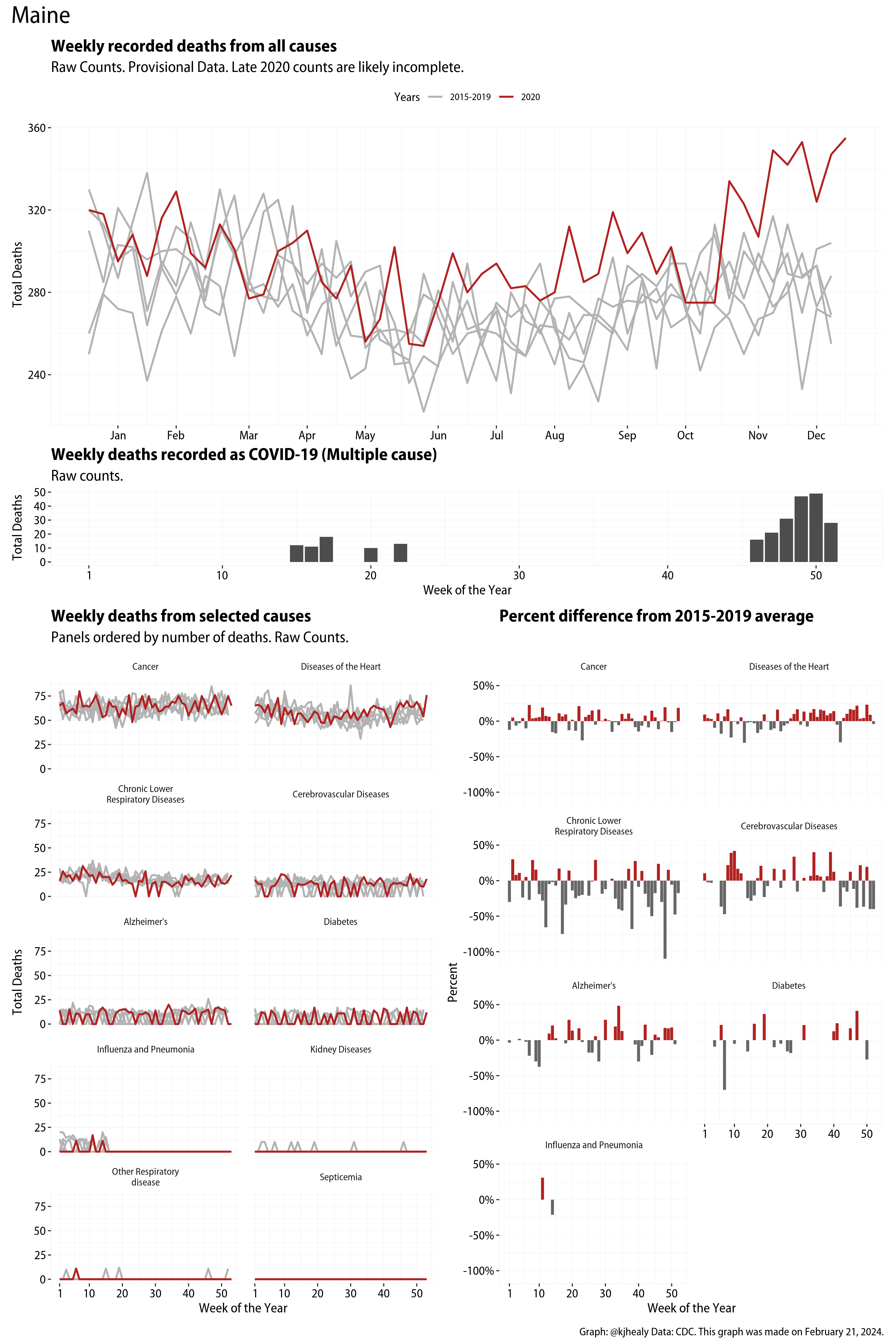
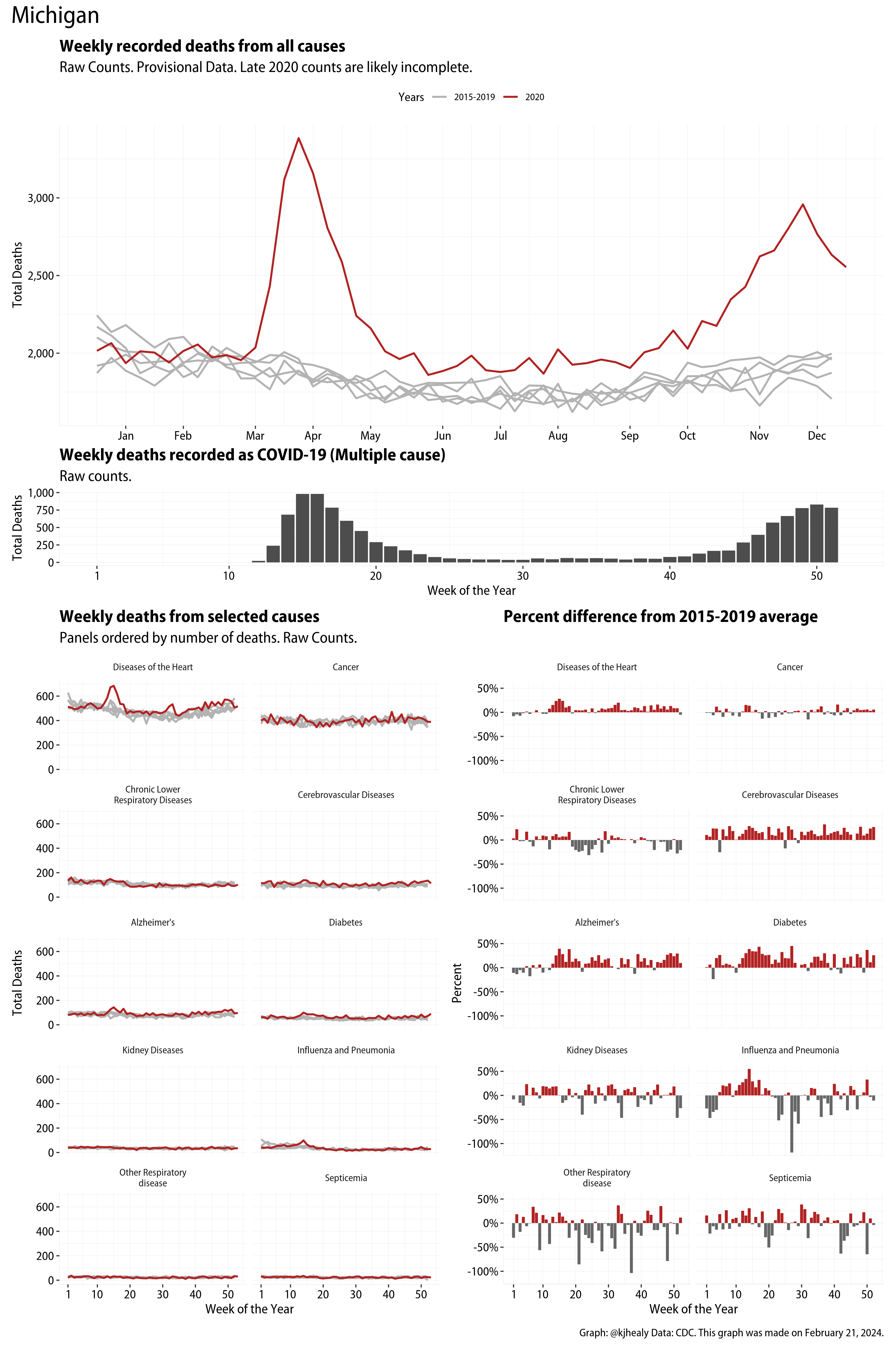
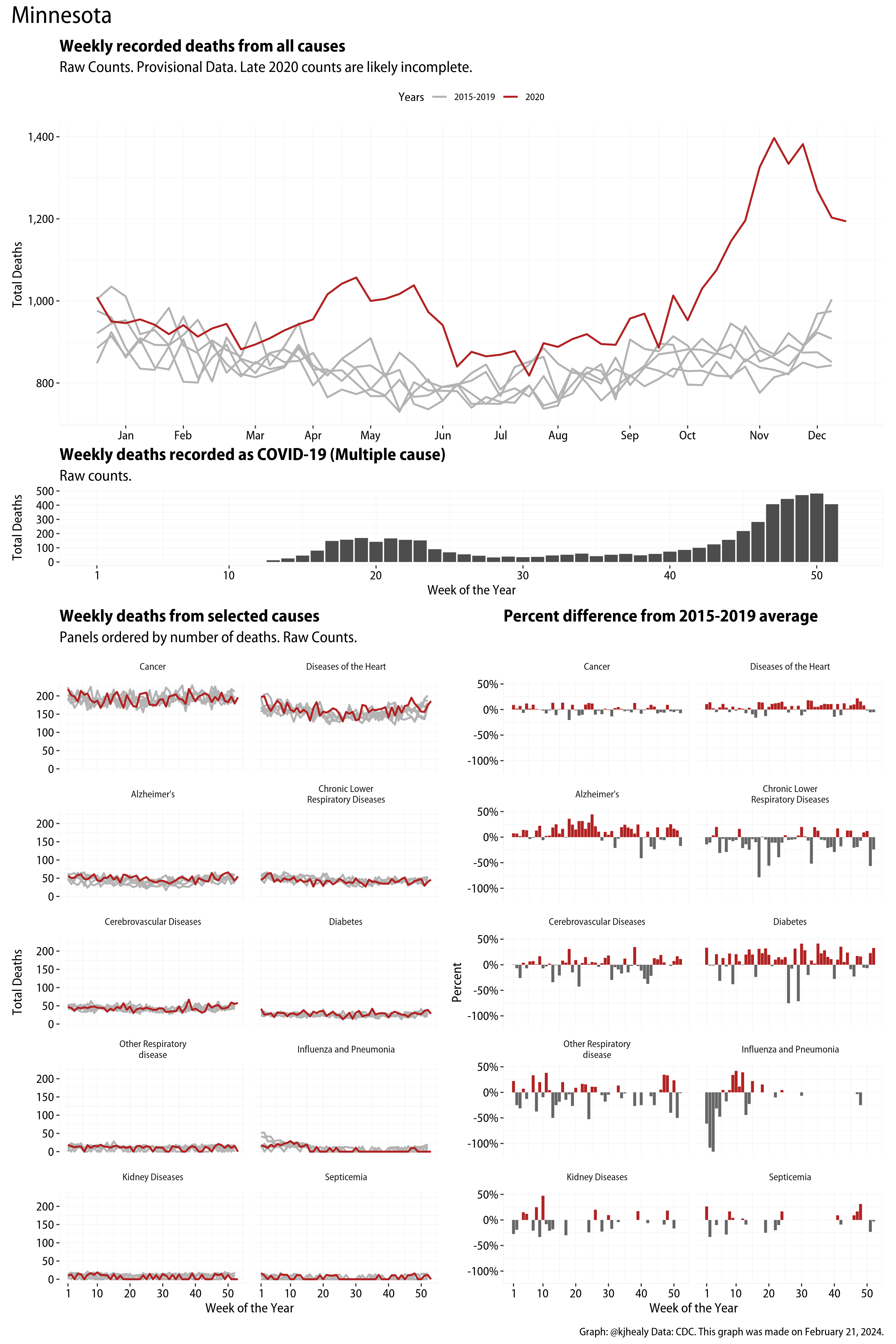
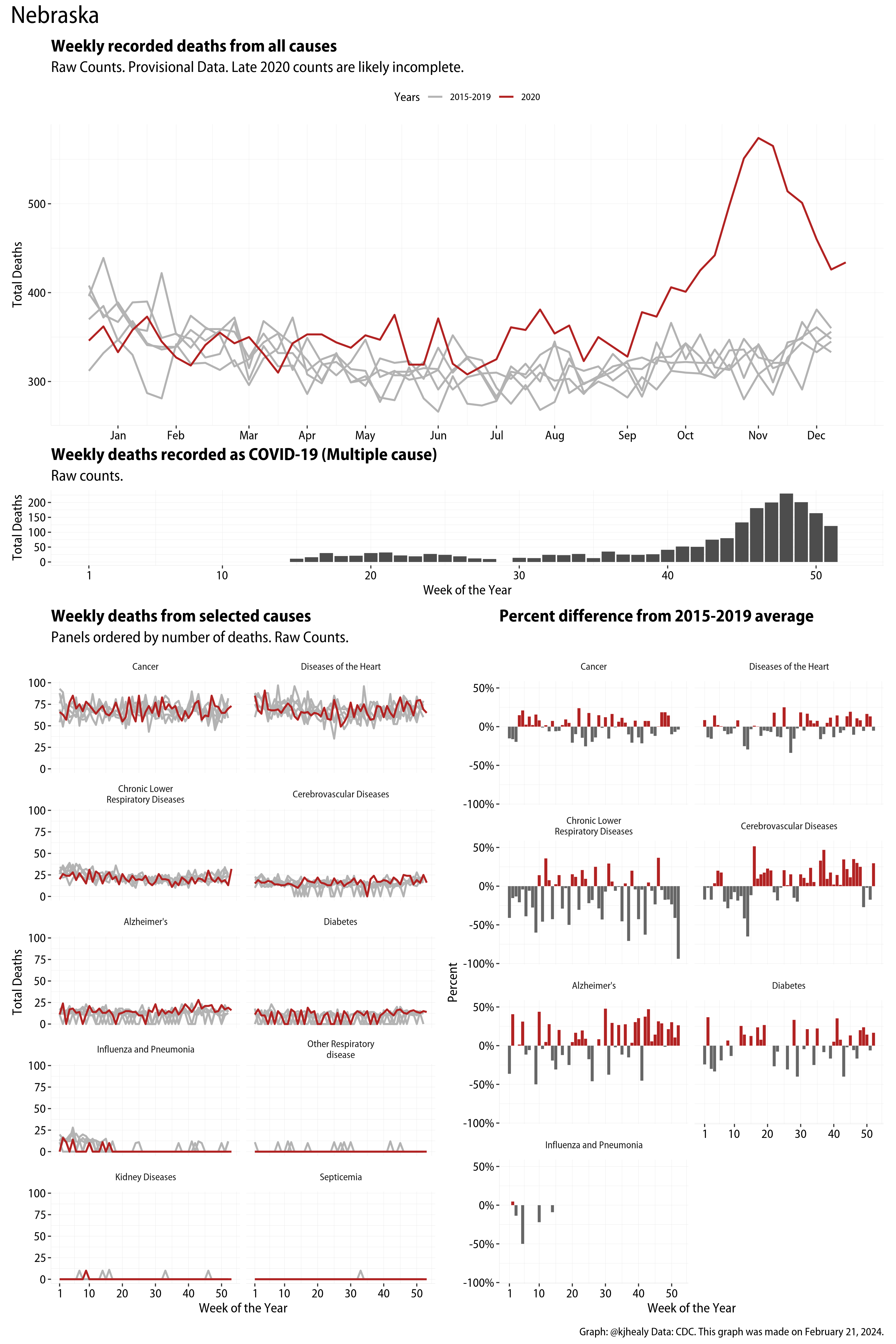
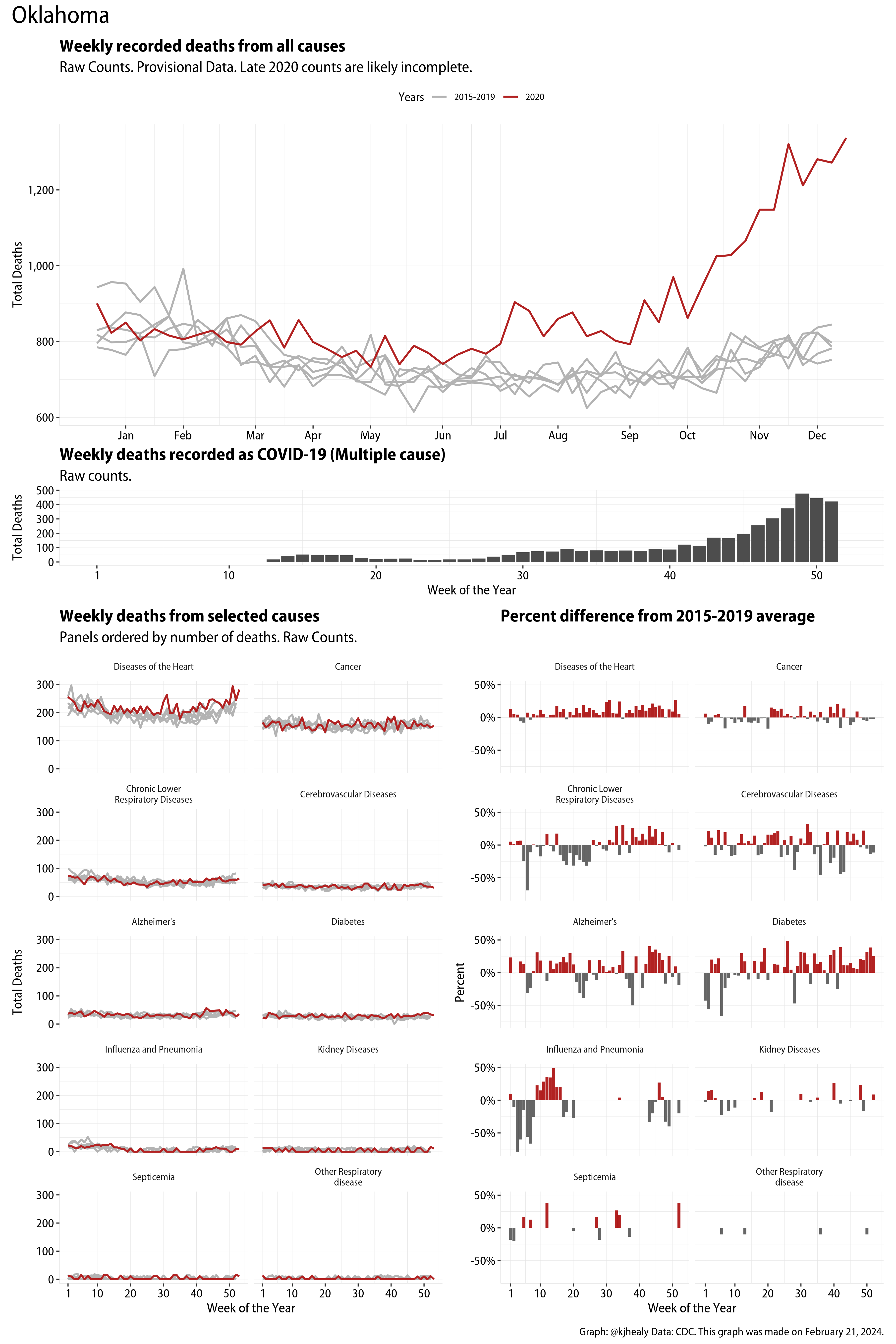
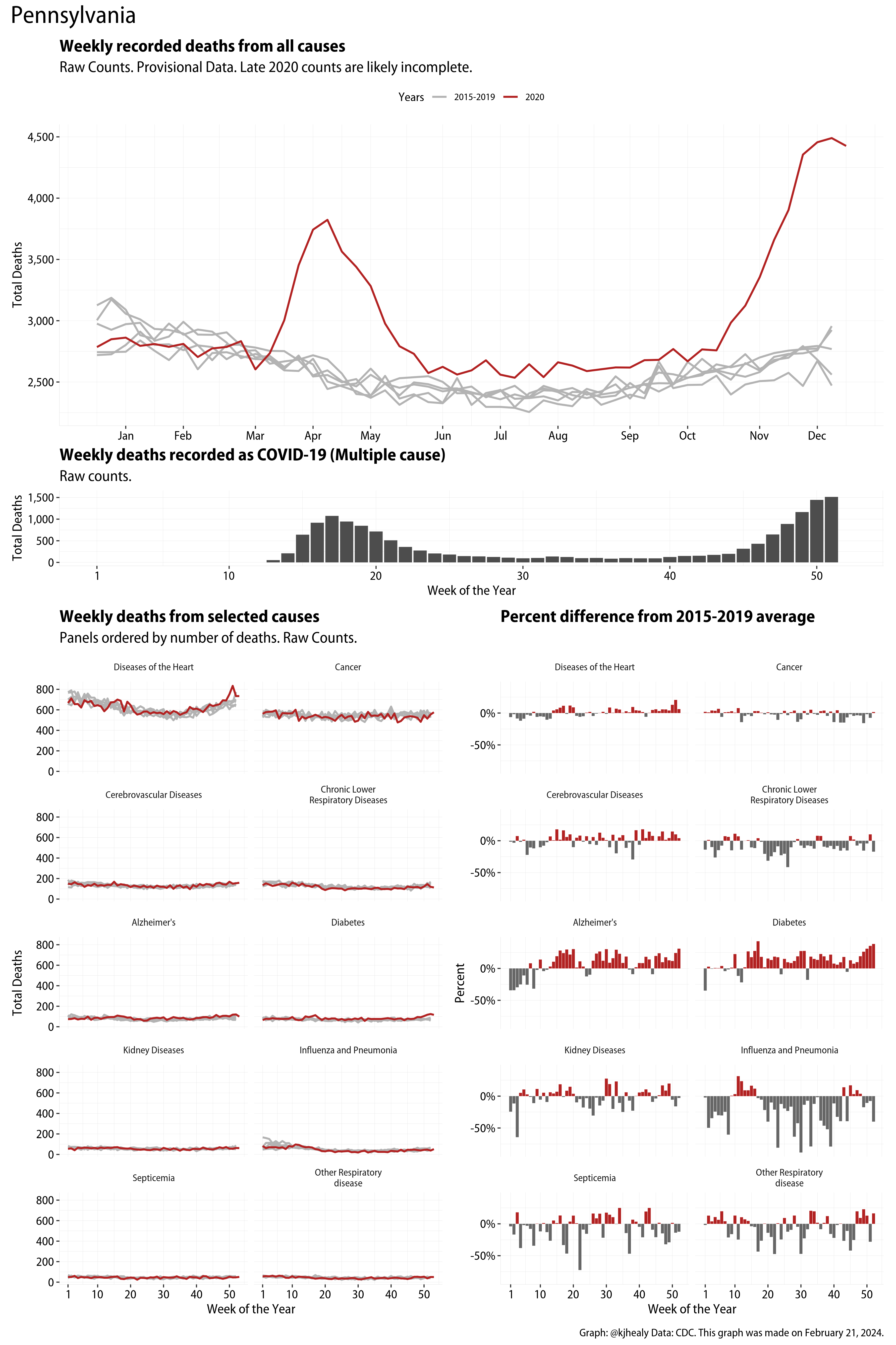
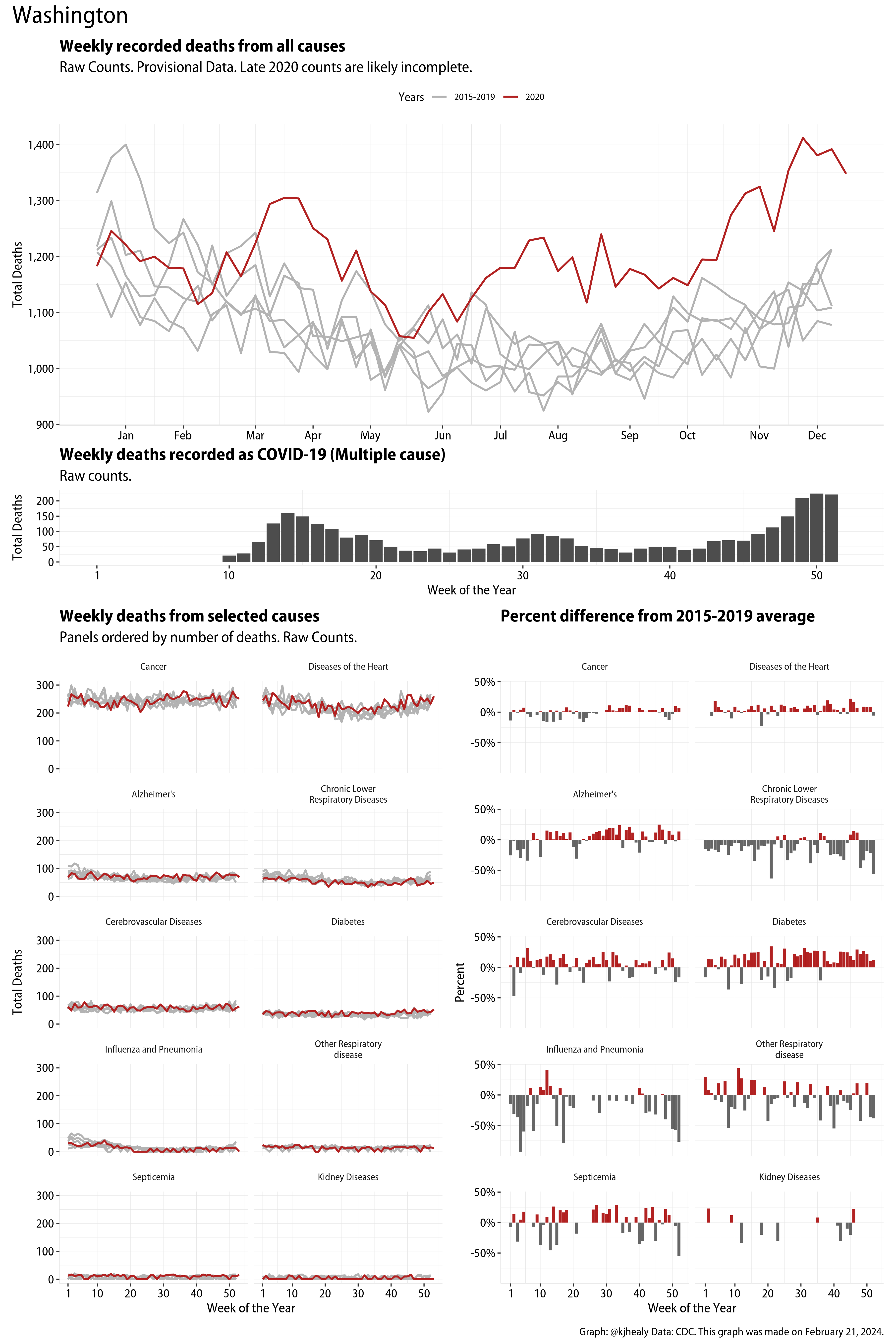
This figure has four sections. At the top is the weekly count of deaths from all causes in the United States. Counts for 2020 so far are highlighted in red. In gray are the equivalent counts for the years 2015 to 2019. More or less reliable data is available for about the first forty five weeks of the year so far, so we stop there. (This is not true of all states: see below.) If you’re not familiar with mortality data of this sort, one thing that will jump out at you is its strongly seasonal character. People are more likely to die in the Winter than in the Summer. You’ll also note the relative stability of these patterns. The grey lines over the past five years are pretty steady, as the ordinary cycle of things continues. It’s this patterned character to the data that lets us infer excess mortality, when things are worse than usual for some reason. Not everything is fixed, of course. For example, the flu season in the Winter of 2017-2018 was exceptionally severe and is the reason there’s a high peak for one of the gray lines. The severity of the flu is easy to underestimate.
The second section shows the count of COVID-related deaths from week to week. The bars show the “COVID-19 (U071, Multiple Cause of Death)” ICD code.
The bottom left panel shows the same weekly data as the upper panel, but broken out by major cause of death. The causes are ordered from highest to lowest by prevalence, with Malignant Neoplasms (that is, cancer) and heart disease being the leading causes in the country in these data. The bottom right panel shows the CDC’s own calculation of the percentage difference between each cause of death so far this year as compared to its average in the five previous years. The ordering of the panels is the same, from highest to lowest overall number of deaths. But because the column charts show weekly changes, you can see where excess deaths are being registered within each cause. Thus far the comparisons are for the first forty five weeks of the year only, as reporting lags make counts from more recent weeks much noisier. In particular, some states lag much more than others in their reporting. Parts of North Carolina, for example, are way behind in thier reporting, with the result that the data seem to show a huge drop in total mortality since the summer. This is an artifact and not a real trend. It will eventually be corrected as full counts come in. I present straight counts here, but the CDC has some modeled estimates of excess deaths due to COVID-19. These estimates attempt to account for reporting lags and. For details, consult their dashboards.
A gallery of excess mortality summaries for every jurisdiction the CDC tracks
These graphs are the same as the one above, but there is one for every jurisdiction that the CDC tracks. Click or touch a thumbnail to see the full version and browse the gallery of images. Trend lines for these counts, especially when broken out by cause, will be noisier the smaller the population of the jurisdiction. Some states (e.g. North Carolina) are slow in reporting complete statewide totals and so more recent weeks are undercounted, sometimes severely.


An overview of excess deaths by cause in the United States
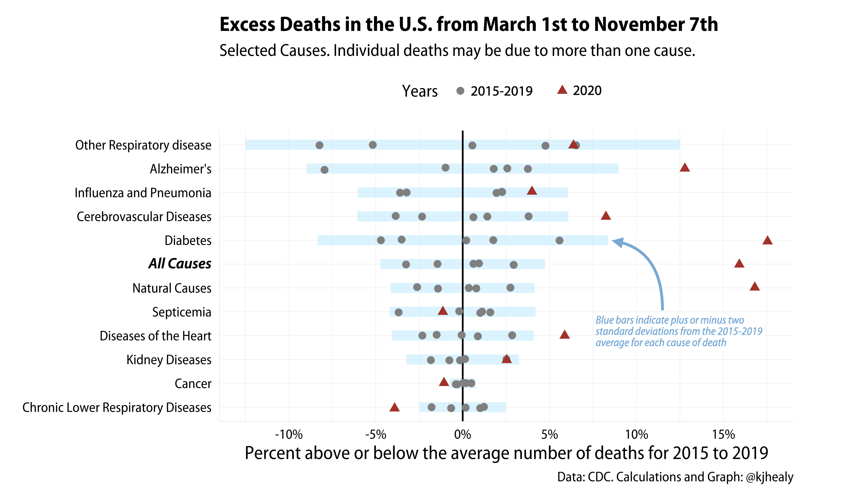
Excess deaths by Cause.
The idea here is to look at selected non-COVID causes of death (and also All-Cause mortality, i.e. everything) between March 1st and September 1st of the year, in comparison to the same causes for the same time period between 2015 and 2019. We set the baseline as the mean number of deaths for each cause between 2015 and 2019. Then we calculate how far off each year is from that mean, for each cause. Remember, people can be (and generally are) recorded as having more than one cause of death, so the different causes here do not uniquely parcel out individuals between them. “All Cause” is, as the name suggests, the only cause that includes everyone.
Most causes bounce around their average, but some are more variable than others. Cancer deaths, for instance, do not move around much from year to year. Others, such as Alzheimer’s, and infectious diseases like the ‘flu, are more variable. In the figure here, each gray dot is one of the years from 2015 to 2019, bouncing around that “No different from average” zero line. I’ve banded them with a blue bar showing twice the standard deviation from the mean. Anything outside two standard deviations from average is probably worth paying attention to. We restrict ourselves to deaths that take place from March 1st because COVID wasn’t causing fatalities in the US before March 2020. Again, more recent weeks are likely to be partial or substantial undercounts in some states.
An overview of excess deaths by cause for selected large states and New York City
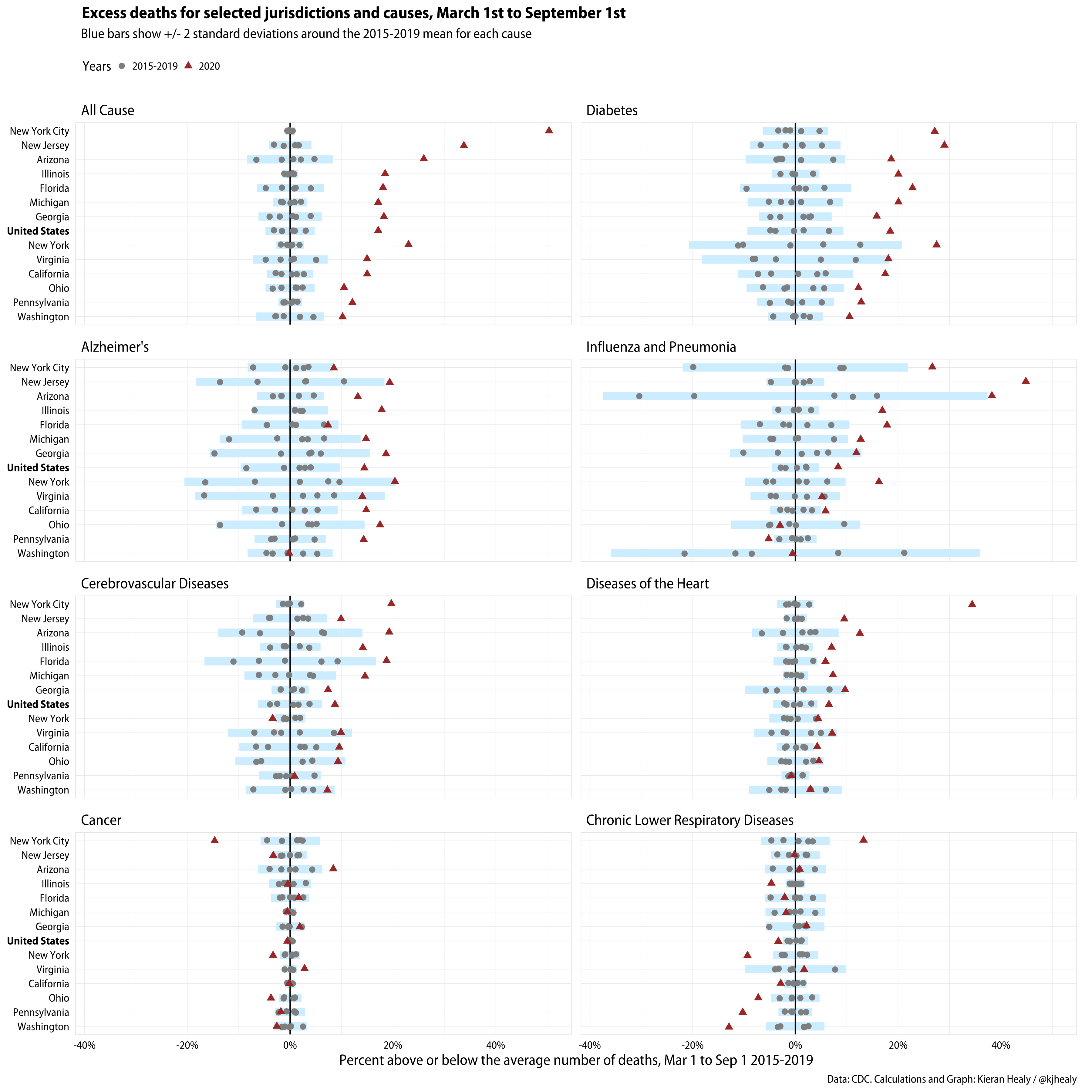
Excess mortality across a number of causes by selected jurisdictions.
The same figure as above, but for several large states as well as the United States as a whole. For comparison I include All Cause mortality here, i.e. all recorded deaths, along with the more specific causes.
An overview of all-cause mortality for every jurisdiction the CDC tracks
For all-cause mortality only, here are all the CDC jurisdictions arranged from high to low average total mortality across the period. This makes the row-order essentially a proxy for overall population size.

Excess all-cause mortality by jurisdictions.
As noted above, some states have reporting issues. Wisconsin, for instance, has some strange periodic dips in its 2015-2019 numbers that clearly seem to be reporting or recording problems. The result is that one of its years has one data point radically below the average number of deaths, which pulls the range of the state way out of line. Second, there are also data reporting issues for this year in at least North Carolina, Connecticut, and West Virginia. These states have been lagging more than average in their reporting of recent deaths since around July or August, and it is artificially suppressing their excess mortality numbers. I expect these numbers to shift as time goes on.