Walk the Walk
The other day I was looking to make a bunch of graphs showing some recent data from the CDC about excess mortality due to COVID-19. The idea was to take weekly counts of deaths over the past few years, both overall and from various important causes, and then show how the weekly counts from this year compare so far. The United States has a very large population, which means that a fairly predictable number of people die each week. Over the course of a year, the average number of people expected to die moves around. More people die on average in the Winter rather than the Summer, for example. The smaller the population the noisier things will get but, on the whole, most U.S. states are large enough to have a fairly stable expectation of deaths per week. Some counties or cities are, too. Overall, our expectations for any large population will be reasonably steady—absent, of course, a shock like the arrival of a new virus.
Competing Risks
The proper estimation of excess mortality is not just a matter of reading off the difference between the average number of people who die in a given period and the number who die in some period of interest where conditions have changed. People can only die once. If someone dies of COVID-19, for example, they are no longer in a position to die of heart disease or complications of diabetes or some other cause. Had they not died of COVID-19, some victims of the disease would have passed away from one of these other causes during the year. This is the problem of competing risks, a member of the family of problems arising from censored data. Causes of death “compete”, so to speak, for the life of each person. In any particular case, if one of them “wins” then that person is no longer there to be claimed by one of the other potential causes later on. As an estimation issue, the problem has been recognised at least since 1760, when Daniel Bernoulli tried to assess the benefits of inoculation against smallpox. In his effort to figure out the quantity of counterfactual lives that would have been lost in the absence of inoculation, Bernoulli used what we’d now call a life table of chances of death at any given age. Science being the relatively compact enterprise that it was in the eighteenth century, that table had been constructed based on “curious tables of births and funerals at the city of Breslaw” [i.e. Breslau, or Wrocław] by the English astronomer Edmond Halley.
The problem is a subtle one with consequences for the interpretation of mortality rates. For example, in the wake of an epidemic that kills a lot of people, average mortality can decline in specific groups or across the population as a whole, simply because some of those who would (counterfactually) have been at higher risk of dying as part of the ordinary flow of events and passage of time instead (in fact) end being victims more or less all at once of the epidemic.
I set aside these complications here. All I wanted to do was show the prime facie evidence that there had been a clear and sudden increase in deaths in the wake of the arrival of COVID-19 in the United States. Precisely parceling out any suppressive effects on mortality rates from other causes is in some ways a secondary problem. COVID-19’s severity is clearly visible both in the spike in all-cause mortality that begins suddenly in March and in the unusual shifts in mortality rates from other casues, too. As we can see by looking at the graphs, COVID-19 has been a huge shock at the margin of death rates, not some sort of subtle signal that we need to work hard to tease out and make visible in the data.
Here are a couple of examples of the plot I ended up making. This is the United States as a whole:
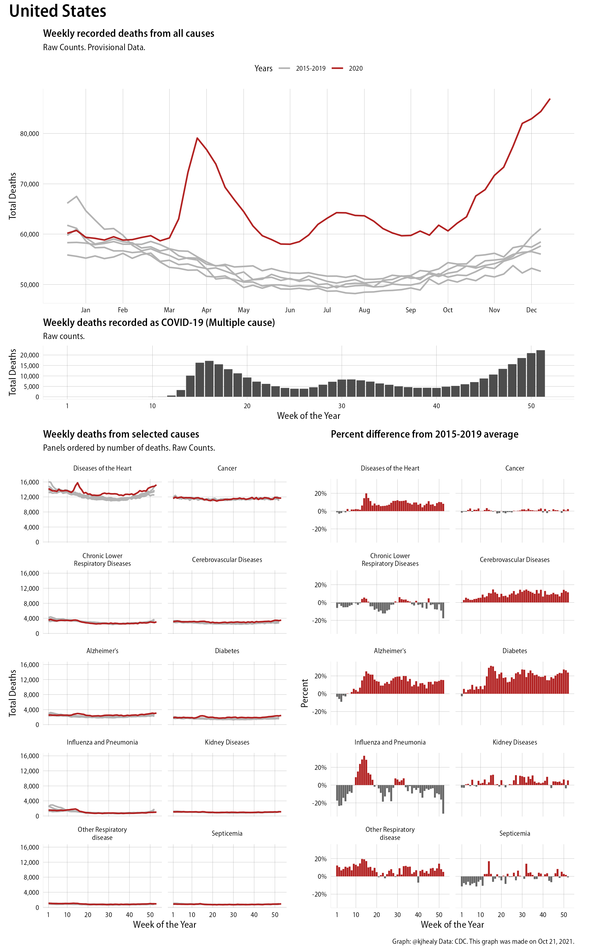
Evidence of excess mortality this year in the United States
And this is New York City:
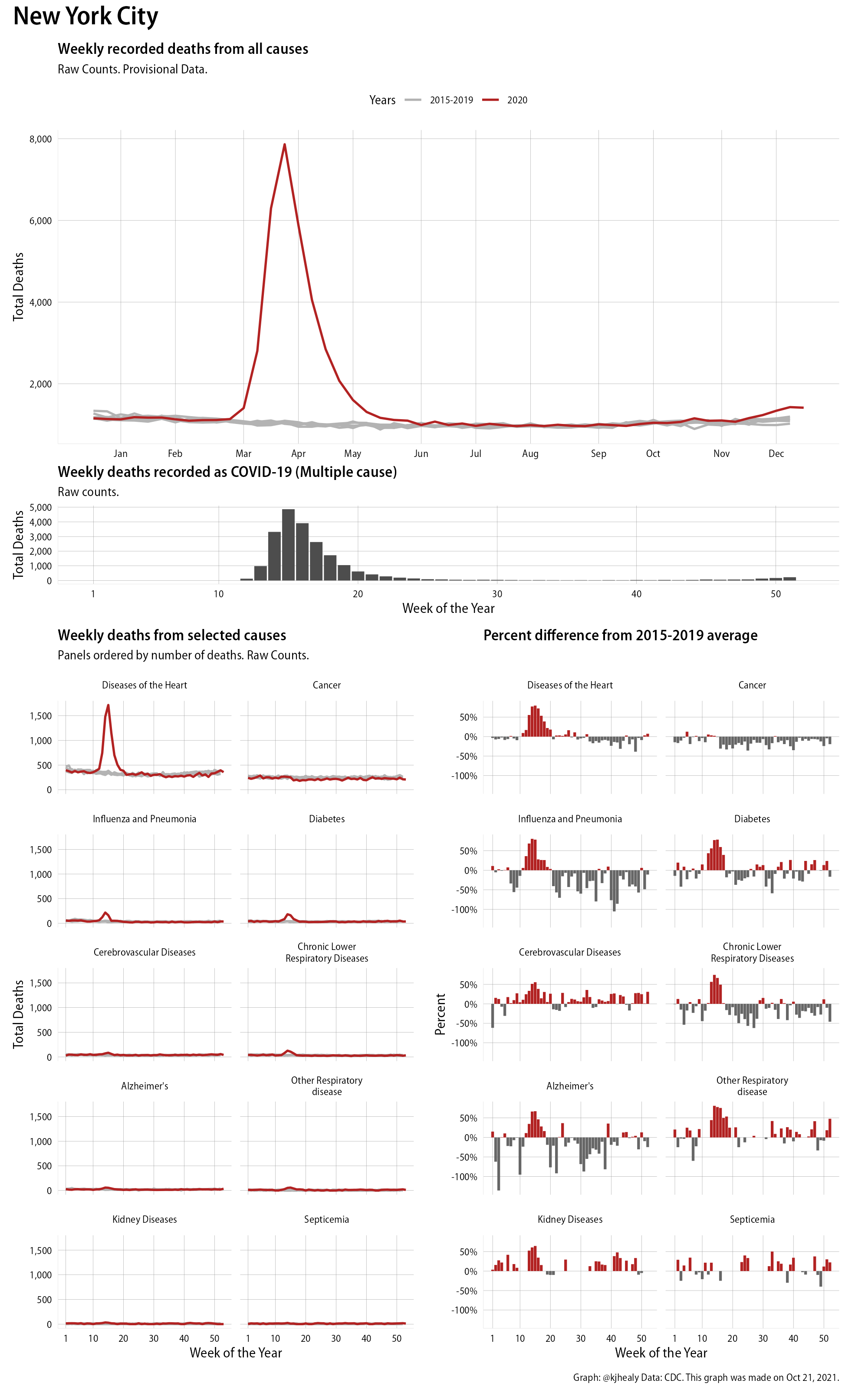
Evidence of excess mortality this year in New York City
You can view the rest of them via the original post.
The upper panel shows the raw count of All-Cause mortality for the year so far (in red) in comparison to the weekly trends for each of the previous five years. This panel is a good example of how the rule of thumb that says “Start your y-axis at zero” is indeed just a rule of thumb and not a law of nature. The relevant comparison here is with the number of people who typically die in the United States each week, versus this year. No-one thinks there are weeks when zero people die. Instead, the grey lines give us the baseline (with the size of the count shown on the y-axis). It would also be reasonable to show this is as a percentage change rather than an absolute one, but I think in this case the best place is to start, for overall mortality, is with the raw counts. The lower panels, meanwhile, break out ten different causes of death and show both the trend in raw counts (in the line charts on the left) and the degree to which these causes have been knocked off-kilter in relative terms (in the bar charts on the right). Again, the terrible impact of the pandemic is immediately evident. The comparisons by cause are very interesting. A useful baseline is the rate of death from cancers, which has barely moved from its typical magnitude. Meanwhile the rate of deaths from heart disease, Alzheimer’s, diabetes, and pneumonia are all way above average. This is in addition, note, to deaths recorded as being directly from COVID-19, which in these data sum to about 190,000, up till the beginning of September. Not every one of the additional deaths in the other causes is attributable to things connected COVID, as some of those people would have died anyway. But I think it’s clear that the excess mortality associated with the pandemic is substantially higher than the single-cause count of COVID-19 fatalities.
Making the graphs
Each figure is made up of four pieces. Assembling them in an elegant way is made much easier by Thomas Lin Pedersen’s patchwork package. Let’s say we have done our data cleaning and calculations on our initial data and now have a tibble, df, that looks in part like this:
|
|
This is a table of weekly numbers of deaths by each of eleven causes for each of fifty four jurisdictions over five years. The pct_diff column is how far a specific cause in that week in that jurisdiction differed from its 2015-2019 average.
For convenience we also have a table of the names of our 54 jurisdictions and we’ve made a column called fname that we’ll use later when saving each graph as a file.
|
|
What we do next is write a few functions that draw the plots we want. We’ll have one for each plot. For example, here’s a slightly simplified version of the patch_state_count() function that draws the top panel, the one showing the count of All Cause mortality:
|
|
These functions aren’t general-purpose. They depend on a specific tibble (df) and some other things that we know are present in our working environment. We write similar functions for the other three kinds of plot. Call them patch_state_covid(), patch_state_cause(), and patch_state_percent(). Give any one of them the name of a state and it will draw the requested plot for that state.
Next we write a convenience function to assemble each of the patches into a single image. Again, this one is slightly simplified.
|
|
The patchwork package’s tremendous flexibility does all the work here. We just imagine each of our functions as making a plot and assemble it according to patchworks rules, where / signifies a new row and + adds a plot next to whatever is in the current row. Patchwork’s plot_layout() function lets us specify the relative heights of the panels, and its plot_annotation() function lets us add global titles and captions to the plot as a whole, just as we would for an individual ggplot.
At this stage we’re at the point where writing, say, make_patchplot("Michigan") will produce a nice multi-part plot for that state. All that remains is to do this for every jurisdiction. There are several ways we might do this, depending on whatever else we might have in mind for the plots. We could just write a for() loop that iterates over the names of the jurisdictions, makes a plot for each one, and saves it out to disk. Or we could use map() and some its relations to feed the name of each jurisdiction to our make_patchplot() function and bundle the results up in a tibble. Like this:
|
|
Neat! We took our little states tibble from above and added a new list-column to it. Each <patchwrk> row is a fully-composed plot, sitting there waiting for us to do something with it. You could of course do something equivalent in Base R with lapply().
What we’ll do with it is save a PDF of each plot. We’ll use ggsave() for that. It will need to know the name of the file we’re creating and the object that contains the corresponding plot. To pass that information along, we could use map() again. Or, more quietly, we can use walk(), which is what you do when you just want to stroll down a list, feeding the list elements one at a time to a function in order to produce some side-effect (like saving a file) rather than returning some value or number that you want to do something else with.
To create a named file for each jurisdiction and have it actually contain the plot we need to provide two arguments: the file name and the plot itself. We assemble a valid file name using the fname column of out_patch. The plot is in the patch_plot column. When we need to map two arguments to a function in this way, we use map2() or its counterpart walk2().
|
|
The first argument creates the filename, for example, "figures/alabama_patch.pdf". The second is the corresponding plot for that jurisdiction. The function we feed those two bits of information to is ggsave, and we also pass along a height and width instruction. Those will be the same for every plot.
The end result is a figures/ folder with fifty four PDF files in it. The GitHub repo that goes along with the earlier post provides the code to reproduce the steps here, assuming you have the covdata package installed (for the CDC mortality data) along with the usual tidyverse tools and of course the patchwork package.