 1
 2
 3
 4
 5
 6
 7
 8
 9
10
11
12
13
14
15
16
17
18
19
20
21
22
23
24
25
26
27
28
29
30
31
32
33
34
35
36
37
38
39
40
41
42
43
44
45
46
47
48
49
|
library(tidyverse)
library(covdata)
rate_rank <- stmf %>%
filter(sex == "b", year > 2014 & year < 2020) %>%
group_by(country_code) %>%
summarize(mean_rate = mean(rate_total, na.rm = TRUE)) %>%
mutate(rate_rank = rank(mean_rate))
rate_max_rank <- stmf %>%
filter(sex == "b", year == 2020) %>%
group_by(country_code) %>%
summarize(covid_max = max(rate_total, na.rm = TRUE)) %>%
mutate(covid_max_rank = rank(covid_max))
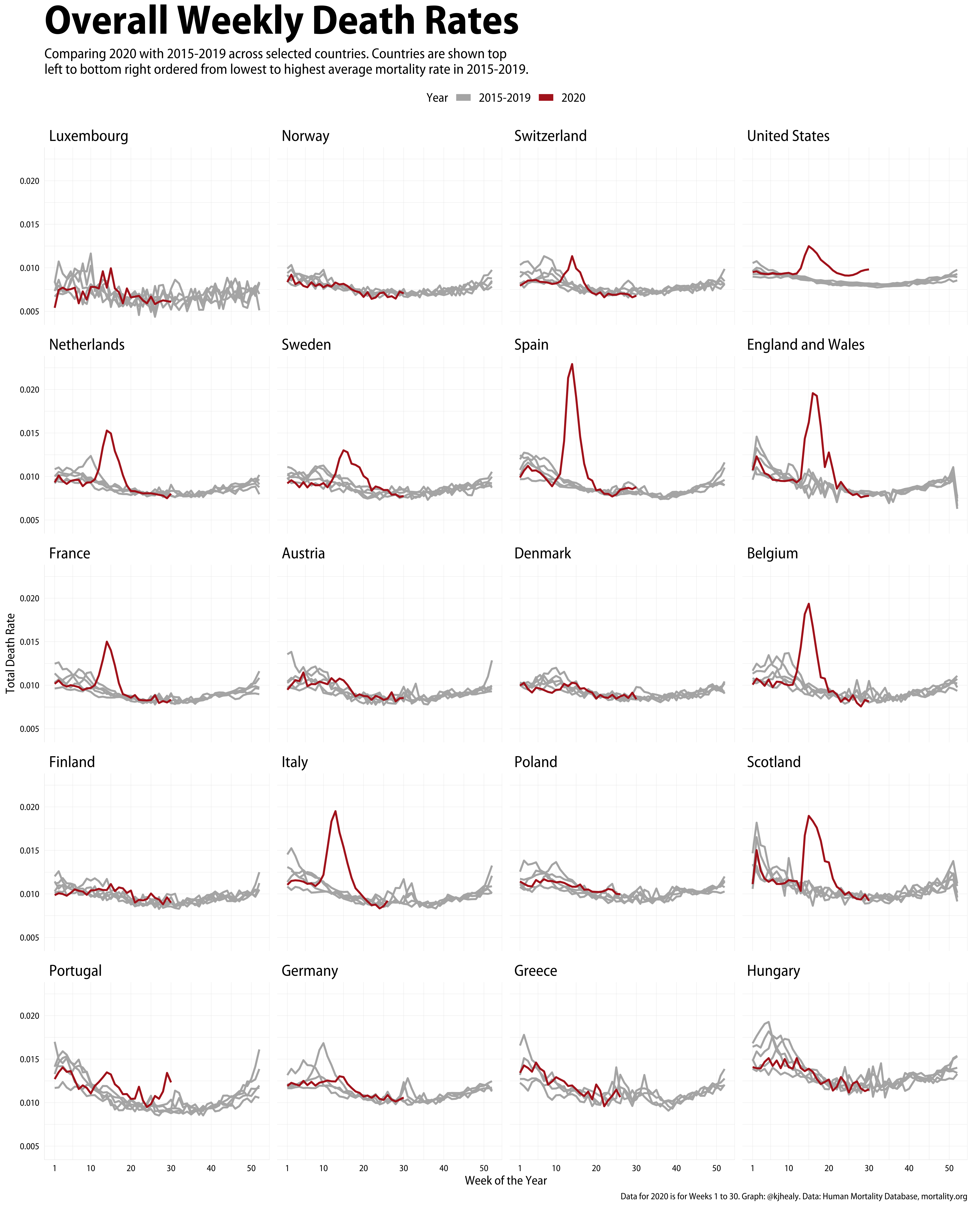
stmf %>%
filter(sex == "b", year > 2014,
country_code %in% c("AUT", "BEL", "CHE", "DEUTNP", "DNK", "ESP", "FIN",
"FRATNP", "GBR_SCO", "GBRTENW", "GRC", "HUN",
"ITA", "LUX", "POL", "NLD", "NOR", "PRT", "SWE", "USA")) %>%
filter(!(year == 2020 & week > 30)) %>%
group_by(cname, year, week) %>%
mutate(yr_ind = year %in% 2020) %>%
slice(1) %>%
left_join(rate_rank, by = "country_code") %>%
left_join(rate_max_rank, by = "country_code") %>%
ggplot(aes(x = week, y = rate_total, color = yr_ind, group = year)) +
scale_color_manual(values = c("gray70", "firebrick"), labels = c("2015-2019", "2020")) +
scale_x_continuous(limits = c(1, 52),
breaks = c(1, seq(10, 50, 10)),
labels = as.character(c(1, seq(10, 50, 10)))) +
facet_wrap(~ reorder(cname, rate_rank, na.rm = TRUE), ncol = 4) +
geom_line(size = 0.9) +
guides(color = guide_legend(override.aes = list(size = 3))) +
labs(x = "Week of the Year",
y = "Total Death Rate",
color = "Year",
title = "Overall Weekly Death Rates",
subtitle = "Comparing 2020 with 2015-2019 across selected countries. Countries are shown top\nleft to bottom right ordered from lowest to highest average mortality rate in 2015-2019.",
caption = "Data for 2020 is for Weeks 1 to 30. Graph: @kjhealy. Data: Human Mortality Database, mortality.org") +
theme(legend.position = "top",
plot.title = element_text(size = rel(3.6)),
plot.subtitle = element_text(size = rel(1.25)),
strip.text = element_text(size = rel(1.1), hjust = 0),
legend.text = element_text(size = rel(1.1)),
legend.title = element_text(size = rel(1.1)))
|