CBO Estimates for the AHCA
The Congressional Budget Office released its cost estimate report for the American Health Care Act yesterday. There are a few tables at the back summarizing the various budgetary and coverage effects of the proposed law. Of these, Table 4 is pretty interesting. The CBO “projected the average national premiums for a 21-year-old in the nongroup health insurance market in 2026 both under current law and under the AHCA. On the basis of those amounts, CBO calculated premiums for a 40-year-old and a 64-year-old, assuming that the person lives in a state that uses the federal default age-rating methodology”. They then calculated what some people in those income and age groups would pay. Specifically they figured it out for people making $26,500 per year (or 175 percent of the Federal poverty line), and for people making $68,200 per year (or 450 percent of the Federal poverty line). Here’s a figure I made based on the numbers in the table.
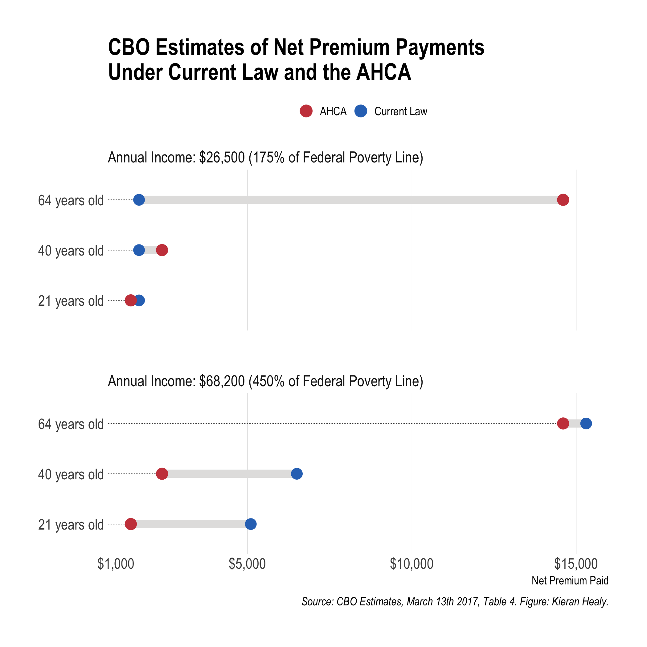
CBO estimates of coverage change for different selected ages in two income groups.
A PDF version is also available.
This picture got circulated fairly widely, thanks mostly to Paul Krugman retweeting it. Here’s a bit more background on how to make one like it.
There are several ways to show data like this. One could just use a bar chart, most obviously, with a bar for the current law and one for the proposed changes. Instead I used a “dumbbell” chart, where the current situation and proposed changes are represented by points, and the gap between them is highlighted by connecting them—that’s the bar on the dumbbell. Projected or actual shifts within categories are a good candidate for a chart of this sort, as you are in effect representing a slide from one state to another for the same group or unit.
By default, ggplot doesn’t have a geom for a plot like this. But I took advantage of Bob Rudis’s ggalt library, which includes geom_dumbbell() along with several other goodies. His hrbrthemes library has some nice thematic elements that are used in this plot, too.
Making the plot involves a little bit of data munging, as geom_dumbbell() wants the start and end points as separate columns, rather than in the long format that ggplot usually prefers. So I made use of the spread() function in the tidyr library to take care of that. There’s also a little trick involved in getting the key at the top of the plot to display. (There isn’t one by default.) In effect you create a dummy variable and map it to the fill aesthetic, to get a key, and then override its default aesthetics to display the colors we want for the graph.
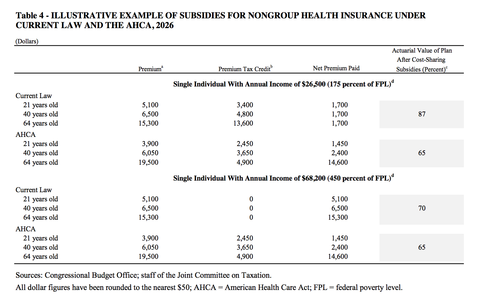
This is where I’d usually end by saying that the code and data to reproduce the figure are available on GitHub, which they are. But it’s worth saying a bit more about the data part. As usual when it comes to making figures, the bulk of the work gets done before a line of graphing code is written. We can’t draw anything until we have the data, and the numbers aren’t given to us in a machine-friendly format. The original table in the report looks like this:
CBO estimates of coverage change for different selected ages in two income groups.
This is a nice example of information that is laid out in a compact and clear form for people to read, but where the data is not at all in the tidy form that computers, and in particular R and ggplot, like to process. Even worse, it’s in PDF format. Getting information out of PDFs and back into a form you can work with is annoying. (I believe the problem is conventionally described as trying to turn a packet of sausages back into a pig.) The challenge is the reverse of the one that Dr Drang has been wrestling with recently. He produces a bunch of numbers that he wants to format into compact, easy-to-read tables. Doing that programatically in a way that preserves the readability of the raw table is surprisingly difficult. What table-formatting programs need is very different from what the table-reading humans want to see.
Conversely, I have the final version of a report produced for humans to read, delivered in a format that you can’t simply copy-and-paste from. There few enough numbers in this table that it would have been feasible to just retype them all manually (like an animal). But an alternative solution—there are several options—is to use a service like PDFtables. You feed it a page of PDF and it returns an Excel spreadsheet (or a CSV, or XML file) with the data more or less sanely reorganized. You have to pay if you use the thing at all regularly, but it can be an effective means of quickly getting material out of PDF reports when a CSV or other machine-readable format is not available.
In my case I extracted the single page I was interested in from the report and sent it to PDFpages, which resulted in this:
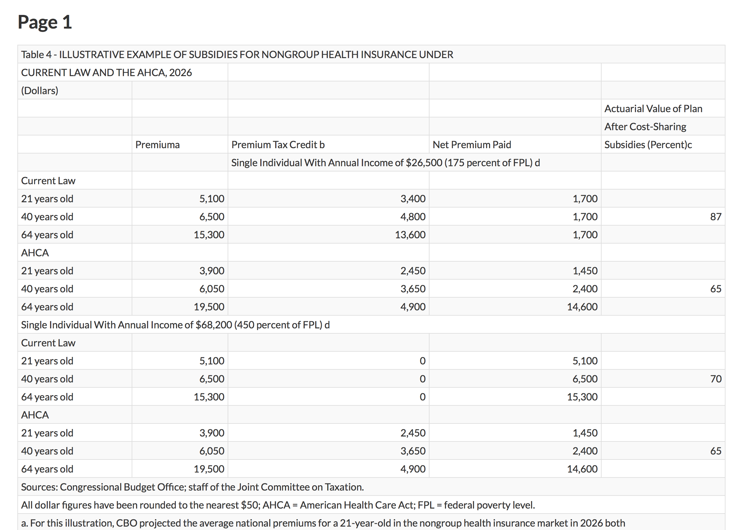
PDFtables extracts the numbers.
It’s best to work with the Excel file in this case, because we still need to cut out all the extraneous notes and headers, simplify the variable names, and clean up the data by duplicating a lot of row names. A tidied, long-format table of data has a lot of redundancy in it, as the values within columns tend to get repeated over and over. This is one reason that, for larger or more complex datasets, the information will be broken up into separate, minimally redundant tables, and managed as a database. Manually reformatting small to medium tables of data is a dangerous business. You’re not doing it programatically, so if you make mistakes copying or pasting the numbers it’s both easy to miss your error and harder to fix later.
After a bit of reorganization the table looks like this:

Nearly to the CSV.
Now we can export it to CSV format and get it into R, where the table gets made. The prep work we did is invisible in the code file, as all the reader sees there is data <- read_csv("data/cbo-table4.csv"). Once data were at that point, things went much faster, and the figure is produced in just a few lines of code.
So, while the code and data to reproduce the figure are indeed available on GitHub, the annoying work-that-comes-before-the-work is not.