Saying no to Pie
I saw this pie chart via Beth Popp Berman on Twitter yesterday:
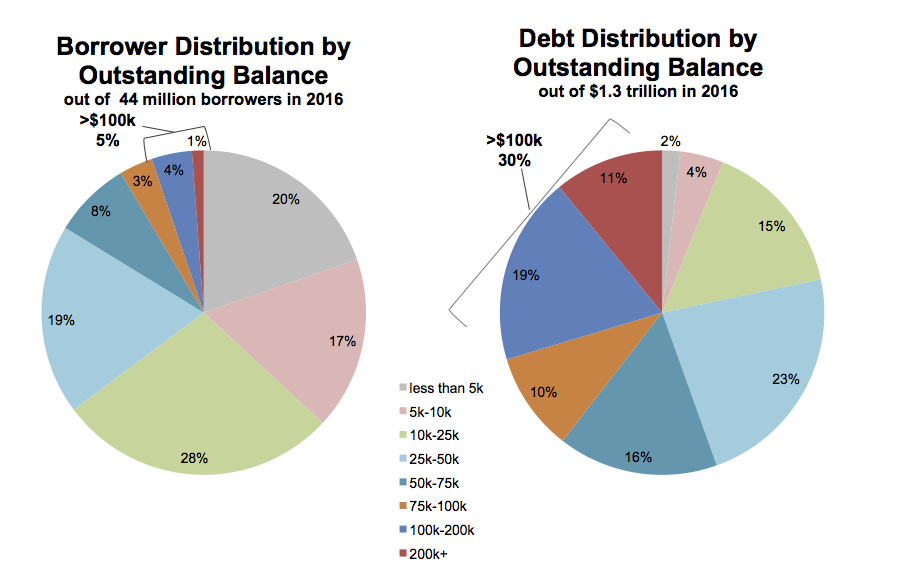
Pie charts of student debts by percent of all borrowers and percent of all debt.
As you probably know, the perceptual qualities of pie charts are not great. In a single pie chart, it is usually harder than it should be to estimate and compare the values shown, especially when there are more than a few wedges and when there are a number of wedges reasonably close in size. A Cleveland dot plot or a bar chart is usually a much more straightforward way of comparing quantities. When comparing the wedges between two pie charts, as in this case, the task is made harder again as the viewer has to ping back and forth between the wedges of each pie and the vertically oriented legend underneath.
There’s an additional wrinkle, too. The variable broken down in each pie chart is not only categorical, it’s also ordered from low to high. The data describe the percent of all borrowers and the percent of all balances divided up across the size of balances owed, from less than five thousand dollars to more than two hundred thousand dollars. It’s one thing to use a pie chart to display shares of an unordered categorical variable, such as percent of total sales due to pizza, lasanga, and risotto for example. Keeping track of ordered categories in a pie chart is harder again, especially when we want to make a comparison between two distributions. The wedges of these two pie charts are ordered (clockwise, from the top), but it’s not so easy to follow them. This is partly because of the pie-ness of the chart, and partly because the color palette chosen for the categories is not sequential. Instead it is unordered. The colors allow the debt categories to be distinguished, but don’t pick out the sequence from low to high values.
So not only is a less than ideal plot type being used here, it’s being made to do a lot more work than usual, and with the wrong sort of color palette. As is often the case with pie charts, the compromise made to facilitate interpretation is simply to display all of the numerical values for every wedge, and also to add a summary outside the pie. If you find yourself having to do this, it’s worth asking whether the chart could be redrawn, or whether you might as well just show a table instead.
Here are two ways we might redraw these pie charts. As usual, neither approach is perfect—or rather, each approach draws attention to features of the data in slightly different ways. Which works best depends on what parts of the data we want to highlight.
A first effort at redrawing the pie charts uses a faceted comparison of the two distributions.
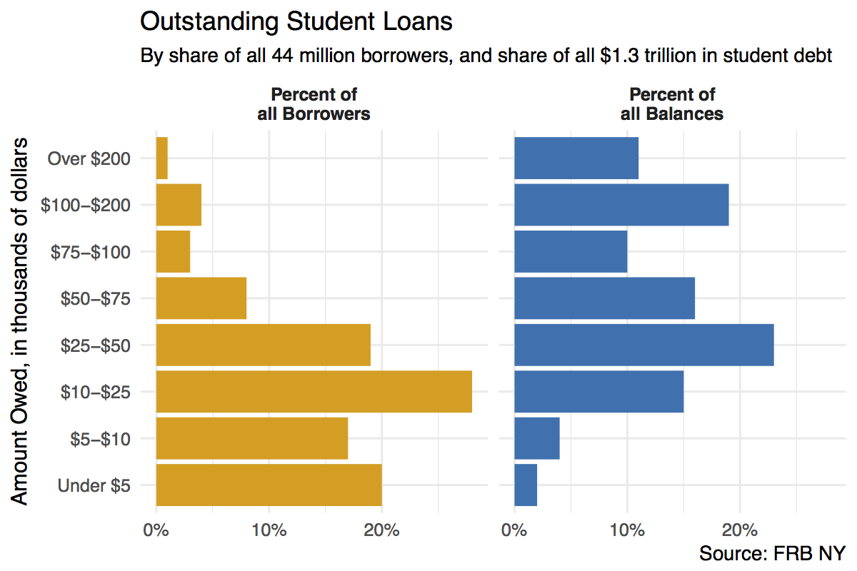
Faceted barplot of student debts by percent of all borrowers and percent of all debt.
Here we split the data into the two categories, and show the percentage shares as bars. The percent scores are on the x-axis. Instead of using color to distinguish the debt categories, we put their values on the y-axis instead. This means we can compare within a category just by looking down the bars. For instance, the left-hand panel shows that almost a fifth of the 44 million people with student debt owe less than five thousand dollars. Comparisons across categories are now easier as well, as we can simply scan across a row to see, for instance, that while just one percent or so of borrowers have more than $200,000 in debt, that category accounts for more than 10 percent of all debts.
We could also have made this bar chart by putting the percentages on the y-axis and the categories of amount owed on the x-axis. When the categorical axis labels are long, though, I generally find it’s easier to read them on the y-axis. Finally, while it looks nice and helps a little to have the two categories of debt distinguished by color, the yellow and blue colors aren’t encoding or mapping any information in the data that isn’t already taken care of by the faceting. This graph could just as easily be in black and white, and it would not lose any informational content if it were.
One thing that is not emphasized in a faceted chart like this is the idea that each of the debt categories is a share or percentage of a total amount. That is what a pie chart emphasizes more than anything, but as we saw there’s a perceptual price to pay for that, especially when the categories are ordered. But maybe we can hang on to the emphasis on shares by using a different kind of barplot. Instead of having separate bars distinguished by heights, we can array the percentages for each distribution proportionally within a single bar. Here’s one way to do that.
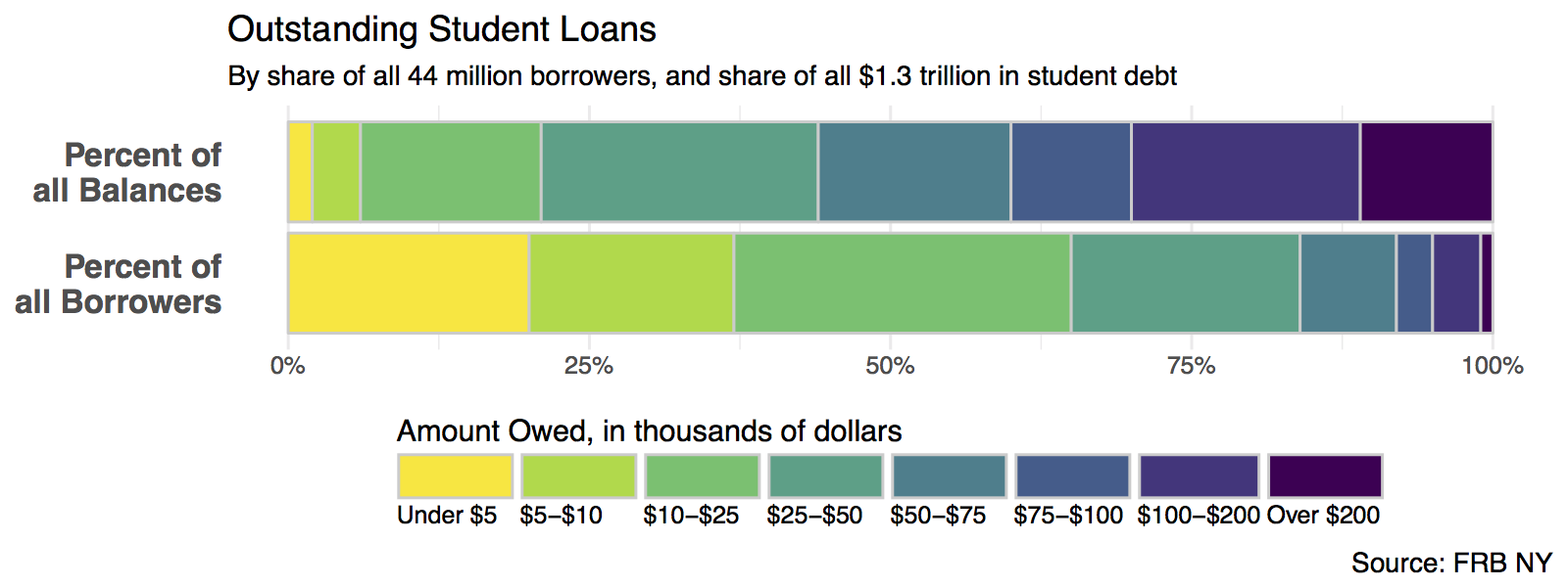
Stacked (but side-oriented) barplot of student debts by percent of all borrowers and percent of all debt.
In this version we can more easily see how the categories of dollar amounts owed break down as a percentage of all balances, and as a percent of all borrowers. We can also eyeball comparisons between the two types, especially at the far end of each scale. It’s easy to see how a tiny percentage of borrowers account for a disproportionately large share of total debt, for example. But estimating the size of each individual segment is not as easy here as it is in the faceted plot, however. This is because it’s harder to estimate sizes when we don’t have an anchor point or baseline scale to compare each piece to. (In the faceted plot, that comparison point was the x-axis.) So the size of the “Under 5” segment in the bottom bar is much easier to estimate than the size of the “$10-25” bar, for instance.
Note also that, compared to the pie chart, our color scheme for the bars recognizes that the debt categories are ordered from a low value to a high value. The colors run in a discrete low-to-high sequence from yellow to dark purple. The palette is from the viridis package, which does a very good job of combining perceptually uniform colors with easy-to-see, easily-contrasted hues along its gradient. Some balanced palettes can be a little washed out at their lower end, especially, but the viridis palettes avoid this.