The Baby Boom Again
Prompted by a local data visualization event, I revisited my old “Visualizing the Baby Boom” poster and added a few things to it. The additions are there to add a little extra context and to bring out some relevant comparisons. There are new rows showing snapshots of the country’s population pyramid every ten years between 1935 and 2015, to show the boomer cohort moving up through the population’s age distribution. Following on from some discussion on the socials with Gina C. Pierters and Carl Schmertmann, I also added a row at the bottom showing a basic time series of the raw number of births per month. The idea here is to bring out the point that while the birth rate has fallen sharply since the peak of the boom, the absolute number of births has been comparatively more stable (with the implication, of course, that the overall population has grown substantially.) Thanks also to Dr Drang for catching a misaligned label. Here’s the figure. You can also get a PDF version at no extra charge.
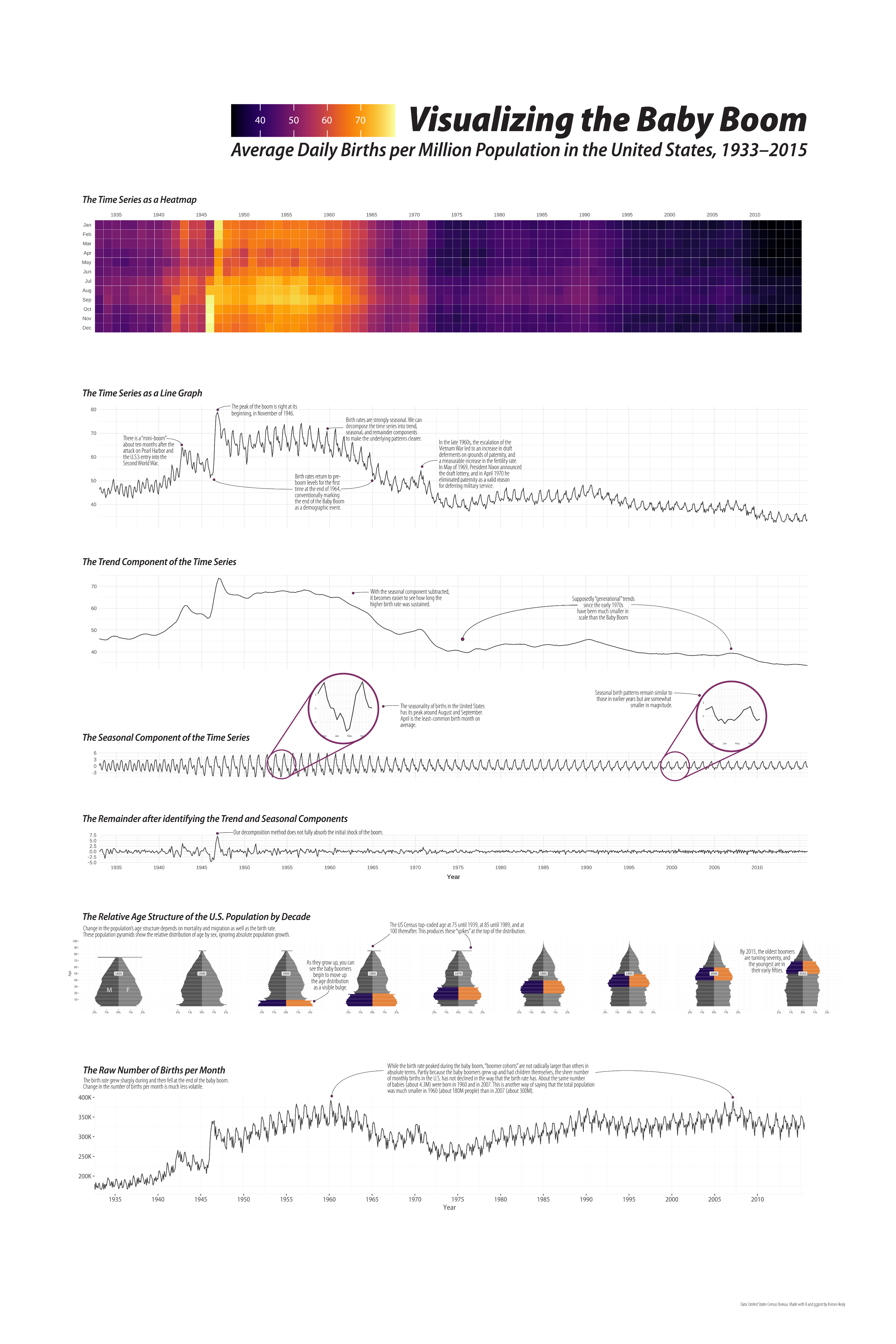
In case you’re interested in learning more about Richard Nixon’s effects on the U.S. birth rate (highlighted in one of the callouts on the poster), see Martha Bailey and Eric Chyn, “The Demographic Effects of Dodging the Vietnam Draft”.
As usual, the components of the graph were made using R and ggplot, though in this case they were partly assembled using Adobe Illustrator.