Earned Doctorates
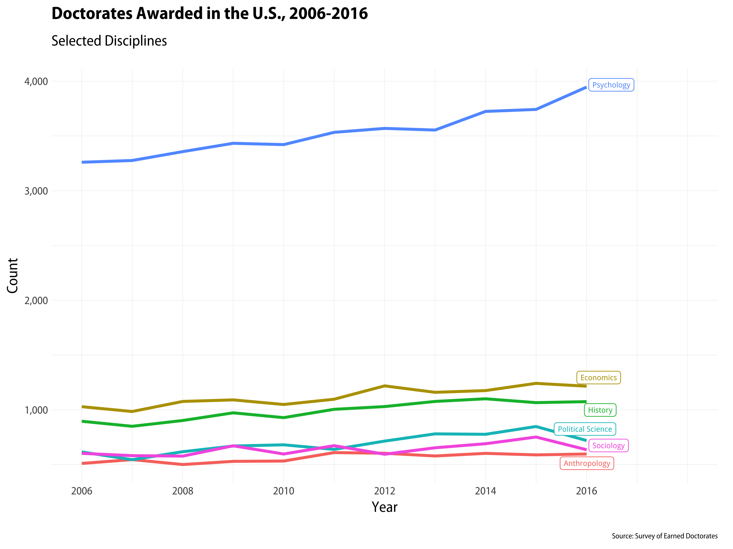
PhDs awarded in selected disciplines, 2006-2016.
Thierry Rossier asked me for the code to produce plots like the one above. The data come from the Survey of Earned Doctorates, a very useful resource for tracking trends in PhDs awarded in the United States. The plot is made with geom_line() and geom_label_repel(). The trick, if it can be dignified with that term, is to use geom_label_repel() on a subset of the data that contains the last year of observations only. That way we can label the endpoints in a nice way, which I think is often preferable to a key or legend that the reader has to refer to in order to decode the graph. The gghighlight package (https://github.com/yutannihilation/gghighlight) will do this for you in a single step. But this works, too.
Here’s the code for the plot shown here. Code and data for it and several others is available on GitHub at https://github.com/kjhealy/earned_doctorates.
|
|