Assault Deaths to 2015
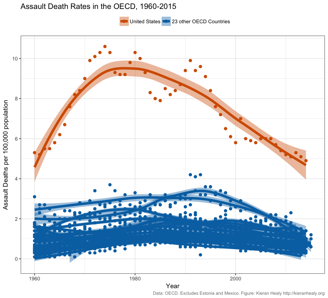
Every couple of years—usually after one of the inevitable mass shootings—I find myself updating this graph. The originals were done in 2012. You can read America is a Violent Country, and Assault Deaths Within the United States to see those. This morning I pulled the latest figures from the OECD Health Status database. The method and scope are the same as before. Here is the main figure, showing assault death rates for the US and 23 other OECD countries.

Assault Death rates in the US and other OECD countries, 1960-2015.
There’s a PDF available as well. The US data go as far as 2014, with most other countries running to the same year or one on either side. The story is much the same as before, with the US death rate from assault continuing to fall, but still much higher than other OECD countries.
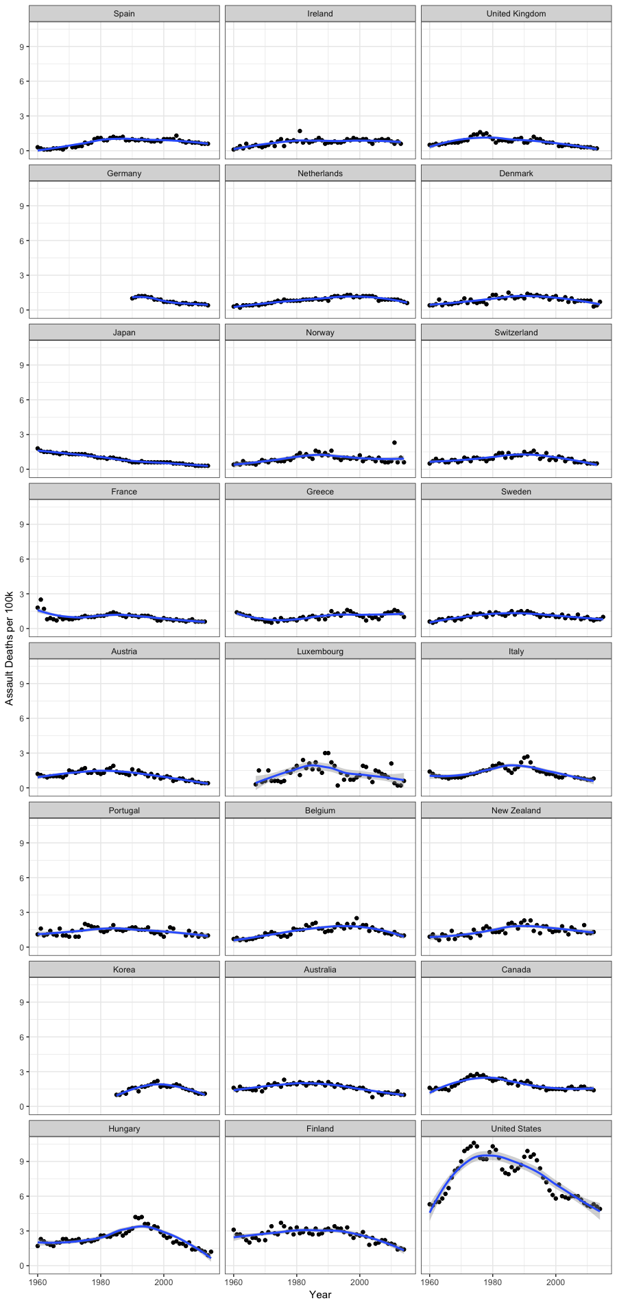
Here’s a small-multiple of the individual country time series, ordered from low to high by mean rate.

Assault Death rates by country, 1960-2015.
There’s a PDF available for this figure, too.