Assault Death Rates in America: Some Follow-Up
The Newtown elementary school shooting led people to link to and share my graphs of OECD and CDC data on assault deaths in the United States. I made them last July, in the wake of the Aurora movie theater shooting. What a depressing reason to be in the newspapers. Here are the original posts: America is a Violent Country, and Assault Deaths Within the United States.
The original posts clearly explain what the data show and what the sources are. Nevertheless, people reshare pictures quickly, the specific topic of gun violence in the United States is highly politicized, and many people are heavily invested in it one way or the other. So when you present data that people glance at, under circumstances like a school shooting, their interpretation of it—and their desire to dismiss or pigeonhole it—is often colored by their own view of things. The result is that I get email, or people write blog posts, asking questions about the data’s source, its meaning, and my own motives or competence. The tone ranges from the polite and interested to the abusive or dismissive. People assert things about the provenance of the data, or its alleged selectivity. Sometimes they refer to other data or media reports that contradict the trends shown.
If you believe I am actively dishonest or desperately stupid there’s probably not much I can do to convince you otherwise. And, frankly, I am not inclined to try. More than a decade of blogging has taught me that there’s little point engaging with people who consistently assume you’re a liar or an idiot while simultaneously demanding that you carry out research tasks for them. I am not interested in having a pissing match with angry trolls. What I will do here is go through some questions that have come up in the past few days in connection with the figures I posted. Some of them were asked in good faith, others not. I’ll answer them as straightforwardly as I can.
Here’s the most widely circulated picture:
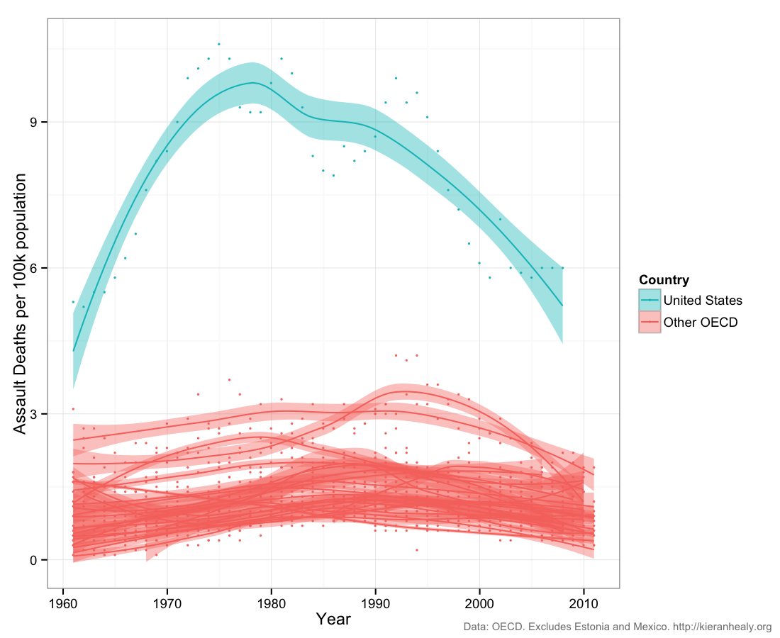
Click for a larger PNG or PDF.
1. Where do these data come from?
As discussed in the original posts, the data for the figure above are from the OECD Health Series. Data for the follow-up post comes from the OECD and the CDC WONDER mortality database. Access to the OECD statistics is gated. Try your local University library. You can query CDC WONDER yourself.
2. Why Assault Death Rates and not just Gun-Use Deaths?
The problem across the board here is getting consistent, reliable, cross-national data. The goal of the original post was to set the U.S. in some kind of longitudinal context with broadly comparable countries—in brief, the advanced industrial democracies—and the OECD is the best source for time-series data of this kind. But there is no good long-run cross-national data on deaths due to gun-use alone. Death as a result of violent assault is the best available series. There are some single-year cross-country datasets, and there are some smaller country-to-country comparisons, too. As a reminder, my original posts did not make any claims at all about guns, gun violence, or gun laws. I was interested in comparing rates of violent death across developed democracies, and that’s exactly what I did.
If you want to know why I was interested in doing this to begin with, it’s not because I have some axe to grind about gun control. It’s because one of the things I work on is cross-national variation in rates of organ donation. National differences in rates of certain kinds of sudden, violent, or accidental death (e.g. due to traffic accidents, gunshot wounds, or stroke) is an important predictor of variation in the availability of organs for donation.
3. Why these specific countries? Isn’t this just cherry-picking?
The purpose of the original posts was to put the U.S. rate of violent death in context. Which context is relevant? My view was that the U.S. was most usefully compared to other advanced industrial democracies. Of course the United States is not the most violent country in the world. But when it comes to questions of living standards, public safety, or social policy, Americans do not typically rush to compare themselves to Honduras, Kyrgystan, or South Africa. So the original comparison set was the following group: Australia, Austria, Belgium, Canada, Denmark, Finland, France, Germany, Greece, Hungary, Ireland, Italy, Japan, Korea, Luxembourg, the Netherlands, New Zealand, Norway, Portugal, Spain, Sweden, Switzerland, and the United Kingdom. Again, the original post showed the trends for these countries separately as well as in the combined figure. Others are welcome to make other comparisons.
4. But what about the OECD Member Countries you excluded?
The original post (and the note attached to the figures) made it clear I excluded two OECD countries with higher assault death rates than the US: Estonia and Mexico. I also excluded some other OECD countries whose rates are lower than the US, again on the grounds of useful comparison. These were Chile, the Czech Republic, Israel, Poland, Slovakia, and Slovenia. Here is what the figure looks like with all of these countries included:
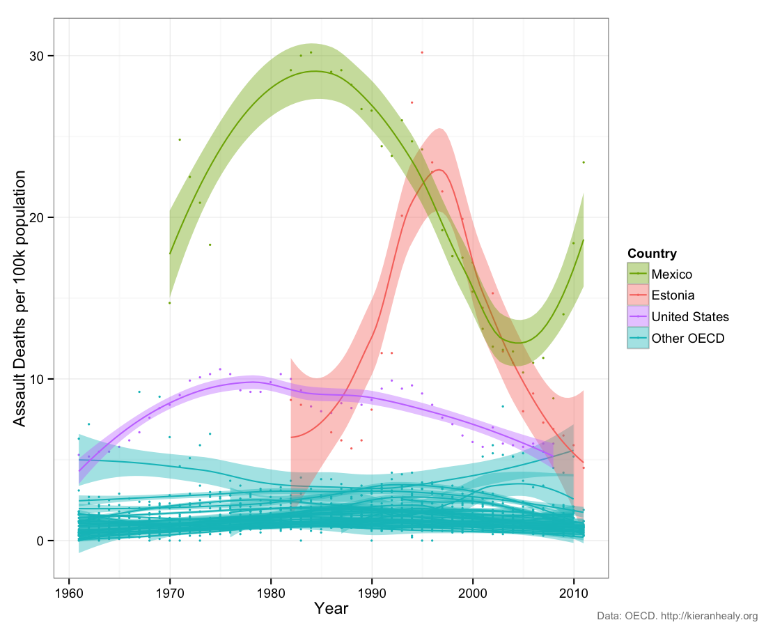
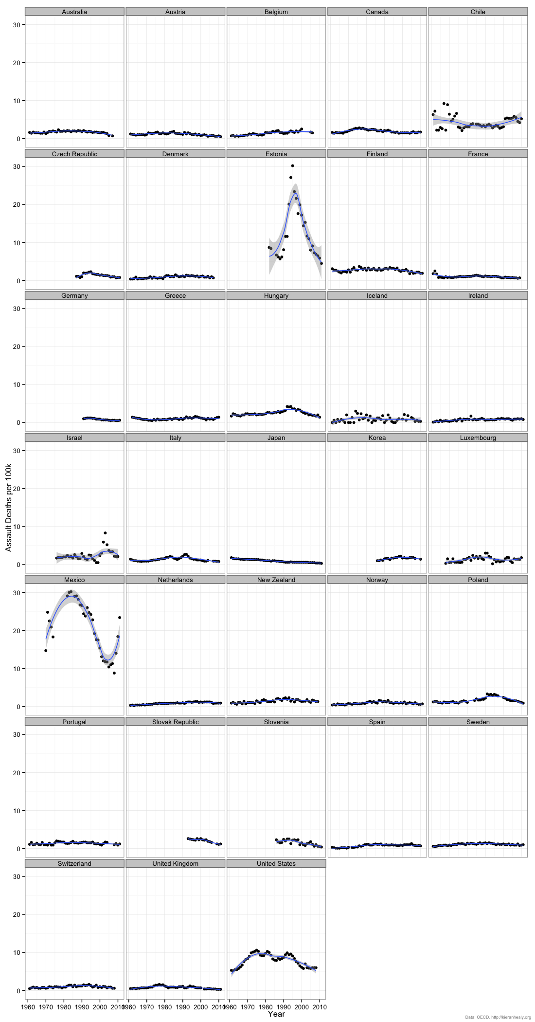
Click for a larger PNG or PDF. The individual time series broken out by country are also available as a large PNG or PDF file.
As you can see, the US comes in third in overall in the OECD countries for which this data is available. In my view, Estonia and Mexico are not good comparison cases for the US. You may disagree. The countries whose average rates are below the US but come closest to it in some years are Chile and Israel. Consult the individual country panels to get a sense of when and and how close these countries are to the U.S. rates.
5. What about Turkey?
Turkey is in the OECD but there is no assault death rate information available for it in the OECD database.
6. I heard most gun deaths are suicides. Doesn’t that explain the U.S. case here?
No. It is true that most gun-related deaths in the U.S. are suicides. But the cause-of-death criteria used by the OECD to construct the assault series excludes suicides (or, to give it its official name, “intentional self harm”). So the gap here is not due to gun-related suicides.
7. You say America is violent, but it looks like the rate is dropping!
As I said in the original post, “the most striking features of the data are (1) how much more violent the U.S. is than other OECD countries (except possibly Estonia and Mexico, not shown here), and (2) the degree of change—and recently, decline—there has been in the U.S. time series considered by itself.”
8. What about rates of non-fatal assault? Can’t a country be violent (e.g. with lots of stabbings or fights) but have a low death rate from assault? I read in the Daily Mail that Britain was one of the most violent countries in the world.
You don’t have to think about the problem for long before realizing that getting good cross-national, comparable data on crime of any kind is difficult for many reasons, and that these problems are worse when the crime doesn’t lead to someone getting killed. Before you get down to some underlying rate of events, you have to consider, amongst other things, (1) Whether the act you have in mind is actually illegal in the country you’re interested in, (2) If it’s illegal, whether it is commonly considered a crime worth reporting, (3) If it’s seen as worth reporting, what’s the rate at which it is actually reported, and (4) If it’s reported, what is the the ability or inclination of the police to reliably record this data. The reason death rates are so often used in comparative settings is that there is a body, and it is harder—not impossible, but harder—for people to disagree about the existence of a dead body as opposed to, say, a fist-fight or stab wound. It is also harder—not impossible, but harder—to keep a fatal assault from being discovered, reported, and recorded as such. This is especially the case in developed democracies.
There are bona fide efforts to collect cross-national data on non-fatal violent crime and assault. The United Nations Office on Drugs and Crime tries to do this. You can look at their brief introduction to the difficulties of compiling and comparing international crime statistics and inspect their data for yourself. The time-series are patchy, and hard to interpret. The organization itself cautions that cross-national comparison and even within-country comparisons from year to year may be invalid due to variability in reporting rates, errors, and data definition.
To get a sense of the issues here take a look at the spreadsheet on non-fatal assault rates. If you took the data at face value, you would believe that the rate of non-fatal assault in Scotland is thirty times higher than it is in Uganda, that between 2006 and 2007 Poland’s assault rate went from 76 per 100k to 1.4 per 100k, that Sweden has 3.3 times the rate of violent assault as the United States, and that El Salvador—a country with the world’s second-highest murder rate, according to other figures from UNDOC—nevertheless had approximately the same rate of violent assault in 2010 as Norway.
Now, perhaps all of those statements are true. It’s possible to make up a story in each case about how these could all be real differences, rather than artifacts due to variation in state capacity to police, bureaucratic reliability in reporting, and local differences in the definition of reportable assault. But I would be extremely cautious about using these numbers to rebut the idea that, for an economically developed democracy, America is unusually violent.
9. But isn’t there a lot of variation inside the United States?
Yes, of course. That’s why I wrote a post called Assault Deaths Within the United States as a follow-up, looking at variation by State, Census Region, and race of victim. To keep things comparable with the cross-national data I used the Assault Series from the CDC database. However, if you want to look specifically at gun violence that data is also available from the CDC, and in somewhat different form—allowing for other sorts of comparisons—from the FBI’s crime statistics.
10. You don’t even do research on violence.
That’s right, I don’t. For that reason, despite various requests, I don’t give interviews or quotes to the media on this topic. Sometimes I informally write about and analyze data on my blog. This was one of those times. I stand by the data analysis, presentation, and discussion in the original posts.
11. Can you make some new graphs for me?
If you want to see exactly what I did with the data, the R code is on github. If you want to do your own analysis, go ahead. I remind you that I am not your RA.