UK Election Miscellany
This UK Election data is really too much fun to play around with. Here’s a (probably final) collection of pictures. First, a map of the turnout (that is, the percentage of the electorate who actually voted) by constituency, with London highlighted for a bit more detail.
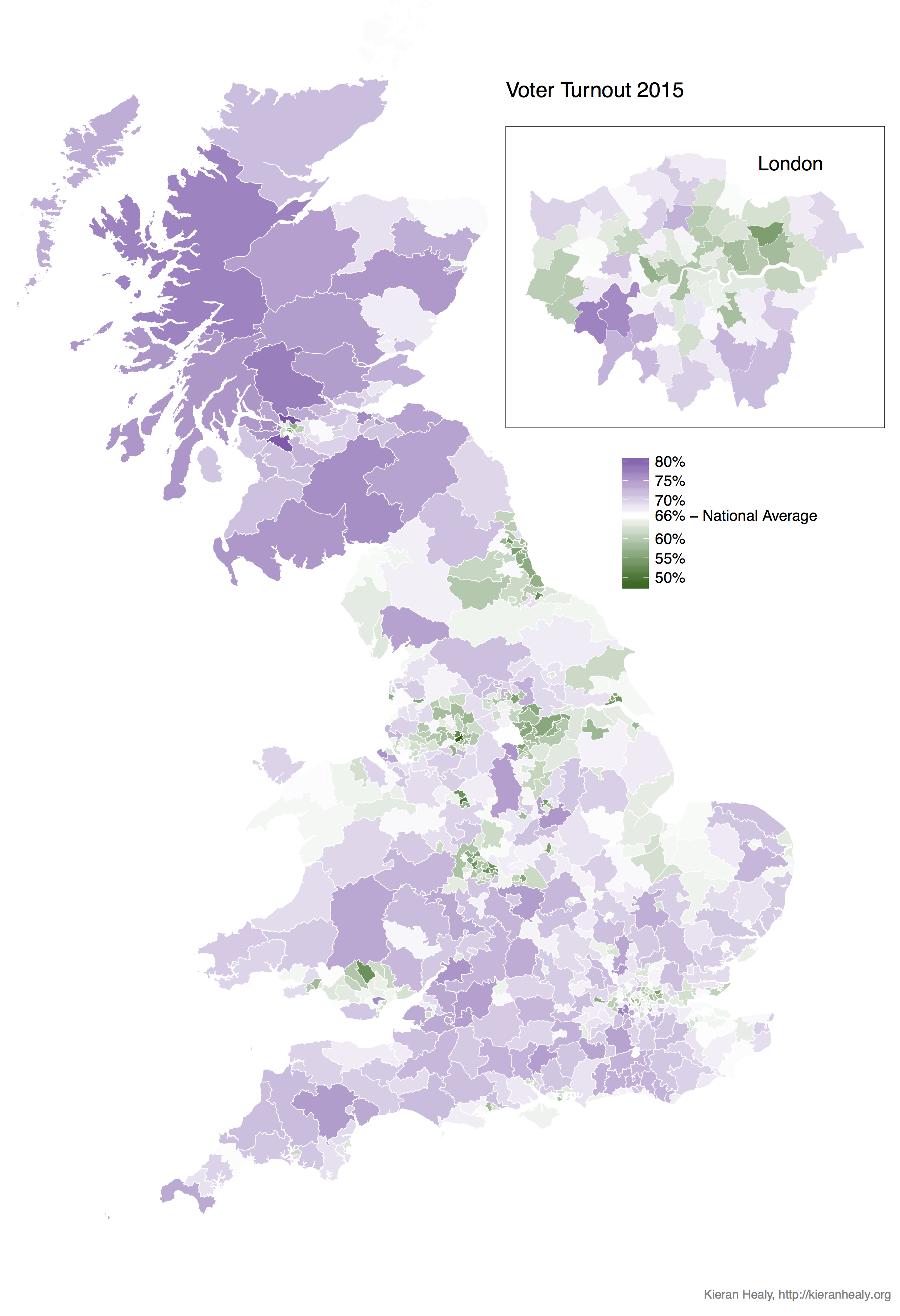
Constituencies by Turnout.
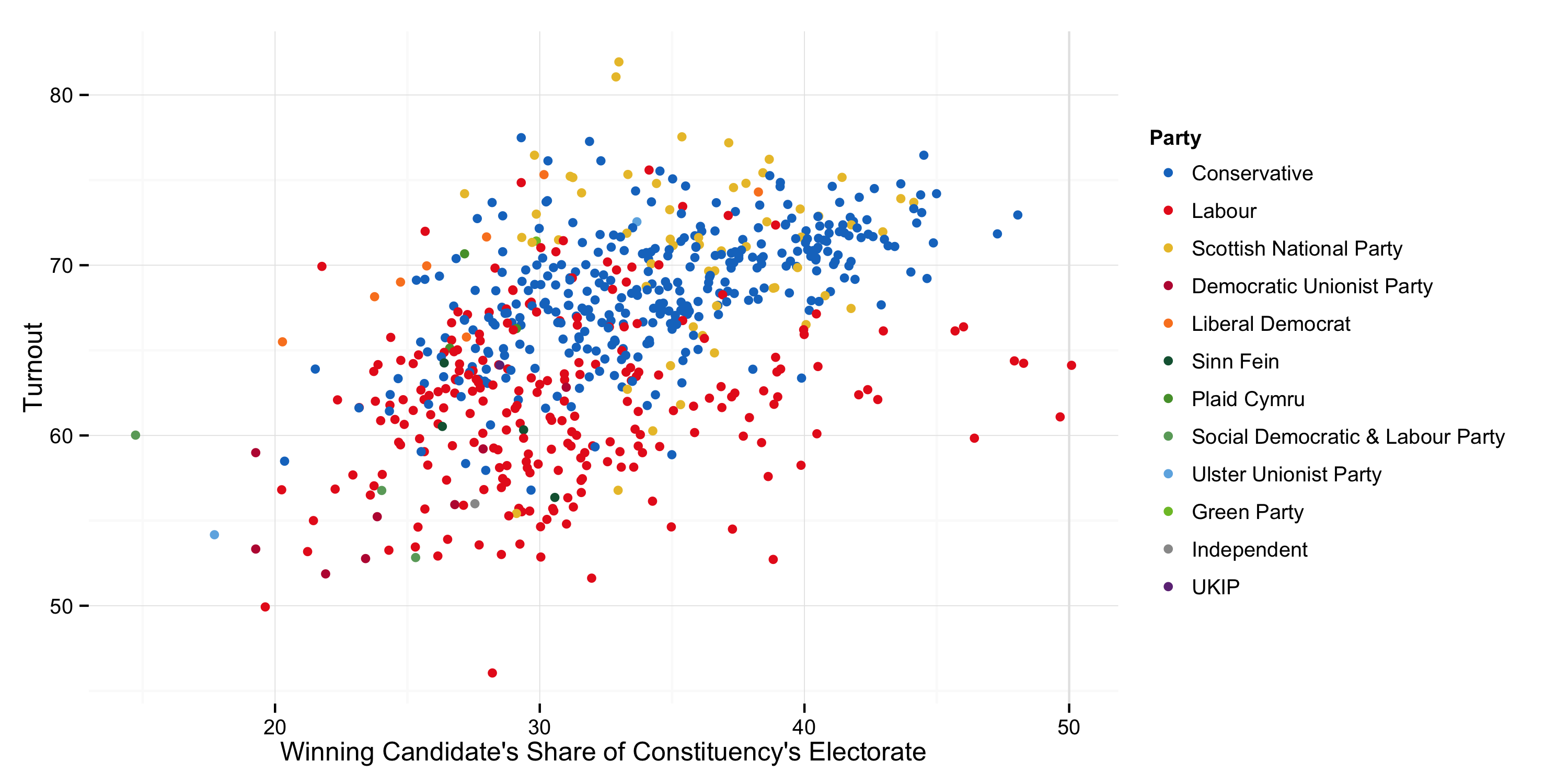
There’s a strong suggestion here that Labour areas have lower turnout. Here’s a scatterplot of all seats showing the winning candidate’s share of the electorate plotted against turnout.
Winner’s share of Electorate v Turnout.
You can see here that Scotland turned out to vote, that Labour won more seats in low-turnout constituencies, and that exactly one MP—George Howarth, Labour MP for Knowsley—was elected by more than fifty percent of his constituency’s electorate. Of course, electorates don’t vote-in MPs, the voters who show up to the polls do. Here’s that plot again with the winning candidate’s vote share on the x-axis.
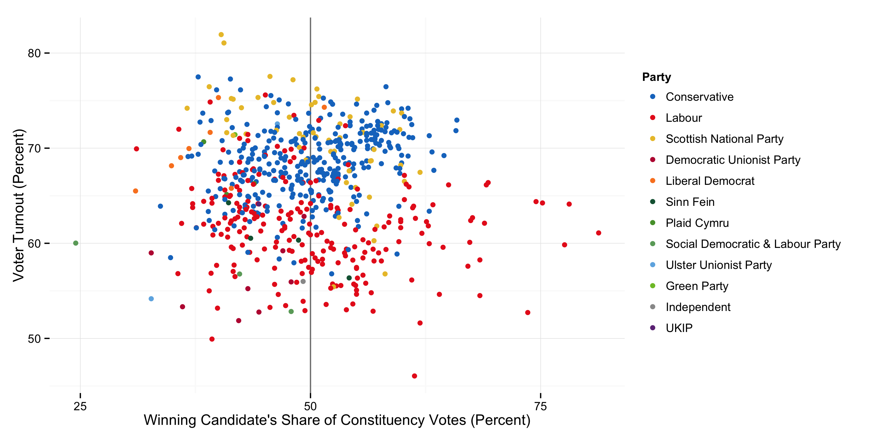
Winner’s share of Vote v Turnout.
Just over half of all MPs are elected with less than fifty percent of their constituents’ votes. Northern Ireland has the worst combination of FPTP & Multi-Party. Belfast South’s MP, for instance, won election with 24% of the vote, or just 15% of the electorate. Notice again that most of the seats with the very largest majorities are Labour seats, even though relatively few of the seats with the highest turnout are.
Finally, just because it was there I looked at the distribution of candidates first names. Here are the top twenty most common candidate names, without any amalgamation of name-forms (i.e. Steve, Stephen, and Steven are all different names).

Most popular candidate names.
It’s a Parliament of Davids. Here’s the distribution of names by party. (Sorry the order isn’t quite the same.)
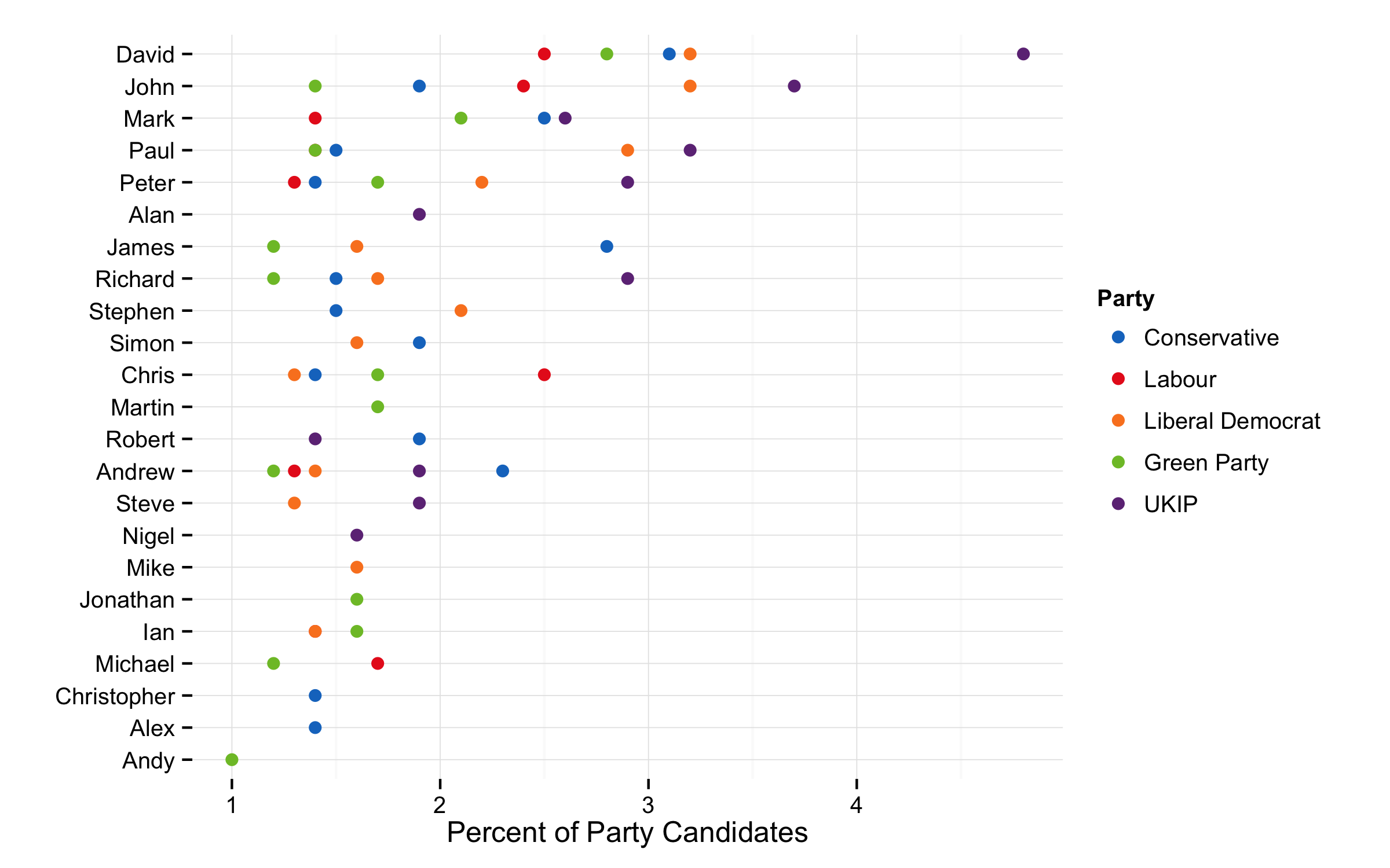
Popular candidate names by Party.
One suggestive pattern here is that UKIP candidates seem to have more of the most common first names than do members of the other main parties. If we calculate the Shannon entropy of names by party this seems to be confirmed:

Shannon Diversity Measure of First Names.
The absolute differences are small enough, as the name population by party is pretty heterogenous. But UKIP has the lowest name diversity. Here’s the Rényi entropy calculated across various values — a common interpretation is that a population can be regarded as more diverse than another only if its Rényi diversities are all higher.
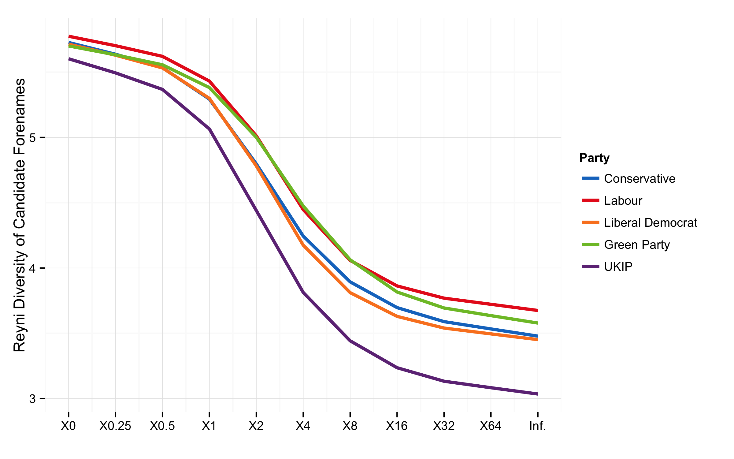
Rényi Diversity Measure of First Names.
On this measure there’s not much to choose between the other main parties, but UKIP is lower across the board.