About the Raters
As it does for the current report, the 2006 rankings listed the names and affiliations of those who participated in the report, along with the survey instrument and a bit of information about the response patterns of raters. Based on this information, we can say a little bit about where the raters come from. For example, in 2006 about sixty five percent of raters were based in the U.S., eighteen percent in the UK, eight percent in Canada, five percent in Australia or New Zealand, and the small remainder elsewhere. We can also use the PGR scores of departments to see how raters were distributed across schools in 2006:
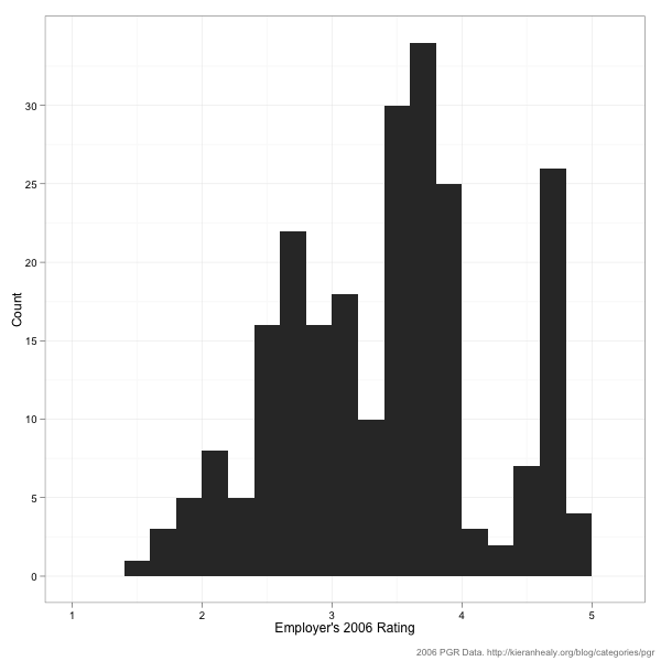
In 2006 the median department got a PGR score of 2.7. There were 99 departments in the 2006 survey, so getting a 2.7 or higher got you into the top 50. As you can see, while there are at least some raters across the distribution of PGR scores, the majority come from departments with average or above-average scores. Raters from very high-scoring departments (i.e., scoring 4 or more—that’s the top ten in 2006, roughly speaking) are very strongly represented. Note that you could construct a histogram like this for the 2011 data yourself if you wanted to, just by counting up the evaluators listed in the report description.
What about overall patterns in the voting? Here’s a histogram showing the number of times raters voted. That is, how many departments did raters give evaluations for, bearing in mind that they could choose to assess all 99 departments, or just one.
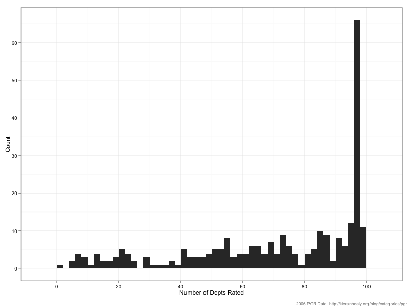
As you can see, the distribution is very skewed to the right. Respondents love rating departments. A small number of respondents rated 25 departments or fewer, but the median respondent rated 77 departments and almost forty percent of raters assigned scores to 90 or more departments of the 99 in the survey. Here’s the distribution of scores across raters:
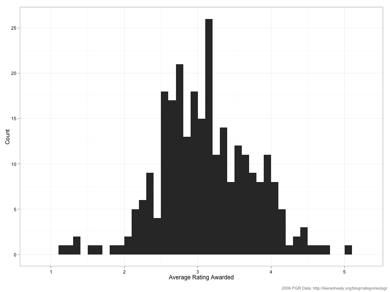
The mean of this distribution is 3.1 with a standard deviation of 0.87. (Note that just because the average rater awards an average score of 3.1 doesn’t mean that’s the average score received by departments.) As you can see, the distribution is skewed to the right a bit. One reason for this is that—as we saw above—some raters only rated a relatively small number of departments, and raters who chose to do that tended to rate (what they saw as) the top departments only. Here’s a plot of the average score awarded vs the number of departments rated:
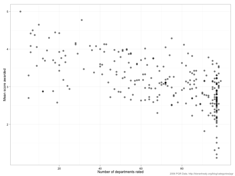
In general the fewer departments a rater assessed, the higher the average score they tended to give.
A final important fact about the raters is their Area of Specialization. (Again, this is information that’s on the PGR website, and you could construct the following figure for the 2011 survey if you wished.) Here’s the prevalence of various specialty areas as a percentage of the total number of respondents. Bear in mind that it’s possible for a respondent to have more than one AOS, so the percentages won’t sum to 100.
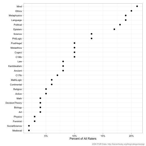
Respondents with AOS’s in Mind, Ethics, Metaphysics, Language, Political Philosophy, and Epistemology have the strongest representation, all with more than 15 percent of the pool. One natural question here is whether this influences the overall rankings in any important way. Respondents can’t vote for their own departments, but what if they vote for departments with strengths in their own areas? More on that tomorrow.