Greetings, Philosophers
I come in peace. As Brian mentioned last week, I’m going to be guesting on his blog for the next few days. For those of you who don’t know me—which I imagine is most of you—I am a sociologist; I teach at Duke University both in my home department and the Kenan Institute for Ethics; and for the past nine years or so I’ve been a blogger at Crooked Timber. Initially, I was tempted to treat this gig in the way that people tend to treat philosophers they meet in bars—viz, aggressively tell you all what my philosophy is, perhaps make a truly original joke that comes with fries, or maybe sketch out my own interpretation of two-dimensionalism. (The latter is typical of certain sorts of bars only.) On mature reflection I decided against these options, promising though they were. Instead, I’ll mostly be telling you about some analysis I’ve done of the PGR. The data I’ll be relying on come partly from information available on the PGR website itself, and partly from rater-anonymized versions of the 2004 and 2006 waves provided to me by Professor Leiter. I presented some of this material last month at a panel at the Central APA meetings, and I have also presented it to various Sociology and (once or twice) Philosophy departments in the recent past. In my posts here I’ll begin by focusing on some of the questions that Philosophers tend to have about the data, but I also hope to get to some of the reasons for why the PGR is an interesting entity in comparison to many other efforts to rank departments or other entities in academia, and why ranking has become so common in recent years.
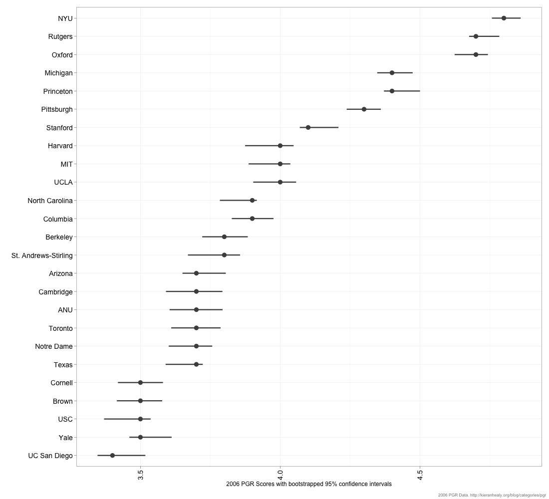
So, first common question. Every department in the survey is ranked based on its mean overall reputational score. What sort of variability is there around those means?
Here’s a figure showing the top 25 departments as they stood in 2006. For each department, the dot shows the mean score and the line on either side of it is the range of a 95% bootstrapped confidence interval. This is constructed by resampling from the distribution of ratings awarded to each department.
(You can get a PNG or PDF of this figure.)
Roughly speaking, the wider the interval the more disagreement there is in the data about a department’s reputation. These intervals aren’t necessarily symmetric around the means because there may be more disagreement in one direction than the other. E.g., there might be strong consensus about a department’s lower bound (everyone agrees it’s in the Top 10) but disagreement about its upper bound. Looking up and down the rows, the degree to which intervals overlap gives us a decent sense of the daylight that does or doesn’t exist between departments. It seems fairly clear the collective judgment of respondents sorts deparmental reputations into bands—the top three, the next three or four, a group of departments in or around the top ten, and so on.
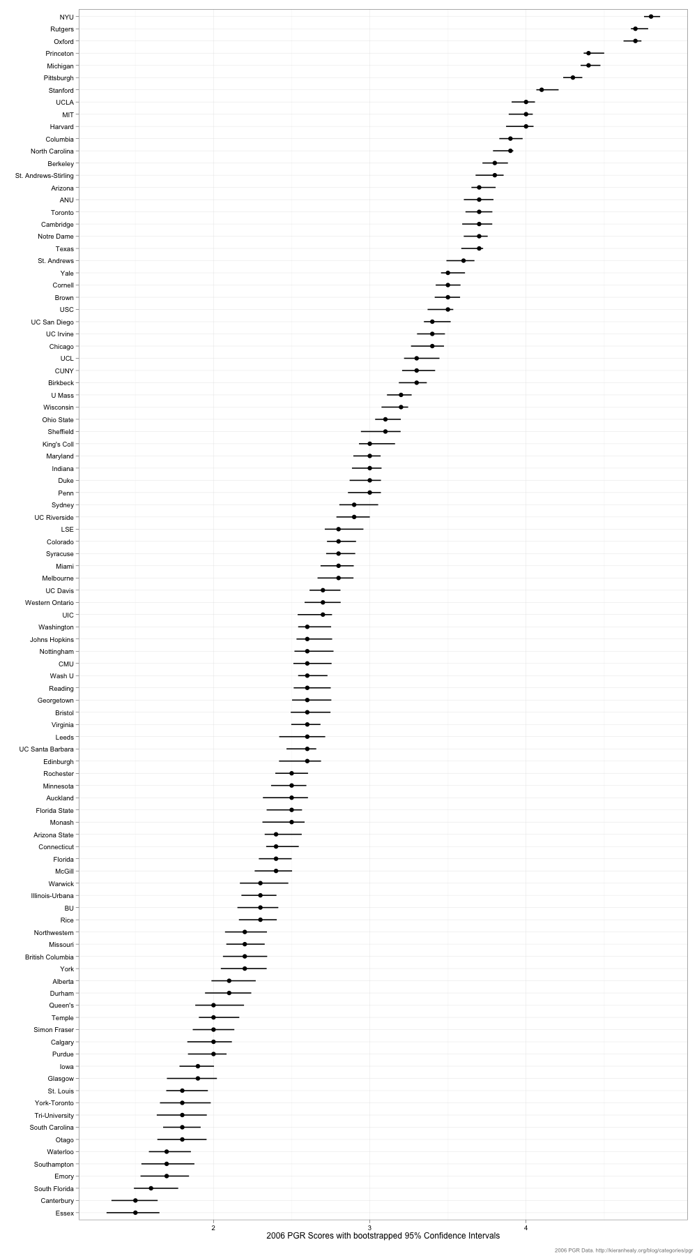
We can do this for all 99 departments surveyed in 2006, too, which makes for a rather tall figure.
As you can see, reputations come in chunks or bands. In many cases a 0.1 point difference in score is probably not all that meaningful.
I’ll say a bit more tomorrow about variance and stability in the overall rankings.