Manhattan Plot of Manhattan
Here I continue my efforts to design visualizations that are as poorly-suited as possible to being displayed on phones. It looks pretty good on a big monitor, or six feet wide on a wall.
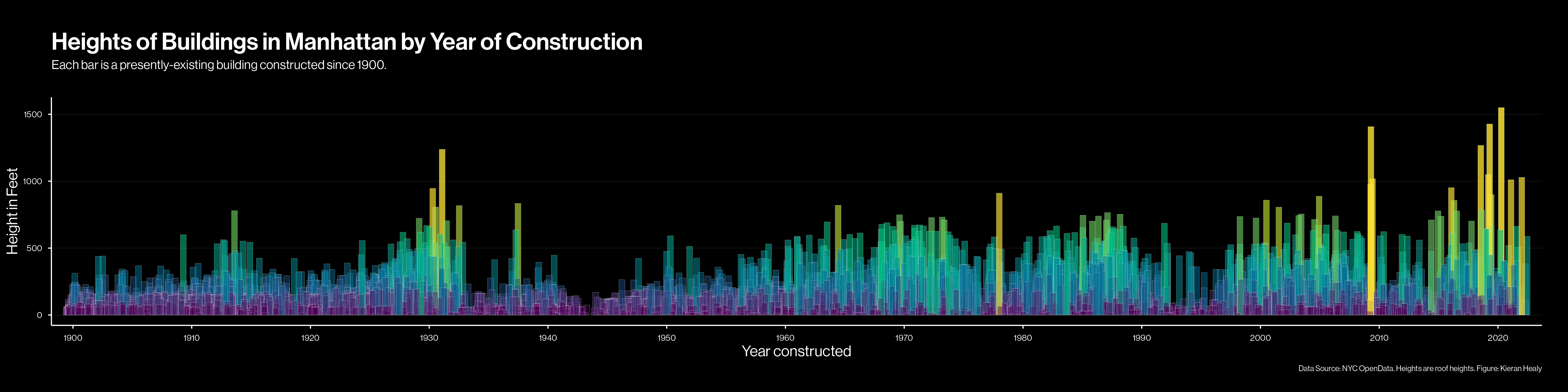
I made a version of this plot a few years ago. I ended up revisiting it this morning because I’m updating various datasets and code. A Manhattan plot is a term sometimes used to describe a kind of scatter plot where the x-values are fairly continuous, and the y values have distributions with long tails, so the plot looks like a skyline. This one here is a bar chart rather than a scatter plot but it’s still a kind of Manhattan plot of Manhattan.
The plot shows the heights of almost all currently-existing buildings1 in Manhattan (on the y-axis) by their year of construction on the x-axis. What I want is a plot that gives a sense of the distribution of building heights over time. To make the plot work I play a few tricks. First, the resolution of the x-axis is only to the year,which would result in way too much overplotting. (We have almost 35,000 buildings to draw.) So we add a small amount of random noise to the x-values, which makes buildings distribute themselves around their year of construction. There’s still overplotting, but now it works in our favor. It contributes to a feeling of building density.
Second, there are so many buildings that we can’t plot everything as solid, filled rectangle. Instead, we make make the outlines of each rectangle a very thin white line, so everything looks like a vector-driven video game from 1981. Then we make a variable that bins buildings by height into ten categories, one for every hundred feet of additional roof height. We map that to fill color of the rectangles (darker purples for shorter buildings through bright yellow for taller ones), which means the taller a building the brighter it looks. But again, we can’t just plot those as solid colors. So we also take the roof heights and rescale them to a range of 0.4 to 0.85. Then we map that number directly to the alpha channel of the fill color. So taller buildings are not only brighter in color, they are more opaque. Alpha runs from 0 (fully transparent) to 1 (fully opaque). The specific values of 0.4 to 0.85 are just from trial and error. We want the taller buildings to stand out, and because there are fewer of them they need to be more opaque. Whereas the fills of many more shorter buildings will overlap, so they can be individually more transparent.
You can really see the recent rise of supertall fancy apartment buildings in Manhattan in the last ten years or so—buildings like the curséd 111 West 57th and 53 West 53rd. The cursédness 111 W57th extends to dataset:
|
|
It’s recorded as having been completed in 1924, instead of 2019. Why? There’s a hint in the lststatype column, which says “Merged”. Technically the building took over and “renovated” Steinway Hall, which was built in 1924. There are a few cases like this in the dataset for buildings that are going to be salient in the figure—i.e. very tall ones. There’s also some missing data, with eight buildings over 600 feet tall where the construction year is not available. At least two of those are because the building was still under construction when the data were recorded. As always, 90% of data analysis is data cleaning.
-
Data on building heights and construction years come from the NYC Open Data portal. The data are restricted to buildings constructed after 1899 that are currently standing in Manhattan. ↩︎