Halloween in the Round
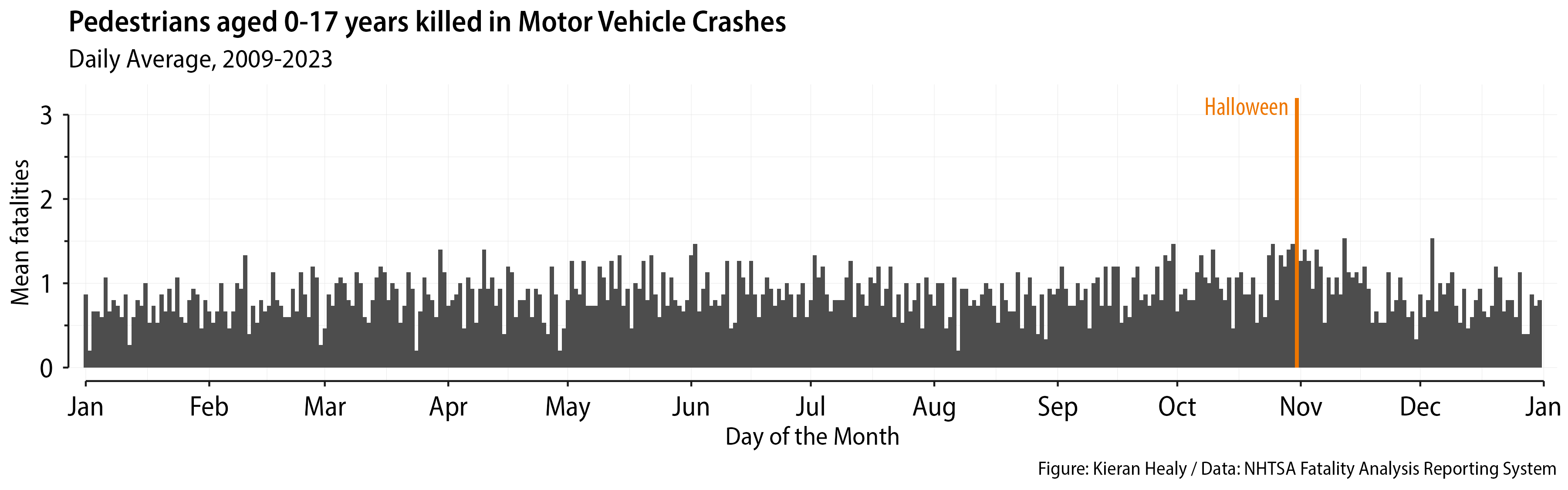
Last year I wrote about cleaning some data from the NHTSA FARS database, the system that tracks information about road accidents in the United States. I did that again this year for my Modern Plain Text Computing class. I won’t repeat the cleaning details, which are more or less the same. One question is how to aggregate data like this, if at all, and how to draw a picture of it. There are, as always, lots of options. The data as obtained (with a slightly different query from last year; a small lesson in itself about repeated measures) arrive as counts of pedestrian fatalities (in motor vehicle accidents) for each day of the year, within months, for each year from 2009 to 2023.

The data in the spreadsheet you get after a specific query to FARS on the web.
What I was interested in was patterns of daily counts, so I wanted to average by day across years. This sort of aggregation of course gets rid of other things we might be interested in, like trends over time by year. Averaging by day means we won’t see, for example, any tendency for the number of pedestrian deaths to decrease over time. One way to draw this is a column chart with time (as day-of-the-year) on the x-axis and the average count on the y-axis.
Wide version.
This works fine. Nice and compact. One thing people tend to underestimate about graphs like this (whether as bars or lines) is that you can often compress the vertical axis a lot without loss of information. Indeed, often with long time series that’s the right thing to do anyway, because there’s nothing better for making your trends look dramatic than narrowing the horizontal part of the aspect ratio. Here the focus is not on a trend, but on the one day that really stands out from the others. In any case, wide is good.
On the other hand, most people are looking at things on their phones. Maybe a vertical view can be better there? We could do something like this, like last year:

Tall version.
Here we facet by month and stack them. It works OK. This would be more useful for data where you expect a bit more structure down the rows as well as across the columns of the table you’re graphing. For example, accidents vary by day of the week, especially pedestrian accidents. There are more people out at the weekend. And then for some parts of the country the seasonality of pedestrian activity would be stronger than in others, because it’s nicer to be outside some months of the year than others. (You can in fact get counts by day of the week from FARS, but I didn’t; exercise for the reader, etc.) Even in this one you can see some evidence of that, as Summer and (back to school) Fall have more fatalities than January, for instance.
Finally, and the point of this post, we can also experiment with the fact that the year is cyclical, and use polar coordinates. When we do this we take our x-axis and wrap it around a circle. Position on the x-axis measured as a distance becomes position on a polar or radial axis measured as an angle. We call it theta and measure in degrees or radians or whatever. In ggplot coord_polar() is available as a transformation to do this. One of the nice things about ggplot’s grammar-of-graphics approach is that it makes it easier to show how the same graph can change under various transformations. A standard xy plot has its coordinates set up by the coord_cartesian() function. We usually never write this unless explicitly want to tweak some aspect of it, but it’s there. But we can just replace it altogether with a different coordinate transformation altogether. This can be a polar system or something else, as when we draw a map and systematically transform points on a sphere into a flat surface via some projection.
Version 4 of ggplot came out last month and introduced coord_radial() as an improved version of coord_polar(). We can use it to draw our plot. Here we’ll use a FARS dataset that shows fatal crashes that involve pedestrians aged 17 and under. (The difference from the ones above is that pedestrians were “involved” in the crash but weren’t necessarily killed.) We write code that looks like this:
|
|
This is well beyond the minimum necessary to get a servicable plot, but I got carried away polishing the thing. The key bit is the call to coord_radial():
|
|
This says: draw the x-axis as a circle; don’t expand the margins (this has the effect of keeping January at the top rather than being slightly decentered); set the y-axis limits (i.e. the length of the radius) to be slightly more than the maximum of the data; put the radial axis inside the plot rather than next to it; and make the circle more like a donut by putting a circular “hole” in the middle of the graph that’s 25 percent of the total length of the radius. Donut-style versions of polar plots are often easier to read, as opposed to having everything go into the very center of the circle.
The word “Halloween” is put in with annotate(). The call to geom_textsegment() is from the very handy geomtextpath package. This lets us put text or labels on or alongside lines in a way that follows their shape. You can do this for ordinary trend lines in xy plots but it understands polar coordinates too. In addition, ggplot 4’s radial system knows about geomtextpath. If you’re using radial coordinates and geomtextpath is loaded then you can write guides(theta = "axis_textpath"). This will change the labels of the theta axis (which is to say, the polar-transformed x-axis). Instead of sticking out horizontally they will pleasingly follow the path of the circle. Nice. We also use the distinction between minor and major breakpoints for the labels and panel grid lines to put the month names on the minor breaks and leave the major breaks empty (and turn off their tick marks). That puts the month names in the middle of each monthly wedge, which is better than having them at the beginning. The only other slightly fancy thing is deliberately picking a shape for the points that lets me have them be empty rings, except for the Halloween point, which is filled. Here’s what we get.

Roundy version.
Not bad. You have to be careful with polar coordinates. People are much better at judging relative lengths than relative angles. This is why pie charts are hated by dataviz nerds. A pie chart is, after all, just a bar or column chart whose x-axis has been spun into a circle. In this case, our humble wide-aspect column plot does perfectly well for much less effort, and has the advantage of being immediately comprehensible by more people. There are cases where truly seasonal data can really benefit from being represented on or in a circle. This data isn’t quite one of those, as we’re just saying “Hey, look how this one day is different from all the others”. But by the same token, we’re not really asking the viewer to judge angular offsets or to estimate the area of a pie wedge. Instead it’s just distance from the inner circle. Seeing the points for all the other days cluster close to the inner ring while Halloween stands out a ways does a decent job of getting the content across, and maybe in a way friendlier to people looking at the plot on a phone.
PS: One other thing. Remember, as we also noted last year, that any inference about how dangerous Halloween is for child pedestrians shouldn’t depend just on the number of fatalities observed but also on the exposure, which we don’t see directly. There are lots more children—perhaps orders of magnitude more—wandering around on the evening of Halloween than on a typical night, which will change the meaning of the count of pedestrian fatalities.