Iterating some sample data
I’m teaching my Modern Plain Text Computing course this semester and so I’m on the lookout for small examples that I can use to show some of the ordinary techniques we regularly use when working with tables of data. One of those is just coming up with some example data to illustrate something else, like how to draw a plot or fit a model or what have you. This is partly what the stock datasets that come bundled with packages are for, like the venerable mtcars or the more recent palmerpenguins. Sometimes, though, you end up quickly making up an example yourself. This can be a good way to practice stuff that computers are good at, like doing things repeatedly.
This happened the other day in response to a question about visualizing some evaluation data. The task goes like this. You are testing a bunch of different LLMs. Say, fifteen of them. You have trained them to return Yes/No answers when they look at repeated samples of some test data. Let’s say each LLM is asked a hundred questions. You have also had an expert person look at the same hundred questions and give you their Yes/No answers. The person’s answers are the ground truth. You want to know how the LLM performs against them. So for each LLM you have a two-by-two table showing counts or rates of true positives, true negatives, false positives, and false negatives. (This is called a “confusion matrix”.) You want to visualize LLM performance for all the LLMs. An additional wrinkle is that, from the point of view of your business, responses are variably costly. Correct answers (true positives or true negatives) cost one unit. Then, say, a False Negative costs two units and a False Positive is worst, costing four units.
The questioner wanted some thoughts on what sort of graph to draw. You can of course just picture what the data would look like and figure out which of your many stock datasets has an analogous structure. Or you’d sketch out an answer with pen and paper. In this case, even though they have problems in general, I thought a kind of stacked bar chart (but flipped on its side) might work. OK, done. But half the fun—for some values of “fun”—is generating data that looks like this. And as I said, I’m on the lookout for data-related examples of iteration, i.e. where I repeatedly do something and gather the results into a nice table.
When we want to repeatedly do something, we first solve the base case and then we generalize it by putting in some sort of placeholder and use an engine that can iterate over an index of values, feeding each one to the placeholder. In imperative languages you might use a counter and a for loop. In a functional approach you map or apply some function.
We’ve got a hundred questions and fifteen LLMs. We imagine that the LLMs can range in accuracy from 40 percent to 99 percent in one percent steps. We’ll pick at random from within this range to set how good any specific LLM is.
|
|
Our baseline is n_runs human answers with some given distribution of Yes/No answers. Let’s say 80% No, 20% Yes. It doesn’t matter what they are; the person is the ground truth. We sample with replacement a hundred times from “N” or “Y” at that probability.
|
|
For each of our fifteen LLM what we want to do is generate a string of its one hundred Y/N answers in the same way, but with its particular idiosyncratic distribution of Ys and Ns, and then evaluate it against the human baseline. And we’d like to gather all the answers into a single data frame so we can keep everything tidy.
Our evaluation function looks like this:
|
|
We generate a string of responses for an imaginary LLM just like we did for the imaginary person. The single case would look like this:
|
|
Which we would then feed to eval_llm() along with the vector of human answers. But we want to do this fifteen times, with varying values for prob and also we want to put each LLM in its own column in a data frame. So we replace the values with variables. Then we evaluate all of them.
First we generate a vector of LLM names. We use str_pad to get sortable numbers with a leading zero:
|
|
Now we’re going to create a little table of LLM parameters. We already created a vector of probabilities for the LLMs, accuracy_range. We’ll sample from that to get fifteen values. The number of runs is fixed at a hundred. R’s naturally vectorized way of working will take care of the table getting filled in properly.
|
|
Next we need a function that can accept each row as a series of arguments and use it to generate a vector of LLM answers:
|
|
This function returns a data frame that has one column and a hundred rows of Y/N answers sampled at a given probability of yes and no answers. There are two tricks. The first is, we want the name of the column to be the same as the llm_id. To do this we have to quasi-quote the llm_id argument. This is what the {{ }} around llm_id does inside the function. It lets us use the value of llm_id as a symbol that’ll name the column. Normally when using tibble() to make a data frame we create a column with col_name = vector_of_values. We did that when we made llm_df a minute ago. But because we’re quasi-quoting the LLM name on the left side of a naming operation, for technical reasons having to do with how R evaluates environments we can’t use = as normal. Instead we have to assign the name’s contents using the excellently-named walrus operator, :=. If we were quasi-quoting with {{ }} on the right-hand side, an = would be fine.
Now we’re ready to go. We feed the llm_df table a row at a time to the run_llm function by using one of purrr’s map functions. Specifically, we use pmap, which takes a list of multiple function arguments and hands them to a function. We have written our llm_df columns so that the columns are named and ordered the way that our run_llm() function expects, so it’s nice and compact.
|
|
We write as.list(llm_df) because pmap() wants its series of arguments as a list. (A data frame is just a list where each list element—each column—is the same length, by the way.) It returns a list of fifteen LLM runs, which we then bind by column back into a data frame. Nice.
Now we can evaluate all these LLMs against our human_evals vector in the same way, by mapping or applying the eval_llm() function we wrote earlier. This time we can just use regular map() because there’s only one varying argument, the LLM id. We take the llm_outputs data frame and use an anonymous or lambda function, \(x) to say “pass each column to eval_llm() along with the non-varying human_evals vector”. (You could write this without a lambda, too, but I find this syntax more consistent.) At the end there I deliberately convert all these character vectors to factors for a reason I’ll get to momentarily.
|
|
Now we’re done; each LLM has been compared to the ground truth and we can construct a confusion matrix of counts for each column if we want. Let’s summarize the table, adding a cost code for the bad answers:
|
|
Now, why did I convert the LLM results table from characters to factors? It’s because of how dplyr handles table summaries. It’s possible that an LLM could get e.g. all True Positive answers, leaving the other three cells in its confusion matrix empty, i.e. with zero counts in those rows. By default, when tallying counts of character vectors, dplyr drops empty groups. For some kinds of tallying that’s fine, but for others you definitely want to keep a tally of zero-count cells. With factors we can tell dplyr explicitly not to drop them. (You can also set this option permanently for a given analysis.) The alternative is to ungroup and complete the table once its been created, explicitly adding back in the implicitly missing zero-count rows.
Now that we have our table, we can graph it. As I said at the beginning, stacked bar charts are not great in many cases but it’s fine here, and better than trying to repeatedly draw fifteen confusion matrices. We don’t really care about the difference between true positives and true negatives anyway. We take the results table, merge it with the summary table, and draw our graph ordering the LLMs by performance weighted by average cost. We use a manual four-value color palette to distinguish the broadly bad from the broadly good answers.
|
|
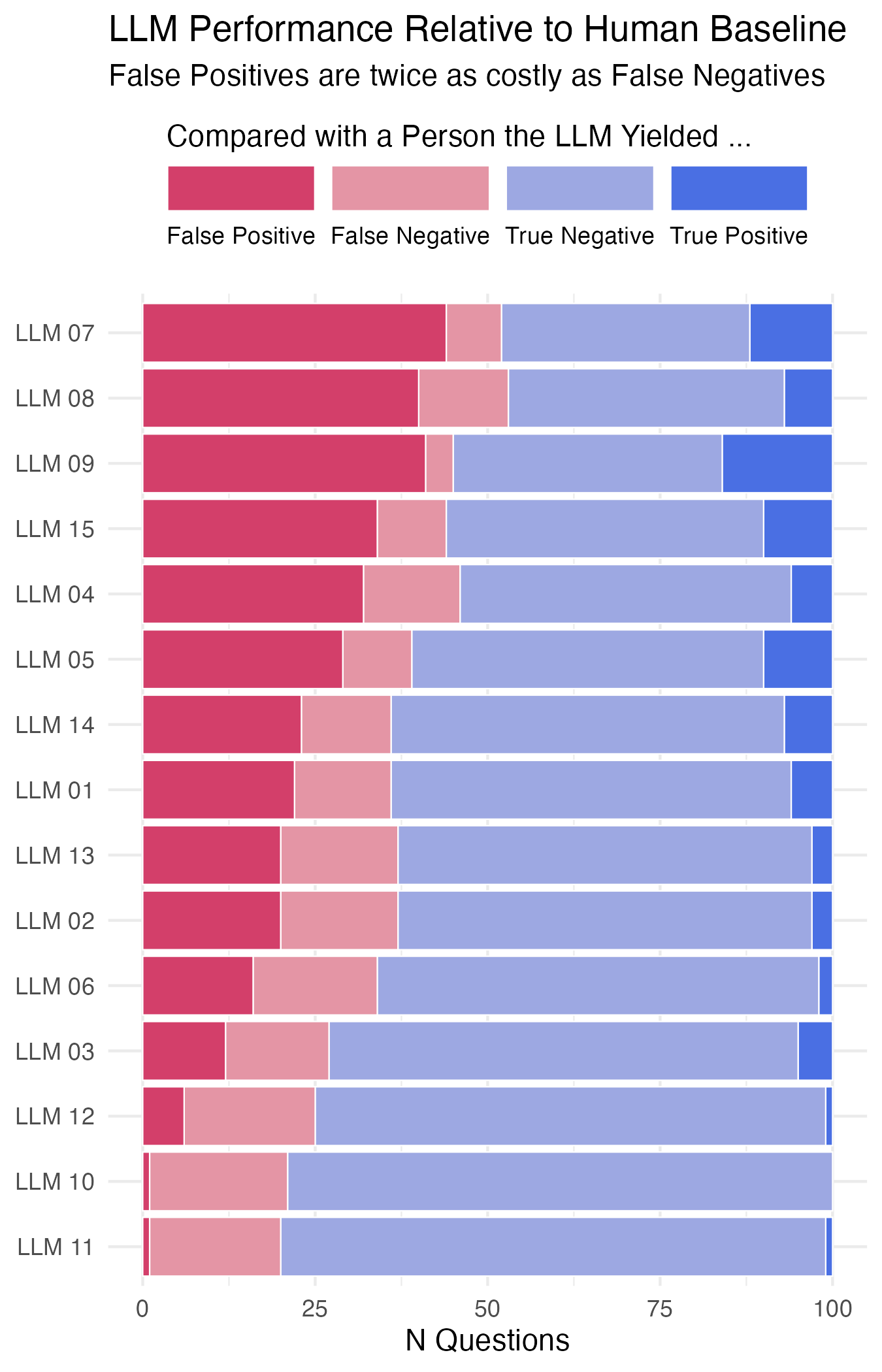
Ordered and stacked bar chart of imaginary LLM performance.