New York City's POC Population
Update (May 19th 2024)
I updated these figures with 2020 data (the correct data, this time—it was 2010 before), and redrew them slightly to fix some issues with the colors.
I was messing around with some Census data this morning. I had two main thoughts. One was to show the utility of old-fashioned grayscale when it comes to mapping data (or displaying it in general). The goal of most carefully thought-through dataviz color palettes is to make them legible to viewers, which mostly means making them as linear as possible in the luminance (or brightness) channel. Which is, at root, making them more like grayscale. I also wanted to work up an example based on block-level Census counts from 2020. This was a little trickier than I initially anticipated because as far as I could tell the Tigris map data returned via the fantastic Tidycensus package was not clipped to shorelines at the block level. (It’ll do it for tract and county level, etc. But apparently not blocks right now.) I messed around with the erase_water() function in tigris which nearly did what I wanted but seemed to leave some artifacts no matter how I tuned its sensitivity. In the end I got a borough boundary shapefile from NYC Open Data and clipped the Census block data to it with st_intersection(). From some previous work I had some shapefiles for NTAs that are parks and other non-residential zones. I got the 2020 Census population counts and race/ethnicity by block for the city and, having calculated the proportion of Non-Hispanic Whites, subtracted that from one to get the POC population. It’s just a rough and ready esimate. Recall that in the US Census there’s a (historcially interesting and practically vexatious) way of classifying race and ethnicity. There’s a “race” question that yields categories like “Black”, “White”, “Asian”, and so on. And there’s an “ethnicity” question about Hispanic or Latino origin. In the Census schema, Hispanics can be of any race. (This whole situation develops over decades and contines to change.) So “Non-Hispanic White” means “People who chose White alone as their race on the Census and also did not say they were of Hispanic origin”. And the map shows the complement of that, by Census Block.
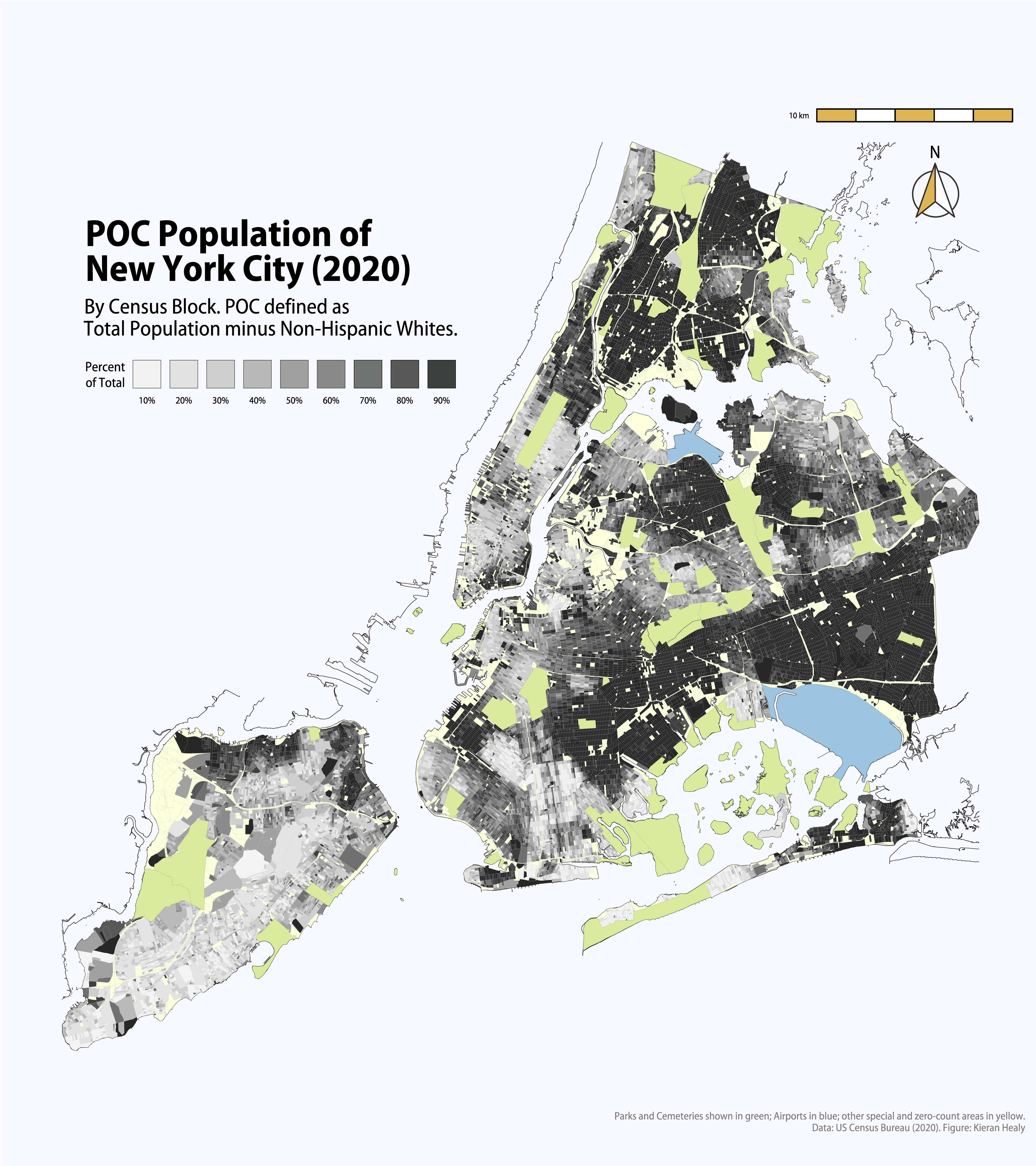
NYC POC map.
A PDF is available as well if you want to look at it in a higher resolution. All the usual caveats apply about not reifying the block areas, but they’re the most fine-grained unit data that are publicly available from the 2020 Census. One thing that’s of interest are the fairly common “empty” areas where the Census does not record any residents. These include Parks and Cemeteries, LaGuardia and JFK Airports, and a variety of places like Brooklyn Navy Yards or the U.N., etc,where no-one lives. There are more such places than you might think, especially in Midtown Manhattan and on either side of Newtown Creek, part of the border between Brooklyn and Queens.
There’s a further issue as well, which Jason Kerwin noted in an email. The Census’s new policy of differential privacy means that for small-count blocks there is noise added to the data to deliberately obfuscate the counts. I think this is a bad idea for reasons well-described by Ruggles et al. Looking at the 2010 block-level data (which I had in fact mistakenly done first), there seem to be more rather than fewer zero-count blocks there than in 2020. I’ll need to look at this in more detail when I get a chance. I should also do more block-level maps for other Census variables.