Updated on December 22nd, 2021. I made the generated data simpler so that the resulting distributions would be less confusing to look at.
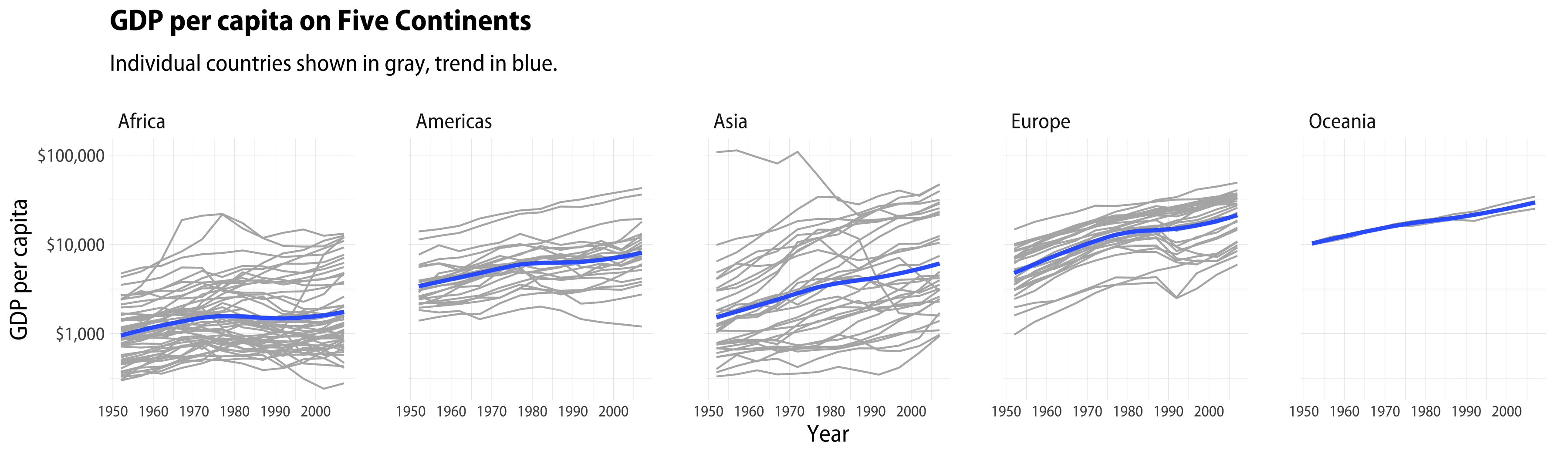
When we want to see how something varies across categories, the trellis or small multiple plot is a good friend. We repeatedly draw the same graph once for each category, lining them up in a way that makes them comparable. Here’s an example from my book, using the gapminder data, which provides a cross-national time series of GDP per capita for many countries.
 1
 2
 3
 4
 5
 6
 7
 8
 9
10
11
library(tidyverse)library(gapminder)p<-ggplot(data=gapminder,mapping=aes(x=year,y=gdpPercap))p+geom_line(color="gray70",aes(group=country))+geom_smooth(size=1.1,method="loess",se=FALSE)+scale_y_log10(labels=scales::dollar)+facet_wrap(~continent,ncol=5)+labs(x="Year",y="GDP per capita",title="GDP per capita on Five Continents",subtitle="Individual countries shown in gray, trend in blue.")
A Gapminder small multiple.
Sometimes, we’re interested in comparing distributions across categories in something like this way. In particular, I’m interested in cases where we want to compare a distribution to some reference category, as when we look at subpopulations in comparison to an overall distribution.
Generate some population and subgroup data
Say we have some number of observed units, e.g., three thousand “counties” or
whatever. Each county has some population made up of three groups. Across all counties, each group has a measure of interest. The measures are all distributed normally but vary in their means and standard deviations.
## Keep track of labels for as_labeller() functions in plots later.grp_names<-c(`a`="Group A",`b`="Group B",`c`="Group C",`pop_a`="Group A",`pop_b`="Group B",`pop_c`="Group C",`pop_total`="Total",`A`="Group A",`B`="Group B",`C`="Group C")# make it reproducibleset.seed(1243098)# 3,000 "counties"N<-3e3# Means and standard deviations of groupsmus<-c(0.2,1,-0.1)sds<-c(1.1,0.9,1)grp<-c("pop_a","pop_b","pop_c")# Make the parameters into a listparams<-list(mean=mus,sd=sds)# Feed the parameters to rnorm() to make three columns, # switch to rowwise() to take the average of the columns for# each row.df<-pmap_dfc(params,rnorm,n=N)%>%rename_with(~grp)%>%rowid_to_column("unit")%>%rowwise()%>%mutate(pop_total=mean(c(pop_a,pop_b,pop_c)))%>%ungroup()df## # A tibble: 3,000 × 5## unit pop_a pop_b pop_c pop_total## <int> <dbl> <dbl> <dbl> <dbl>## 1 1 -0.926 0.0604 0.0799 -0.262 ## 2 2 1.65 1.30 1.01 1.32 ## 3 3 1.28 1.69 0.425 1.13 ## 4 4 0.901 0.915 1.40 1.07 ## 5 5 -0.459 0.764 -0.292 0.00435## 6 6 -1.57 1.38 -1.37 -0.521 ## 7 7 1.36 1.32 0.0935 0.923 ## 8 8 0.732 2.07 -0.208 0.865 ## 9 9 0.739 1.27 -2.23 -0.0727 ## 10 10 -1.44 2.93 -0.0114 0.493 ## # … with 2,990 more rows
In the tibble we’ve just made up, unit is our county, pop_a, pop_b, and pop_c are our groups, measured on whatever we are measuring, and pop_total is the mean value of pop_a, pop_b, and pop_c for each unit. We make a vector of 3,000 populations using rnorm. Each group is distributed normally but with a slightly different mean and standard deviation in each case. The unit names here are just to make things explicit, we don’t need them for the rowwise() operation to work.
Single panels
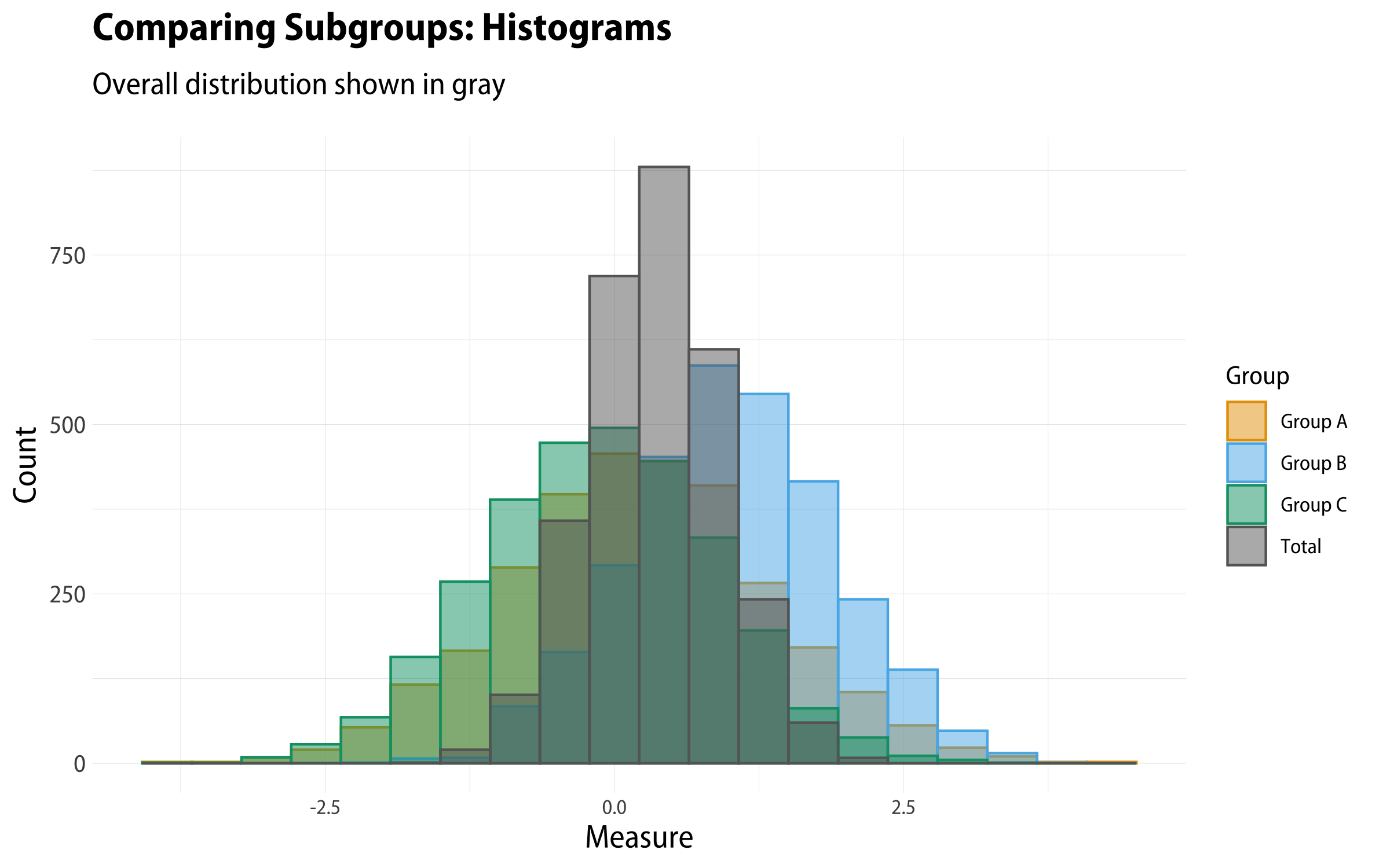
Now we can plot the group-level population distributions across counties. Again, we
want to compare group distributions to one another and to the overall average
distribution by county. A single-panel histogram showing all four distributions isn’t very satisfactory. Even though we’re using alpha to make the columns semi-transparent, it’s still very muddy.
 1
 2
 3
 4
 5
 6
 7
 8
 9
10
11
12
13
14
15
16
df%>%pivot_longer(cols=pop_a:pop_total)%>%ggplot()+geom_histogram(mapping=aes(x=value,y=..count..,color=name,fill=name),stat="bin",bins=20,size=0.5,alpha=0.7,position="identity")+scale_color_manual(values=alpha(c(my_oka[1:3],"gray40"),1),labels=as_labeller(grp_names))+scale_fill_manual(values=alpha(c(my_oka[1:3],"gray40"),0.6),labels=as_labeller(grp_names))+labs(x="Measure",y="Count",color="Group",fill="Group",title="Comparing Subgroups: Histograms",subtitle="Overall distribution shown in gray")
Histogram of all groups.
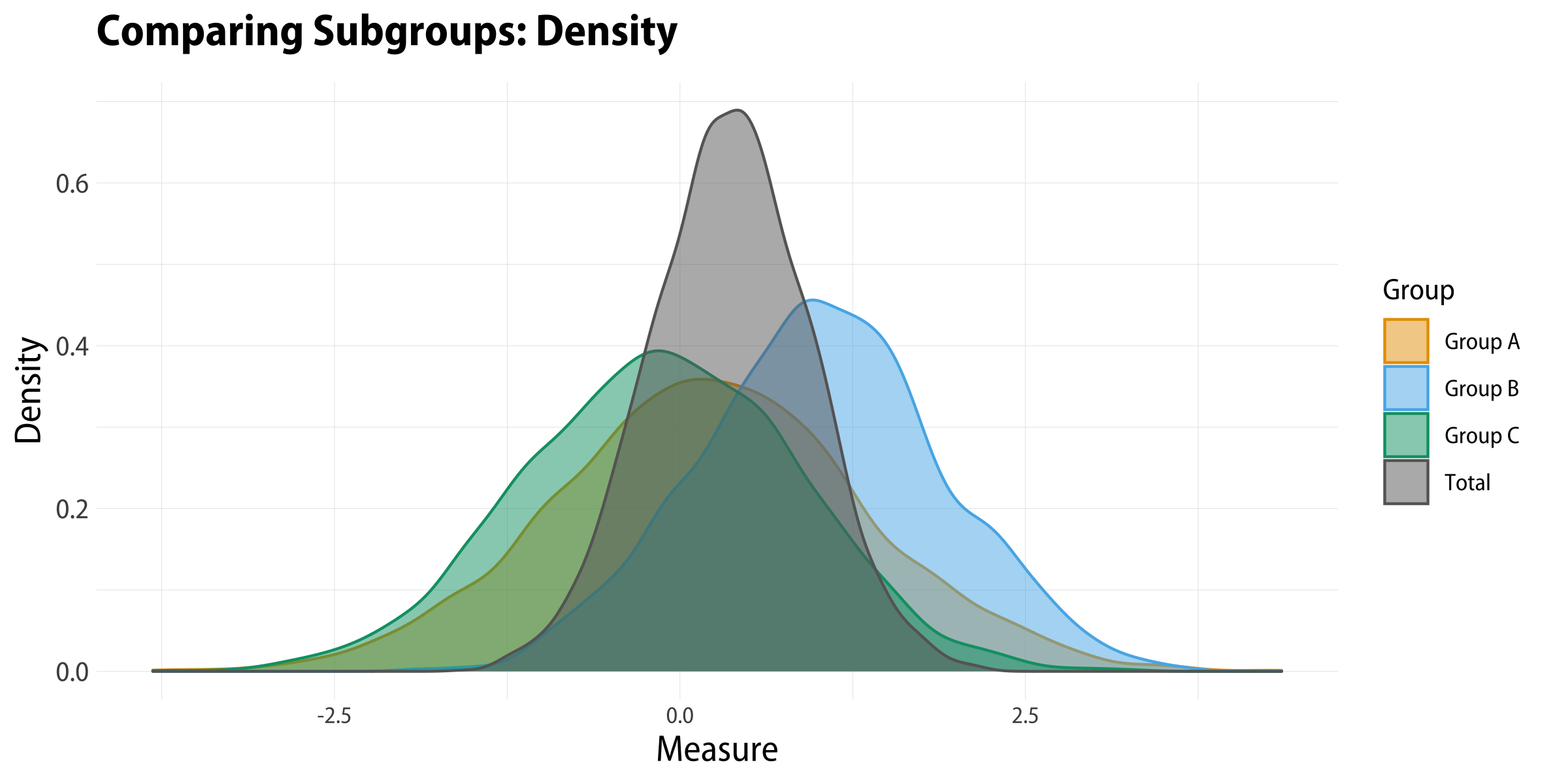
If we use a geom_density() rather than geom_histogram() we’ll generate kernel density estimates for each group. These look a little better, but not great.
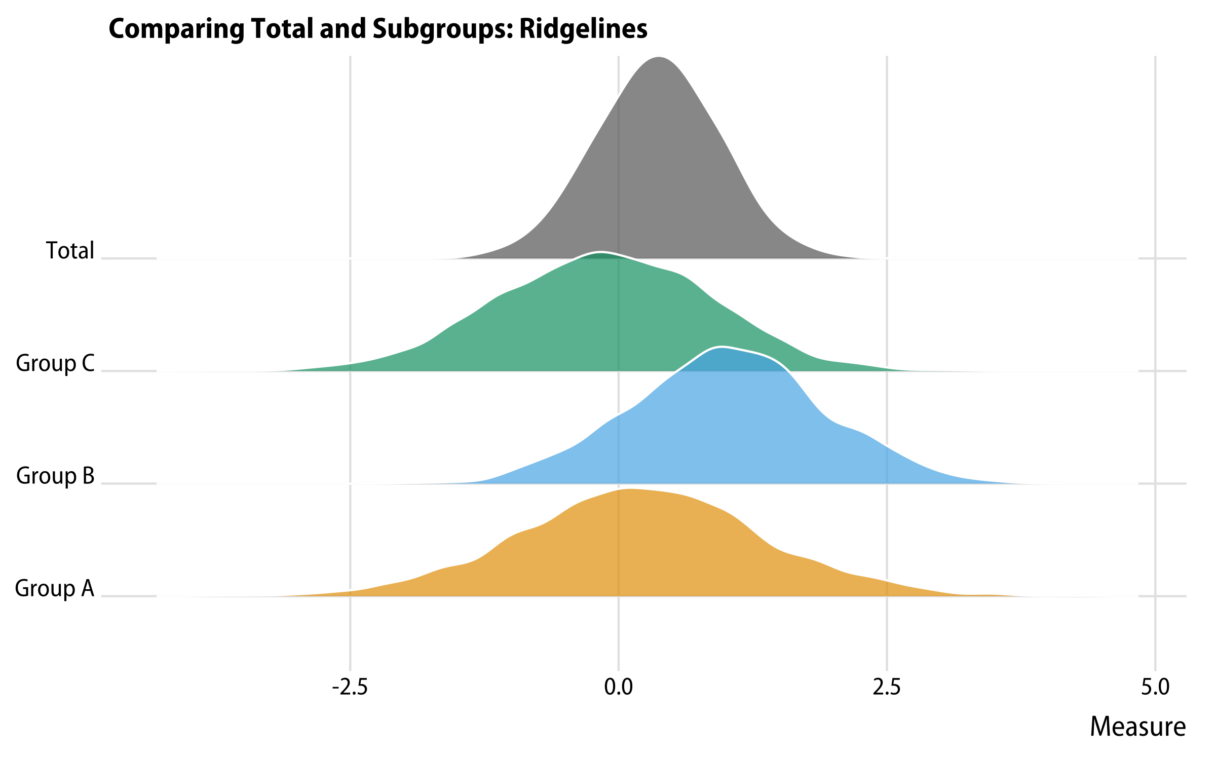
That’s better, but still not great. A very serviceable compromise that has many of the virtues of a small multiple but has the advantage of keeping things in one panel is a ridgeline plot, courtesy of geom_ridgeline() from Claus Wilke’s ggridges package:
1
2
3
4
5
6
7
8
9
10
11
12
df%>%pivot_longer(cols=pop_a:pop_total)%>%ggplot()+geom_density_ridges(mapping=aes(x=value,y=name,fill=name),color="white")+scale_fill_manual(values=alpha(c(my_oka[1:3],"gray40"),0.7))+scale_y_discrete(labels=as_labeller(grp_names))+guides(color="none",fill="none")+labs(x="Measure",y=NULL,title="Comparing Total and Subgroups: Ridgelines")+theme_ridges(font_family="Myriad Pro SemiCondensed")
A ridgeline plot.
Ridgeline plots look good and scale pretty well when there are larger numbers of categories to put on the vertical axis, especially if there’s a reasonable amount of structure in the data, such as a trend or sequence in the distributions. They can be slightly inefficient in terms of space with smaller numbers of categories. When the number of groups gets large they work best in a very tall and narrow aspect ratio that can be hard to integrate into a page.
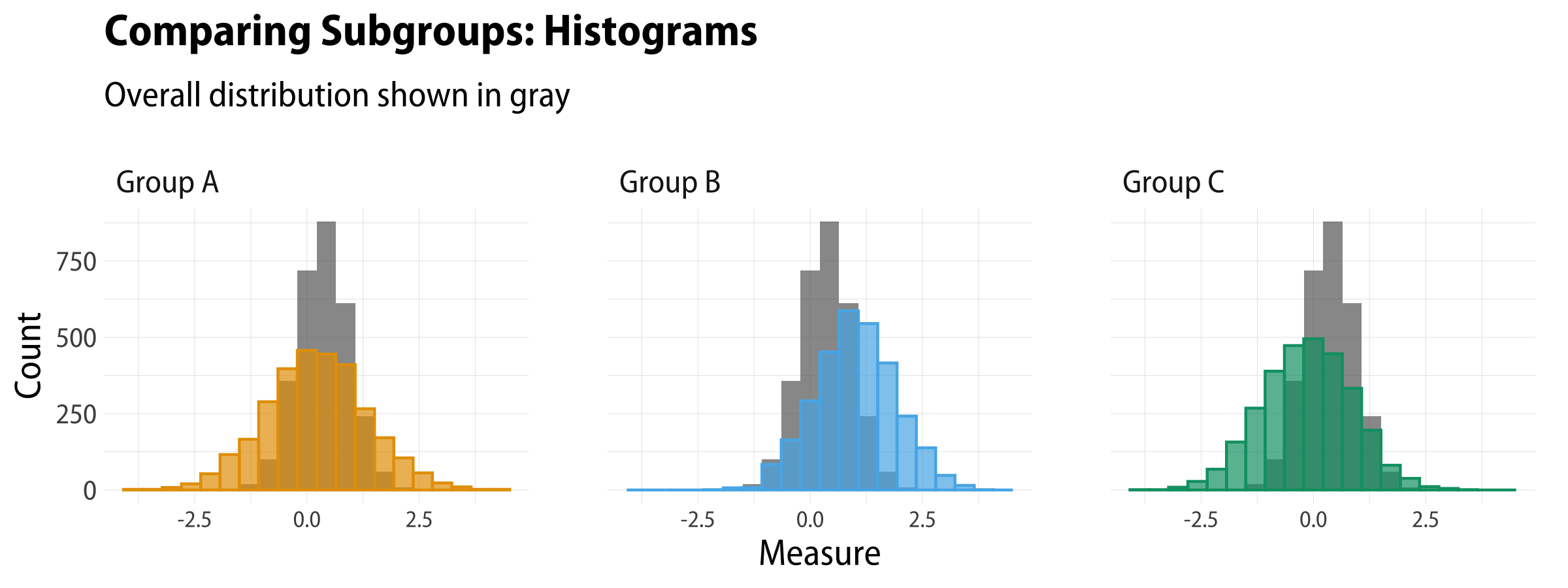
Histograms with a reference distribution
Like with the Gapminder plot, we can facet our plot so that every subgroup gets
its own panel. But instead of having the Total population be its own panel, we
will put it inside each group’s panel as a reference point. This allows us to
compare the group to the overall population, and also makes eyeballing
differences between the group distributions a little easier. To do this, we’re
going to need to have some way to put the total population distribution into
every panel. The trick is to hold on to the total population by only pivoting
the subgroups to long format. That leaves us with repeated values for the total
population, pop_total, like this:
When we draw the plot, we first call on geom_histogram() to draw the
distribution of the total population, setting the color to gray. Then we
call it again, separately, to draw the subgroups. Finally we facet on
the subgroup names. This leaves us with a faceted plot where each panel
shows one subpopulation’s distribution and, for reference behind it, the
overall population distribution.
 1
 2
 3
 4
 5
 6
 7
 8
 9
10
11
12
13
14
15
16
17
df%>%pivot_longer(cols=pop_a:pop_c)%>%ggplot()+geom_histogram(mapping=aes(x=pop_total,y=..count..),bins=20,alpha=0.7,fill="gray40",size=0.5)+geom_histogram(mapping=aes(x=value,y=..count..,color=name,fill=name),stat="bin",bins=20,size=0.5,alpha=0.7)+scale_fill_okabe_ito()+scale_color_okabe_ito()+guides(color="none",fill="none")+labs(x="Measure",y="Count",title="Comparing Subgroups: Histograms",subtitle="Overall distribution shown in gray")+facet_wrap(~name,nrow=1,labeller=as_labeller(grp_names))
Histograms with a reference distribution in each panel.
This is a handy trick. We’ll use it repeatedly in the remaining figures, as we look at different ways of drawing the same comparison.
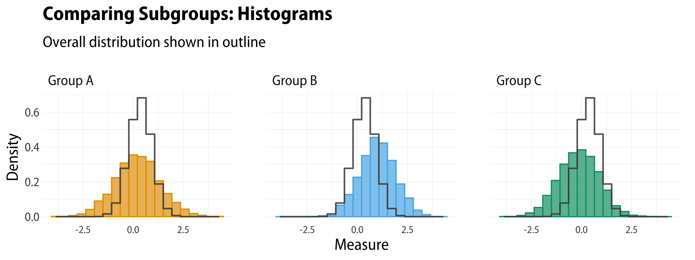
While putting the reference distribution behind the subgroup distribution is nice, the way the layering works produces an overlap that some viewers find difficult to read. It seems like a third distribution (the darker color created by the overlapping area) has appeared along with the two we’re interested in. We can avoid this by taking advantage of the underused geom_step() and its direction argument. We can tell geom_step() to use a binning method (stat = "bin") that’s the same as geom_histogram(). Here we’re also using the computed ..density.. value rather than ..count.., but we could use ..count.. just fine as well.
 1
 2
 3
 4
 5
 6
 7
 8
 9
10
11
12
13
14
15
16
17
18
19
df%>%pivot_longer(cols=pop_a:pop_c)%>%ggplot()+geom_histogram(mapping=aes(x=value,y=..density..,color=name,fill=name),stat="bin",bins=20,size=0.5,alpha=0.7)+geom_step(mapping=aes(x=pop_total,y=..density..),bins=20,alpha=0.9,color="gray30",size=0.6,stat="bin",direction="mid")+scale_fill_manual(values=alpha(my_oka,0.8))+scale_color_manual(values=alpha(my_oka,1))+guides(color="none",fill="none")+labs(x="Measure",y="Density",title="Comparing Subgroups: Histograms",subtitle="Overall distribution shown in outline")+facet_wrap(~name,nrow=1,labeller=as_labeller(grp_names))
With geom_step(), we get a histogram with just its outline drawn. This works quite well, I think. Because we’re just drawing the outline, we call it after we’ve drawn our histograms, so that it sits in a layer on top of them.
Group histograms and overall distribution in outline.
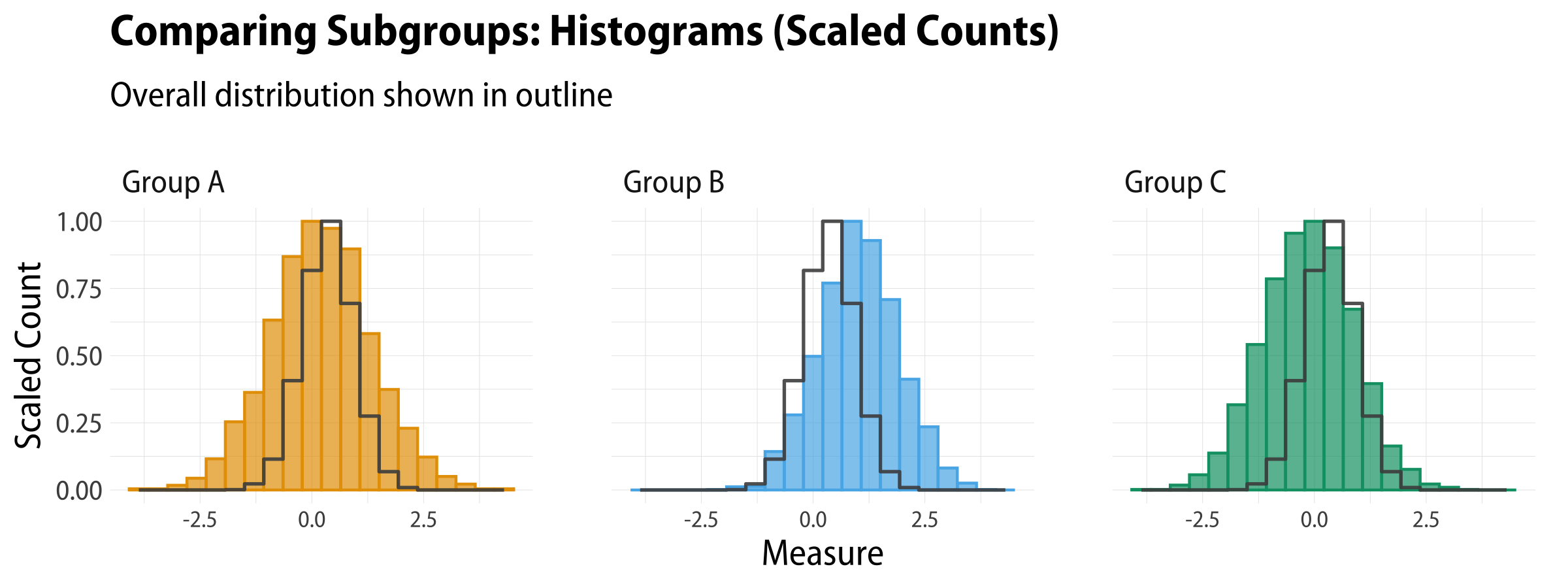
We can also scale the counts within bins, if we like, using ..ncount.., which is one of the statistics that stat_bin() computes along with the default ..count...
 1
 2
 3
 4
 5
 6
 7
 8
 9
10
11
12
13
14
15
16
17
18
19
df%>%pivot_longer(cols=pop_a:pop_c)%>%ggplot()+geom_histogram(mapping=aes(x=value,y=..ncount..,color=name,fill=name),stat="bin",bins=20,size=0.5,alpha=0.7)+geom_step(mapping=aes(x=pop_total,y=..ncount..),bins=20,alpha=0.9,color="gray30",size=0.6,stat="bin",direction="mid")+scale_fill_manual(values=alpha(my_oka,0.8))+scale_color_manual(values=alpha(my_oka,1))+guides(color="none",fill="none")+labs(x="Measure",y="Scaled Count",title="Comparing Subgroups: Histograms (Scaled Counts)",subtitle="Overall distribution shown in outline")+facet_wrap(~name,nrow=1,labeller=as_labeller(grp_names))
Group histograms and overall distribution in outline, with scaled counts.
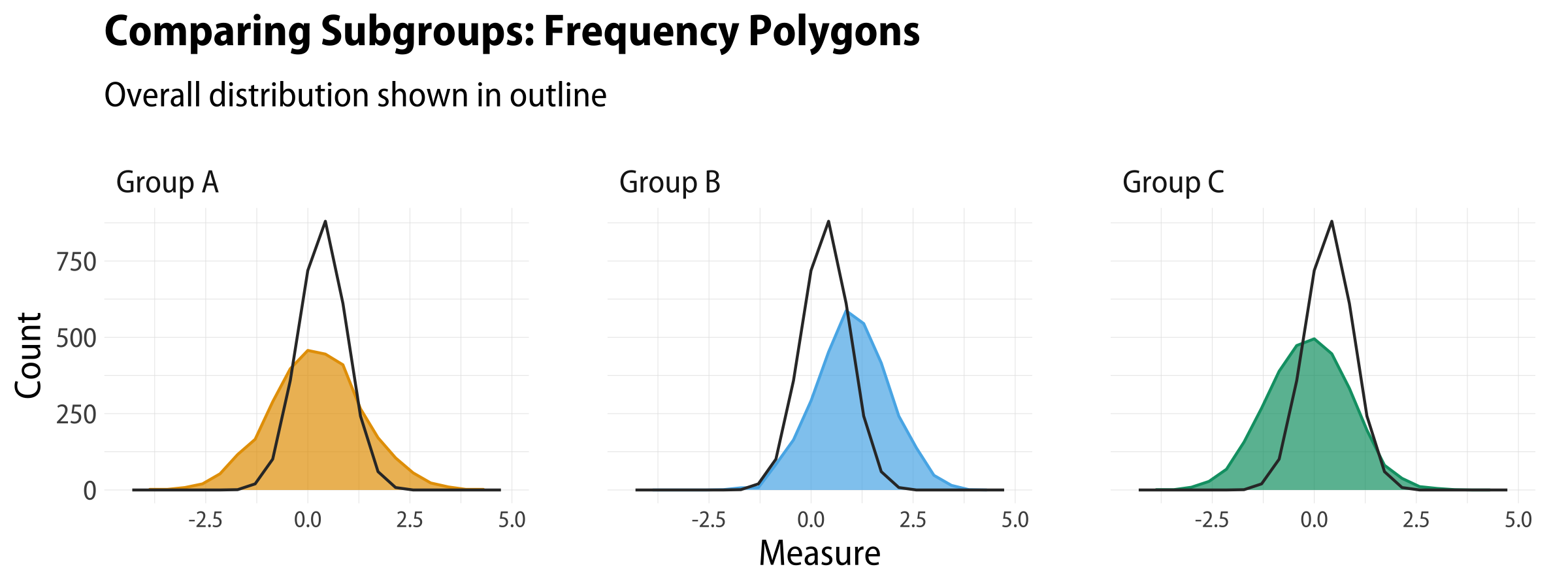
Frequency polygons
A final option, half way between histograms and smoothed kernel density estimates, is to use filled and open frequency polygons. Like geom_histogram(), these use stat_bin() behind the scenes but rather than columns they draw filled areas (geom_area) or lines (geom_freqpoly). The code is essentially the same as geom_histogram otherwise. We switch back to counts on the y-axis here.
 1
 2
 3
 4
 5
 6
 7
 8
 9
10
11
12
13
14
15
16
17
�
df%>%pivot_longer(cols=pop_a:pop_c)%>%ggplot()+geom_area(mapping=aes(x=value,y=..count..,color=name,fill=name),stat="bin",bins=20,size=0.5)+geom_freqpoly(mapping=aes(x=pop_total,y=..count..),bins=20,color="gray20",size=0.5)+scale_fill_manual(values=alpha(my_oka,0.7))+scale_color_manual(values=alpha(my_oka,1))+guides(color="none",fill="none")+labs(x="Measure",y="Count",title="Comparing Subgroups: Frequency Polygons",subtitle="Overall distribution shown in outline")+facet_wrap(~name,nrow=1,labeller=as_labeller(grp_names))
Frequency polygons, filled and unfilled.
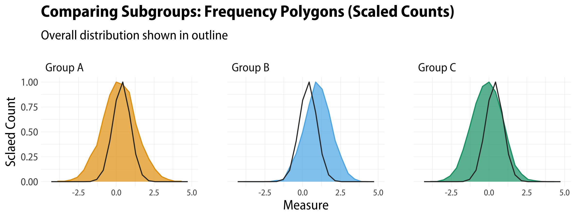
We can scale the counts in frequency polygons, too:
 1
 2
 3
 4
 5
 6
 7
 8
 9
10
11
12
13
14
15
16
17
�
df%>%pivot_longer(cols=pop_a:pop_c)%>%ggplot()+geom_area(mapping=aes(x=value,y=..ncount..,color=name,fill=name),stat="bin",bins=20,size=0.5)+geom_freqpoly(mapping=aes(x=pop_total,y=..ncount..),bins=20,color="gray20",size=0.5)+scale_fill_manual(values=alpha(my_oka,0.7))+scale_color_manual(values=alpha(my_oka,1))+guides(color="none",fill="none")+labs(x="Measure",y="Count",title="Comparing Subgroups: Frequency Polygons (Scaled Counts)",subtitle="Overall distribution shown in outline")+facet_wrap(~name,nrow=1,labeller=as_labeller(grp_names))
Frequency polygons, filled and unfilled, with scaled counts.
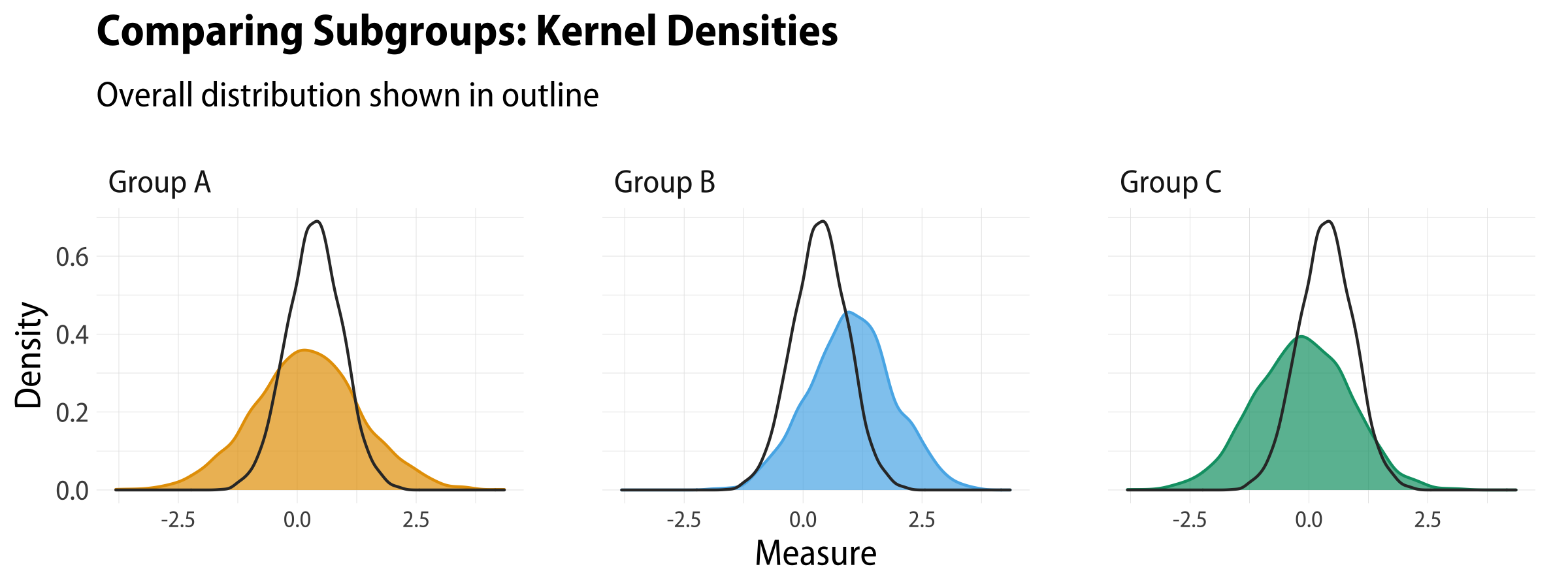
And once more we can do both of these things with kernel densities, too:
1
2
3
4
5
6
7
8
9
10
11
12
13
14
15
df%>%pivot_longer(cols=pop_a:pop_c)%>%ggplot()+geom_density(mapping=aes(x=value,color=name,fill=name),size=0.5)+geom_density(mapping=aes(x=pop_total),color="gray20",size=0.5)+scale_fill_manual(values=alpha(my_oka,0.7))+scale_color_manual(values=alpha(my_oka,1))+guides(color="none",fill="none")+labs(x="Measure",y="Density",title="Comparing Subgroups: Kernel Densities",subtitle="Overall distribution shown in outline")+facet_wrap(~name,nrow=1,labeller=as_labeller(grp_names))
Kernel densities with an outline reference distribution.
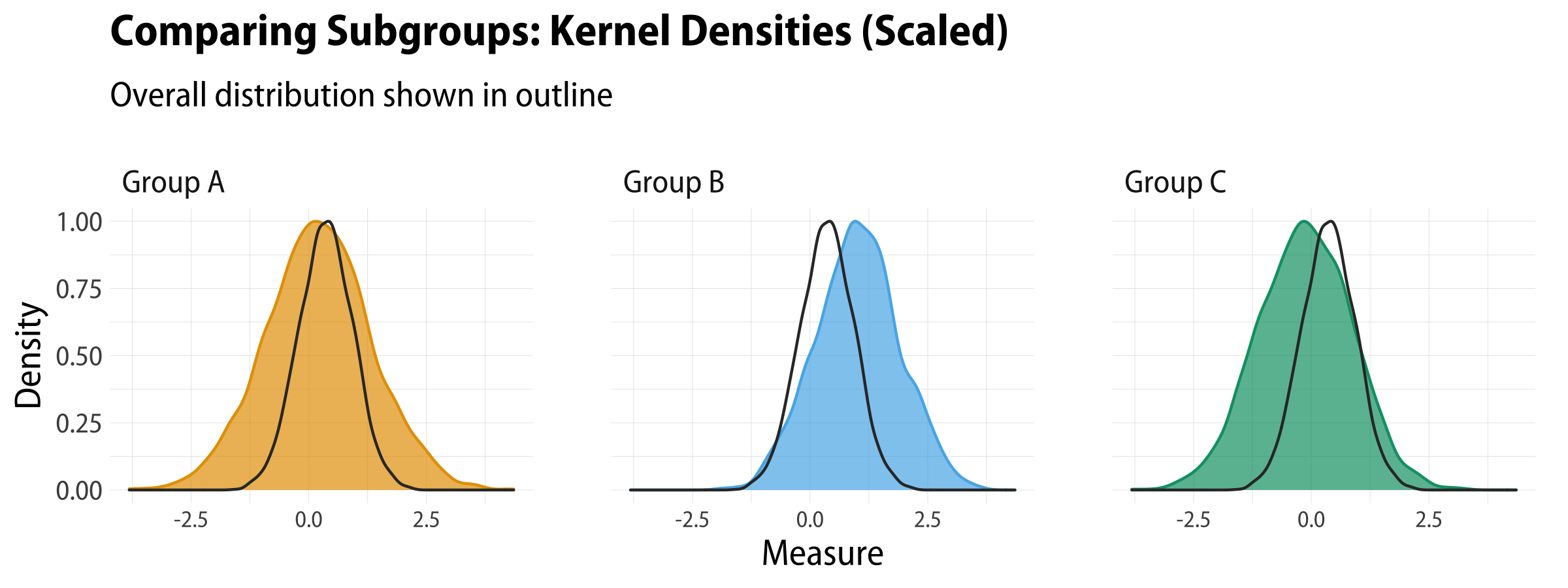
For the scaled kernel densities we use ..ndensity.. on the y-axis.
 1
 2
 3
 4
 5
 6
 7
 8
 9
10
11
12
13
14
15
16
17
df%>%pivot_longer(cols=pop_a:pop_c)%>%ggplot()+geom_density(mapping=aes(x=value,y=..ndensity..,color=name,fill=name),size=0.5)+geom_density(mapping=aes(x=pop_total,y=..ndensity..),color="gray20",size=0.5)+scale_fill_manual(values=alpha(my_oka,0.7))+scale_color_manual(values=alpha(my_oka,1))+guides(color="none",fill="none")+labs(x="Measure",y="Density",title="Comparing Subgroups: Kernel Densities (Scaled)",subtitle="Overall distribution shown in outline")+facet_wrap(~name,nrow=1,labeller=as_labeller(grp_names))
Kernel densities with an outline reference distribution (scaled densities).
While these look good, kernel densities can be a little tricker for people to interpret than straightforward bin-and-count histograms. So it’s nice to have the frequency polygon as an option to use when you just want to show counts on the y-axis.