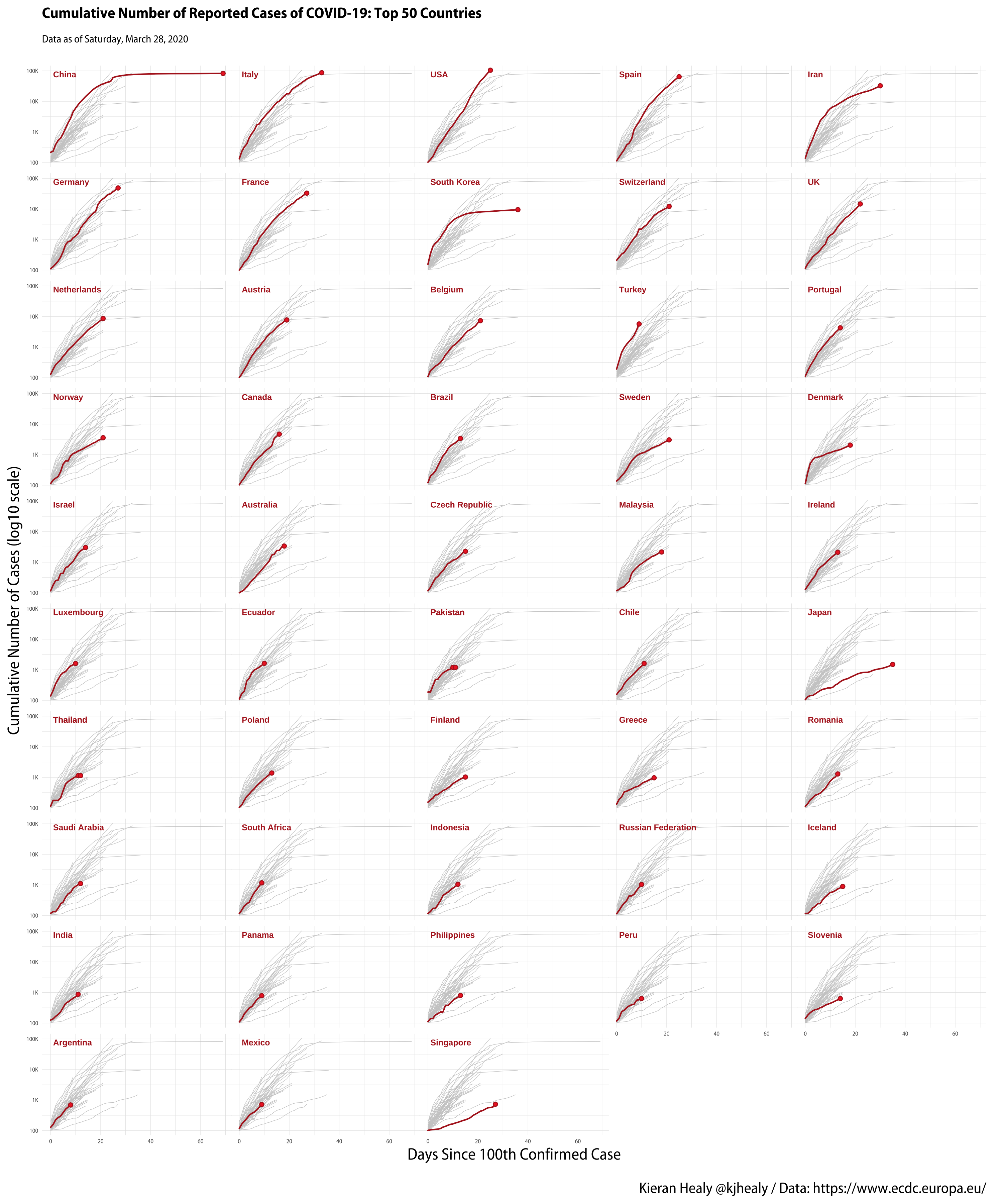
John Burn-Murdoch has been doing very good work at the Financial Times producing various visualizations of the progress of COVID-19. One of his recent images is a small-multiple plot of cases by country, showing the trajectory of the outbreak for a large number of countries, with a the background of each small-multiple panel also showing (in grey) the trajectory of every other country for comparison. It’s a useful technique. In this example, I’ll draw a version of it in R and ggplot. The main difference is that instead of ordering the panels alphabetically by country, I’ll order them from highest to lowest current reported cases.
Here’s the figure we’ll end up with:
Cumulative reported COVID-19 cases to date, top 50 Countries
There are two small tricks. First, getting all the data to show (in grey) in each panel while highlighting just one country. Second, for reasons of space, moving the panel labels (in ggplot’s terminology, the strip labels) inside the panels, in order to tighten up the space a bit. Doing this is really the same trick both times, viz, creating a some mini-datasets to use for particular layers of the plot.
The code for this (including code to pull the data) is in my COVID GitHub repository. See the repo for details on downloading and cleaning it. Just this morning the ECDC changed how it’s supplying its data, moving from an Excel file to your choice of JSON, CSV, or XML, so this earlier post walking through the process for the Excel file is already out of date for the downloading step. There’s a new function in the repo, though.
We’ll start with the data mostly cleaned and organized.
 1
 2
 3
 4
 5
 6
 7
 8
 9
10
11
12
13
14
15
>covid# A tibble: 7,320 x 14date_repdaymonthyearcasesdeathscountries_and_territoriesgeo_idcountryterritory_codepop_data2018dateiso2iso3cname<chr><dbl><dbl><dbl><dbl><dbl><chr><chr><chr><dbl><date><chr><chr><chr>128/03/20202832020161AfghanistanAFAFG371723862020-03-28AFAFGAfghanistan227/03/2020273202000AfghanistanAFAFG371723862020-03-27AFAFGAfghanistan326/03/20202632020330AfghanistanAFAFG371723862020-03-26AFAFGAfghanistan425/03/2020253202020AfghanistanAFAFG371723862020-03-25AFAFGAfghanistan524/03/2020243202061AfghanistanAFAFG371723862020-03-24AFAFGAfghanistan623/03/20202332020100AfghanistanAFAFG371723862020-03-23AFAFGAfghanistan722/03/2020223202000AfghanistanAFAFG371723862020-03-22AFAFGAfghanistan821/03/2020213202020AfghanistanAFAFG371723862020-03-21AFAFGAfghanistan920/03/2020203202000AfghanistanAFAFG371723862020-03-20AFAFGAfghanistan1019/03/2020193202000AfghanistanAFAFG371723862020-03-19AFAFGAfghanistan# … with 7,310 more rows
This is the data as we get it from the ECDC, with some cleaning of the country codes and the date format. We’ll calculate some cumulative totals and do some final recoding of the country labels.
## Top 50 countries by >> 100 cases, let's say. top_50<-cov_case_curve%>%group_by(cname)%>%filter(cu_cases==max(cu_cases))%>%ungroup()%>%top_n(50,cu_cases)%>%select(iso3,cname,cu_cases)%>%mutate(days_elapsed=1,cu_cases=max(cov_case_curve$cu_cases)-1e4)>top_50# A tibble: 50 x 4iso3cnamecu_casesdays_elapsed<chr><chr><dbl><dbl>1PAKPakistan9468612THAThailand9468613ARGArgentina9468614AUSAustralia9468615AUTAustria9468616BELBelgium9468617BRABrazil9468618CANCanada9468619CHLChile94686110CHNChina946861# … with 40 more rows
This gives us our label layer. We’ve set days_elapsed and cu_cases values to the same thing for every country, because these are the x and y locations where the country labels will go.
Next, a data layer for the grey line traces and a data layer for the little endpoints at the current case-count value.
We drop cname in the cov_case_curve_bg layer, because we’re going to facet by that value with the main dataset in a moment. That’s the trick that allows the traces for all the countries to appear in each panel.
cov_case_sm<-cov_case_curve%>%filter(iso3%in%top_50$iso3)%>%ggplot(mapping=aes(x=days_elapsed,y=cu_cases))+# The line traces for every country, in every panelgeom_line(data=cov_case_curve_bg,aes(group=iso3),size=0.15,color="gray80")+# The line trace in red, for the country in any given panelgeom_line(color="firebrick",lineend="round")+# The point at the end. Bonus trick: some points can have fills!geom_point(data=cov_case_curve_endpoints,size=1.1,shape=21,color="firebrick",fill="firebrick2")+# The country label inside the panel, in lieu of the strip labelgeom_text(data=top_50,mapping=aes(label=cname),vjust="inward",hjust="inward",fontface="bold",color="firebrick",size=2.1)+# Log transform and friendly labelsscale_y_log10(labels=scales::label_number_si())+# Facet by country, order from high to lowfacet_wrap(~reorder(cname,-cu_cases),ncol=5)+labs(x="Days Since 100th Confirmed Case",y="Cumulative Number of Cases (log10 scale)",title="Cumulative Number of Reported Cases of COVID-19: Top 50 Countries",subtitle=paste("Data as of",format(max(cov_curve$date),"%A, %B %e, %Y")),caption="Kieran Healy @kjhealy / Data: https://www.ecdc.europa.eu/")+theme(plot.title=element_text(size=rel(1),face="bold"),plot.subtitle=element_text(size=rel(0.7)),plot.caption=element_text(size=rel(1)),# turn off the strip label and tighten the panel spacingstrip.text=element_blank(),panel.spacing.x=unit(-0.05,"lines"),panel.spacing.y=unit(0.3,"lines"),axis.text.y=element_text(size=rel(0.5)),axis.title.x=element_text(size=rel(1)),axis.title.y=element_text(size=rel(1)),axis.text.x=element_text(size=rel(0.5)),legend.text=element_text(size=rel(1)))ggsave("figures/cov_case_sm.png",cov_case_sm,width=10,height=12,dpi=300)