Assault Death Rates in the United States 1999-2013
Having recently revisited plots of some international comparative data on assault death rates in the OECD, here’s a quick update to the state- and region-level plots for assault deaths within the United States. CDC Wonder data now goes up to 2013, so if we query that for adjusted death rates due to assault (based on ICD-10 codes X85-Y09 and Y87.1) we can make some new plots. Here’s a boxplot of the yearly trends across states, with some high-rate outliers marked. We don’t mark the low-rate outliers as things are complicated there by states where the crude number of assault deaths is so low that it’s not possible to construct reliable age-adjusted estimates. This tends to happen in North and South Dakota, Wyoming, Vermont, New Hampshire, and Maine.
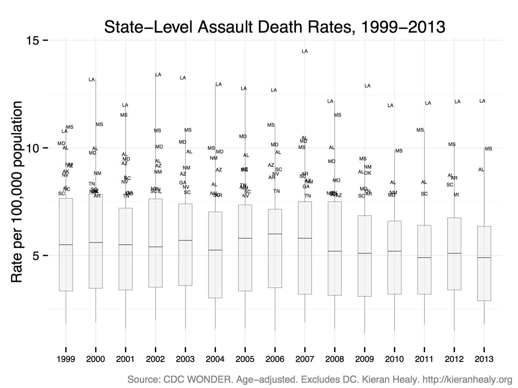
Assault Death rates in US States, 1999-2013.
As you can see the range of variation is quite wide. We can break out out the boxplots by census regions to get a better sense of it.
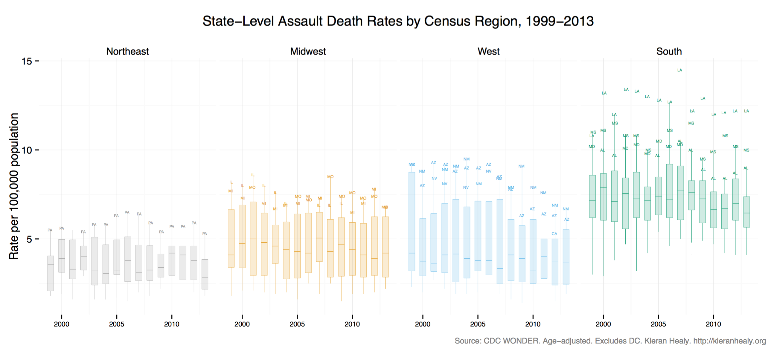
Assault Death rates in US States, by Census Region, 1999-2013.
Far more people die of assault in the South, and especially the Deep South, than elsewhere in the country. But as in the earlier plots, it’s worth remembering that, in comparison to other OECD countries, even the placid Northeast is several times more violent than any other OECD country, except Mexico.
Here’s another view of the same data, showing the regional averages (the thick lines) and the individual state trends (the dotted lines).
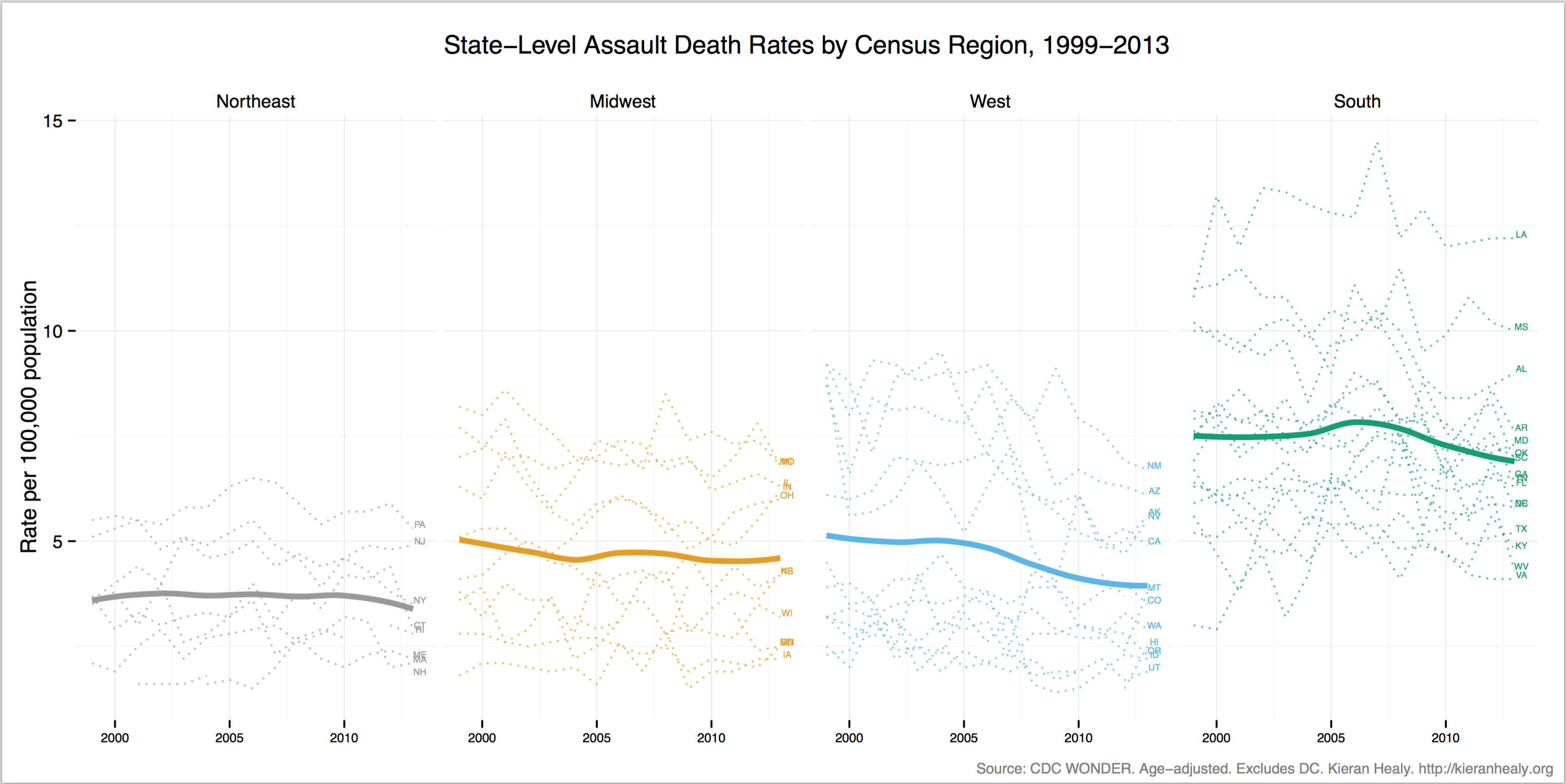
Assault Death rates in US States, by Census Region, 1999-2013.
And finally here’s a small-multiple for each state, ordered from highest to lowest median rate over the period. Notice that for some of the small states mentioned above, estimates are not available and aren’t plotted.
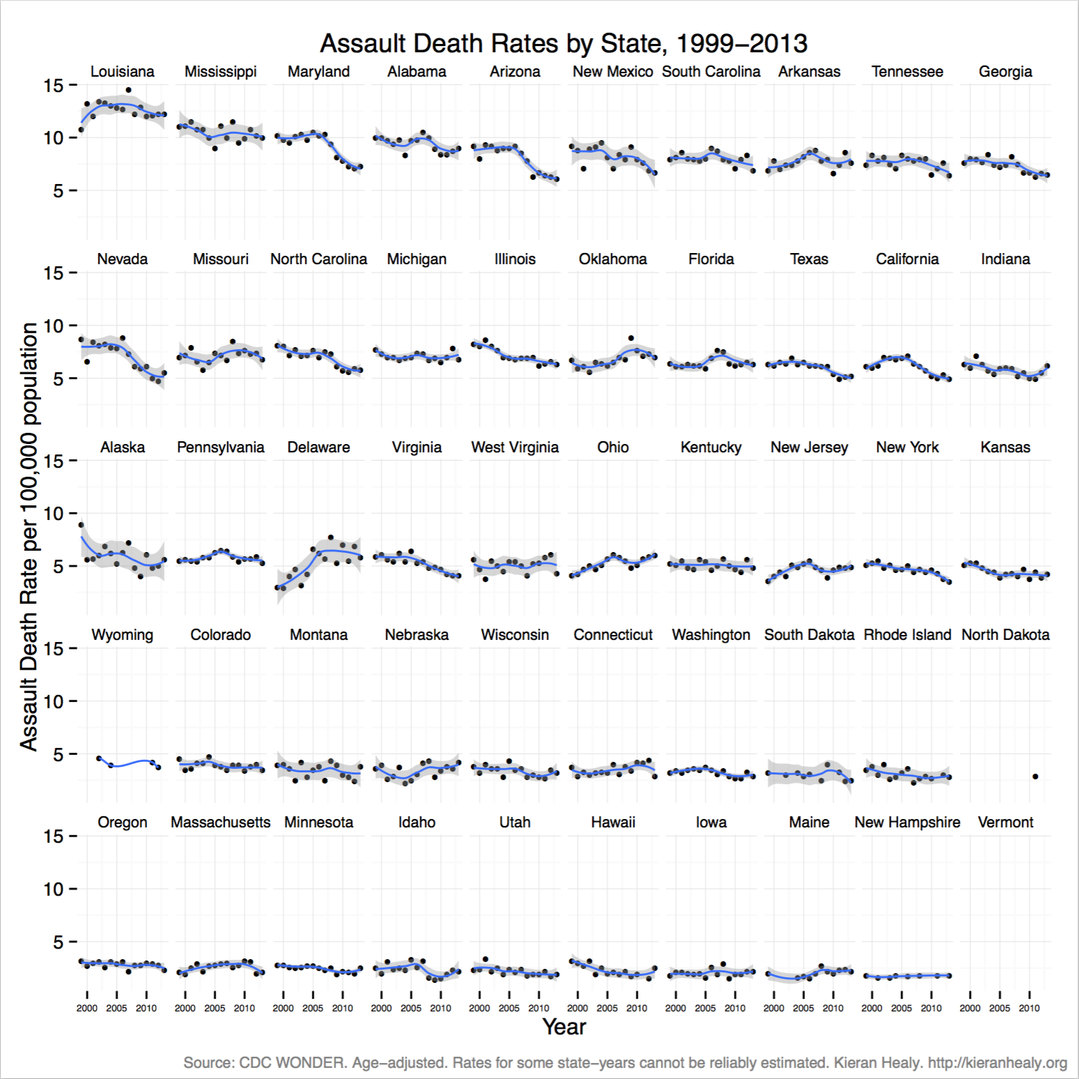
Assault Death rates in US States, 1999-2013.