The Neighborhood in your People
Via John Siracusa, a really nice exercise in crowdsourcing and data visualization on Bostonography.
we’re running an ongoing project soliciting opinions on Boston’s neighborhood boundaries via an interactive map. We want to keep collecting data, but we’ve already received excellent responses that we’re itching to start mapping, and when we hit 300 submissions recently it seemed like a good enough milestone to take a crack at it. (That’s actually 300 minus some junk data. If you offer the ability to draw freeform shapes, some people draw random rectangles and triangles, and some people draw… er, other long, tipped objects.) There are many questions to be asked here. Where are the areas of consensus? Where are the disputed zones? Where are the no-man’s lands, etc
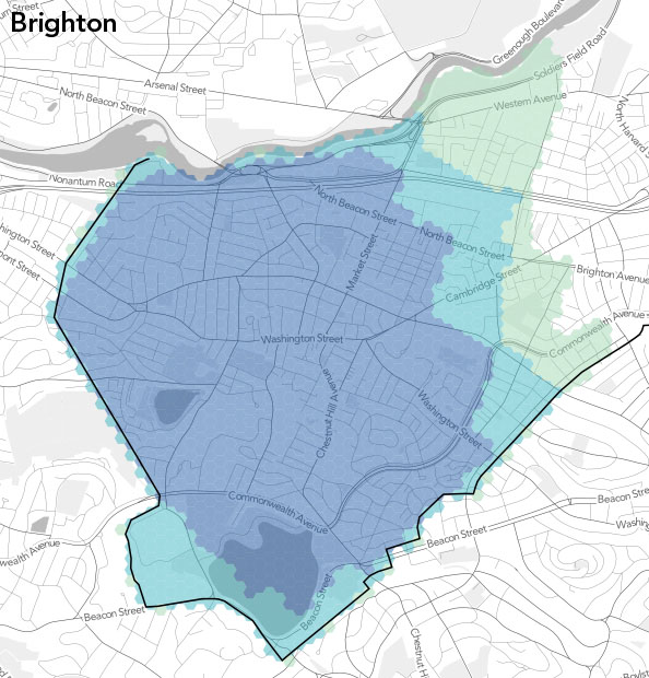
Boundaries are fuzzy, but not uniformly so, the consensus center of a neighborhood need not be its geometric center, and so on. Lots of interesting stuff. It’d be great if they could collect data on the social distribution of this knowledge, too. It’s like an updated version of Kevin Lynch’s The Image of the City, with shades of Rick Grannis’s classic paper The Importance of Trivial Streets. Very nice work. Check out the full discussion.