Aligning labels in circular igraph layouts
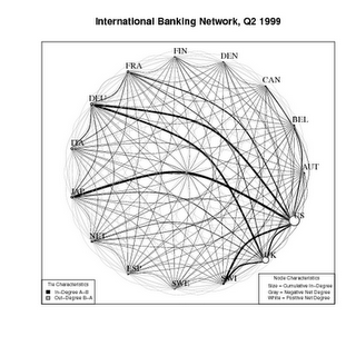
IPE financial integration network
The folks at IPE at UNC have produced this nice animated gif of some network data on increasing financial integration in the run-up to the 2008 crisis. They used a small trick I pointed to a while ago (just using a pipe, nothing fancy) that lets you generate the gif from within R without tediously typing in filenames. Then they ask,
Also, a nerdy request: I wasn’t able to find a way to put the country labels outside the graph, next to the nodes. I.e., I can move all the labels up or down, left or right, some constant distance. But I want to move them all outward so they sit next to their respective nodes, rather than above/below/to the side of the node. They would be more clearly visible that way. Any suggestions? I’m using igraph, because it supports tnet, so it would have to be something that works with those packages.
So, with a circular graph layout, how to get the labels aligned nicely? Here’s an approach that I think will work, and should generalize to however many vertices you have around the circle. The igraph documentation says that the alignment of a label with respect to its vertex is controlled by vertex.label.degree, and that
It is interpreted as an angle in radian, zero means ’to the right’, and ‘pi’ means to the left, up is -pi/2 and down is pi/2. The default value is pi/4
As is common in R, you can give this parameter a scalar argument (0, say, so all labels are aligned to the right) but it will also accept a vector. Because we’re plotting the entire graph in a circle, and igraph lays out its nodes predictably when plotting in a circle, we can take advantage of this and calculate the right position for each label with respect to its vertex given the vertex’s position on the big circle. Like this.
|
|
This gives us a graph with a nice layout, like this:
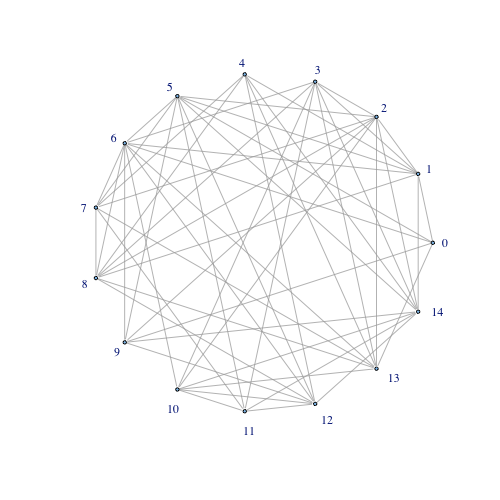
circular igraph with properly-aligned labels
I think this is what they’re looking for.