Apple Sales Trends to January 2016
Continuing my nonremunerative career as an IT Analyst, I updated my Apple Sales plots to the most recent (end of 2015) round of quarterly data. These plots were originally inspired by Dr Drang, and the trend for the iPad (shown below) continues to confirm his views. I also took the opportunity to clean up the code a little, and to fix a small problem in the earlier versions. The x-axis of the “Remainder” panel didn’t line up properly with the line plots above and below it. That’s fixed now. I also removed some superfluous axis labeling.
A quick reminder about what the plots show. The idea is that there are different components to the raw time series of sales. There’s some underlying trend of growth or decline; there are seasonal swings around that trend associated for example with purchases for the holiday quarter or the back-to-school quarter; and there’s some residual non-seasonal element, perhaps associated with the introduction of new products, or just random noise. I nonparametrically decompose the sales time series into these different components using LOESS. Then I plot them along with the raw data. I also show the seasonal swing as a percentage of total sales from period to period. This lets us see, for example, whether seemingly large seasonal ups-and-downs are truly periodic or just a function of growing annual sales volume that happens to be concentrated in a particular season.
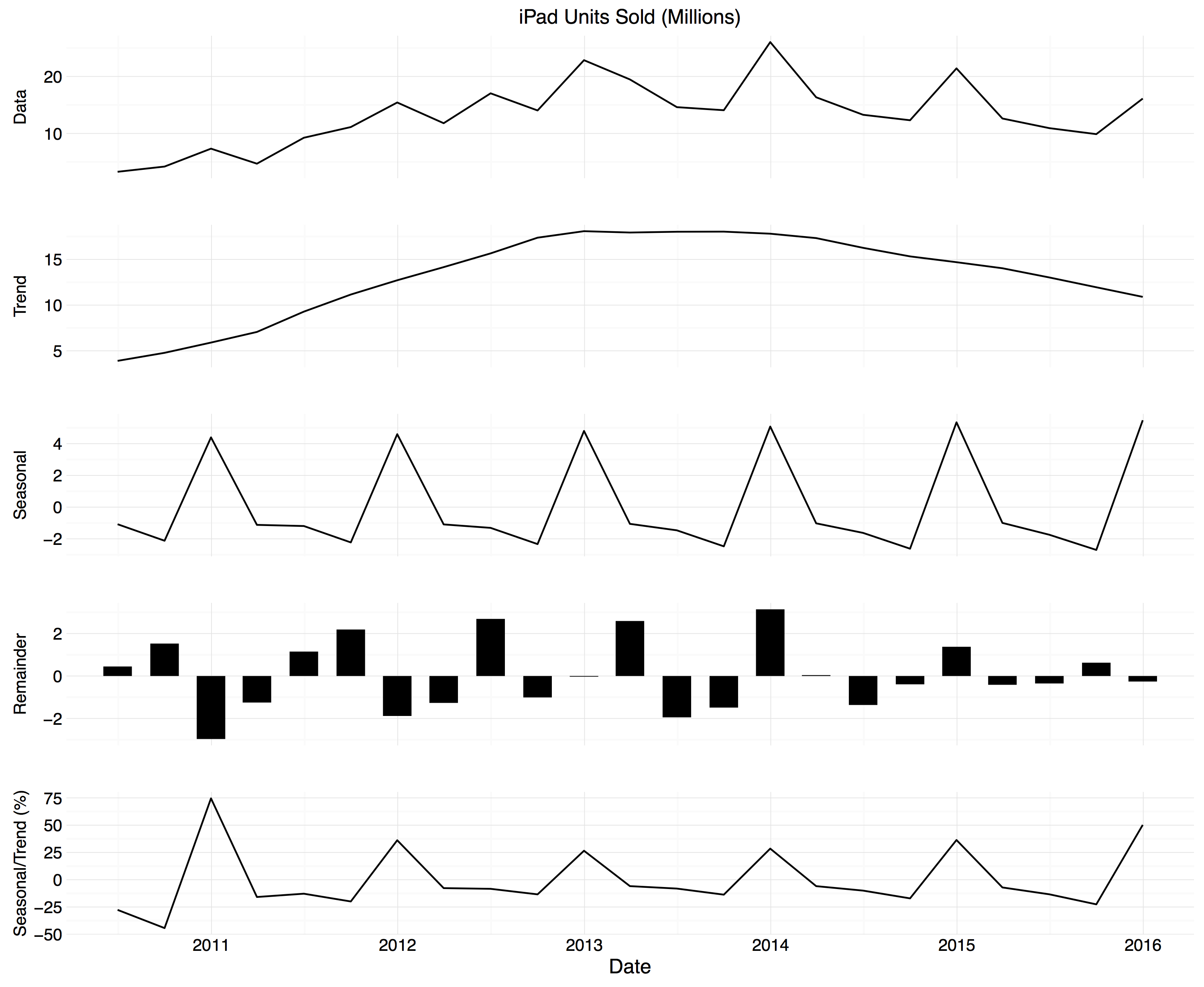
Figure 1. STL decomposition for iPad sales.
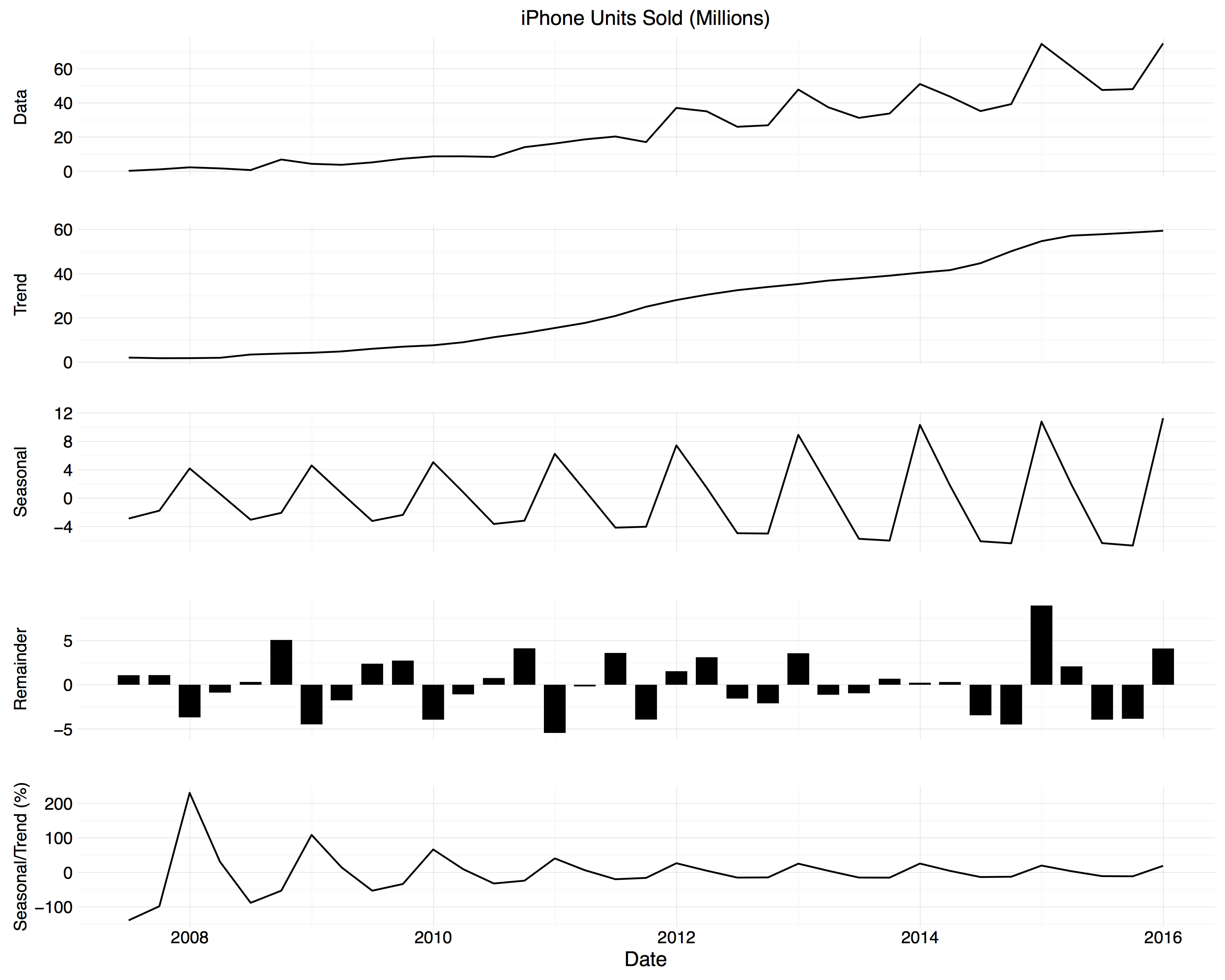
Figure 2. STL decomposition for iPhone sales.
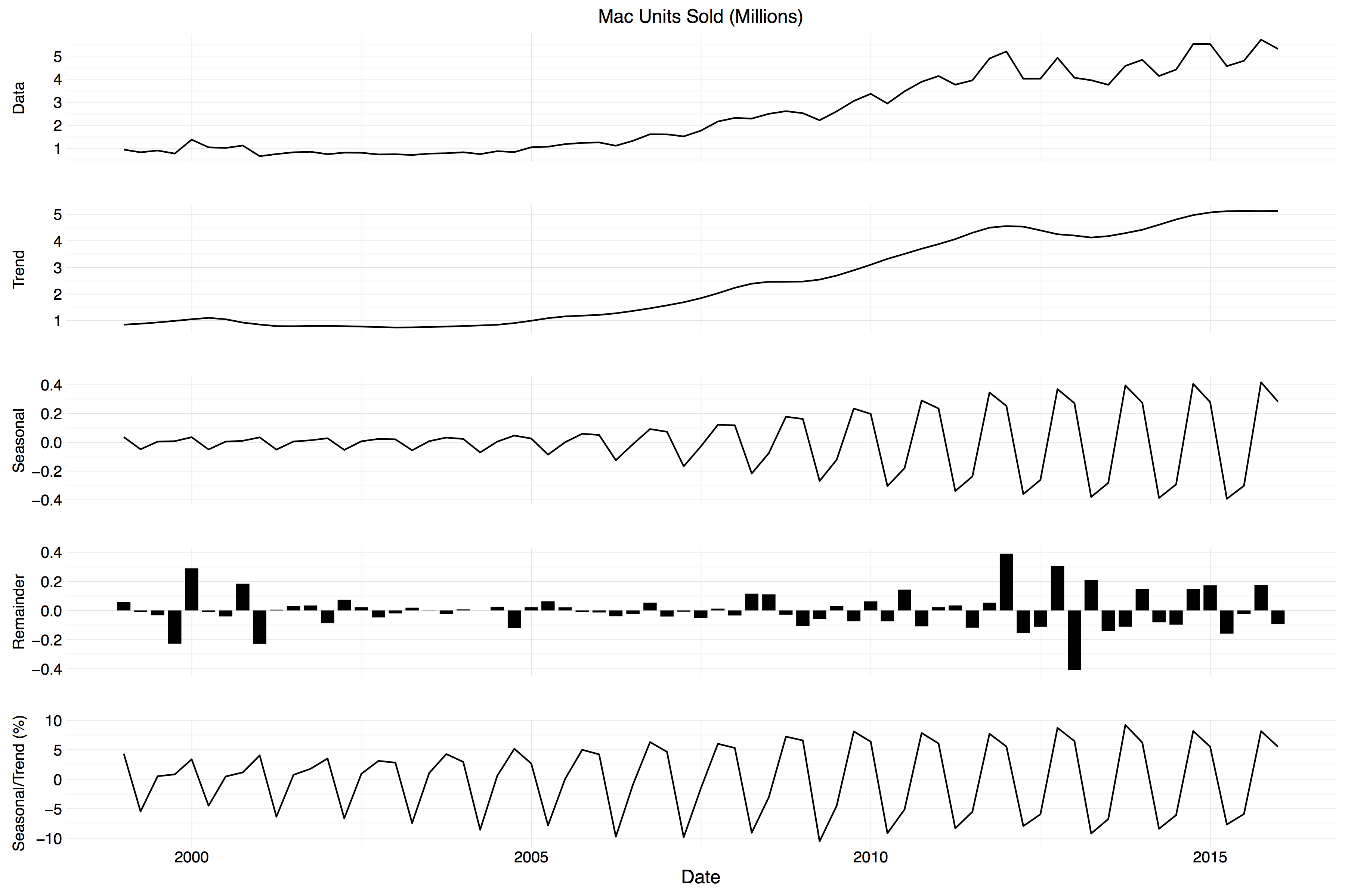
Figure 3. STL decomposition for Mac sales.
Note that the time periods covered on the x-axes are not the same across products. The Mac has been on the market for longer than the iPhone, and the iPhone longer than the iPad. The various y-axes also have scales appropriate to the range of the series displayed.
As I say, things aren’t looking too good for iPad growth, even though it’s not like it’s short of sales volume.
Update: While listening to the discussion on ATP last night, I did two more as well. First, the decomposed trend lines for all the main products, including the iPod:
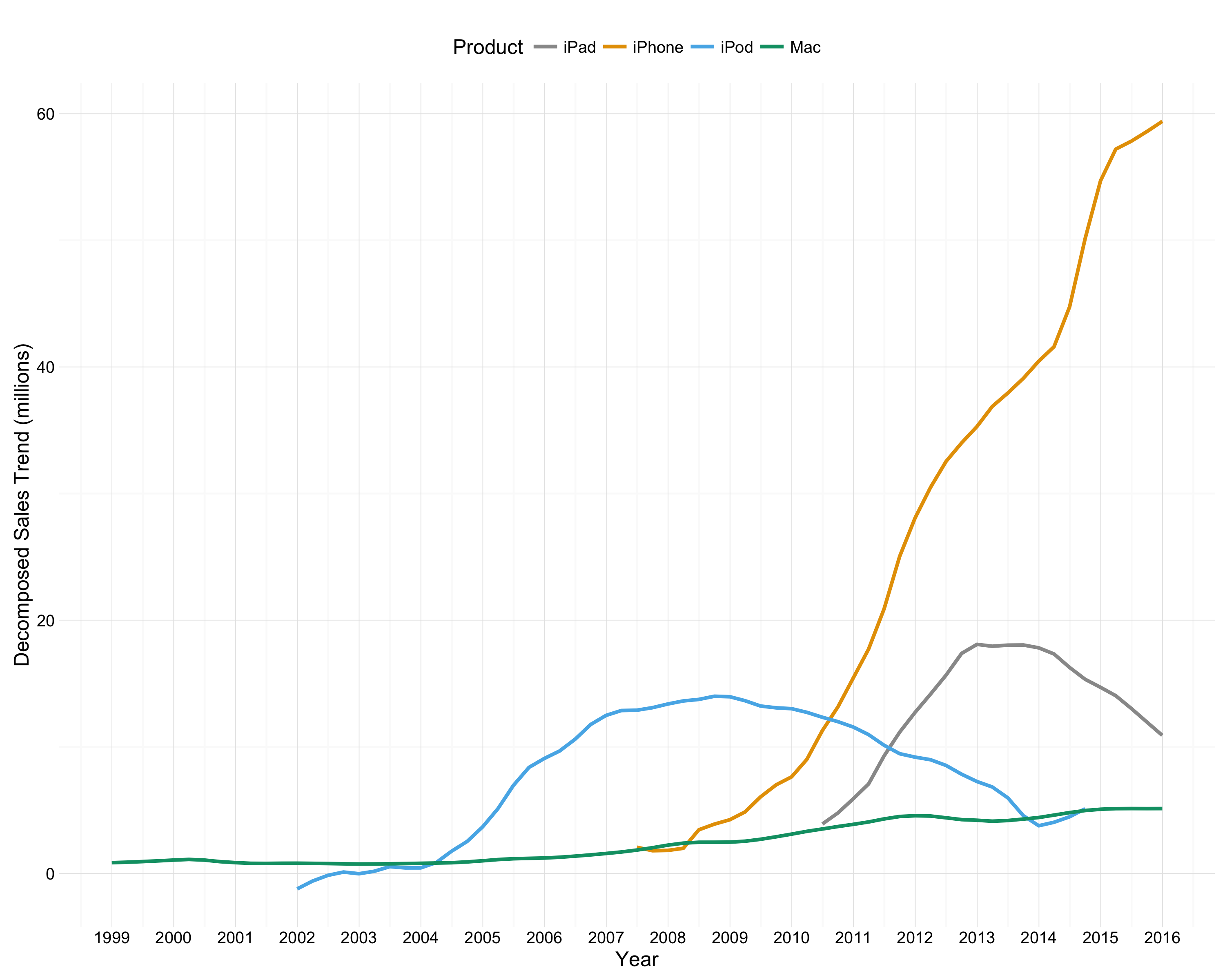
Figure 4. Decomposed sales trend lines for all four products.
And second, the same thing with the raw time series, which shows how much quarterly seasonality the trend smooths out:
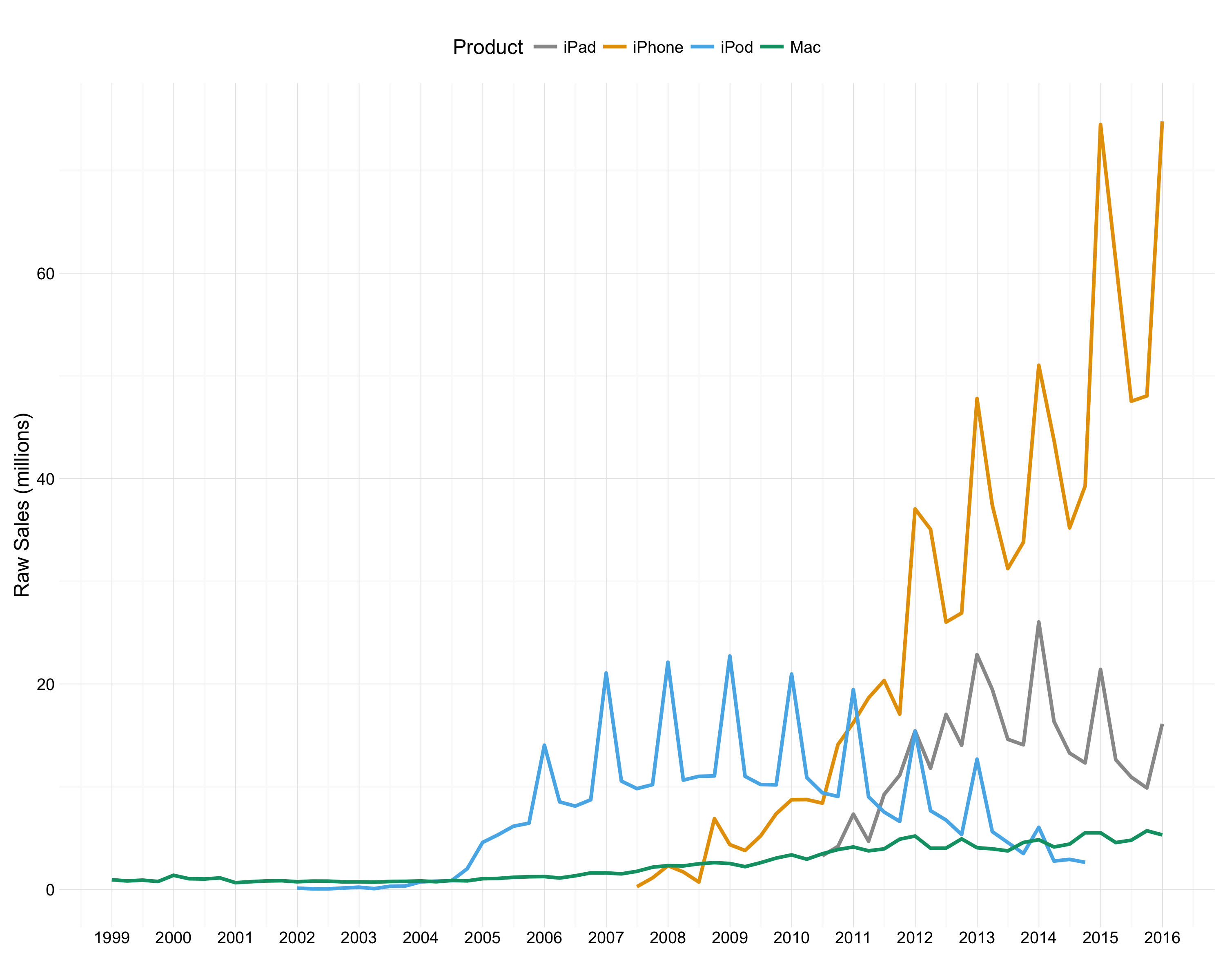
Figure 4. Quarterly sales for all four products.