Two Y-Axes
A few days ago, Matt Yglesias shared this tweet from Liz Ann Sonders, Chief Investment Strategist with Charles Schwab, Inc.
Matt remarked that “Friends don’t let friends use two y-axes”. It’s a good rule. The topic came up a couple of times during the data visualization short course I taught last semester. Using two y-axes makes it even easier than usual to fool yourself (or someone else) about the degree of association between two variables. This is because you can adjust the scaling of the axes to relative to one another in way that moves the data series around more or less however you like.
Most of the time you want to line them up as closely as possible because you suspect that there’s a substantive association between them, as in this case. Here the two variables are the S&P 500 index and the Monetary Base, one of the many measures of the size of the money supply. The S&P is an index that ranges from about 700 to about 2100 over the period of interest (about the last seven years). The Monetary Base ranges from about 1.5 trillion to 4.1 trillion dollars over the same period.
I visited FRED and got the two series. Because it’s designed by responsible people, R makes it slightly tricky to draw graphs with two y-axes. The most widely-used plotting library these days, Hadley Wickham’s ggplot, rules it out of order. But you can do it in Base R if you insist, like an animal. The code and data for these figures is on GitHub.
Here are four versions of our two series.
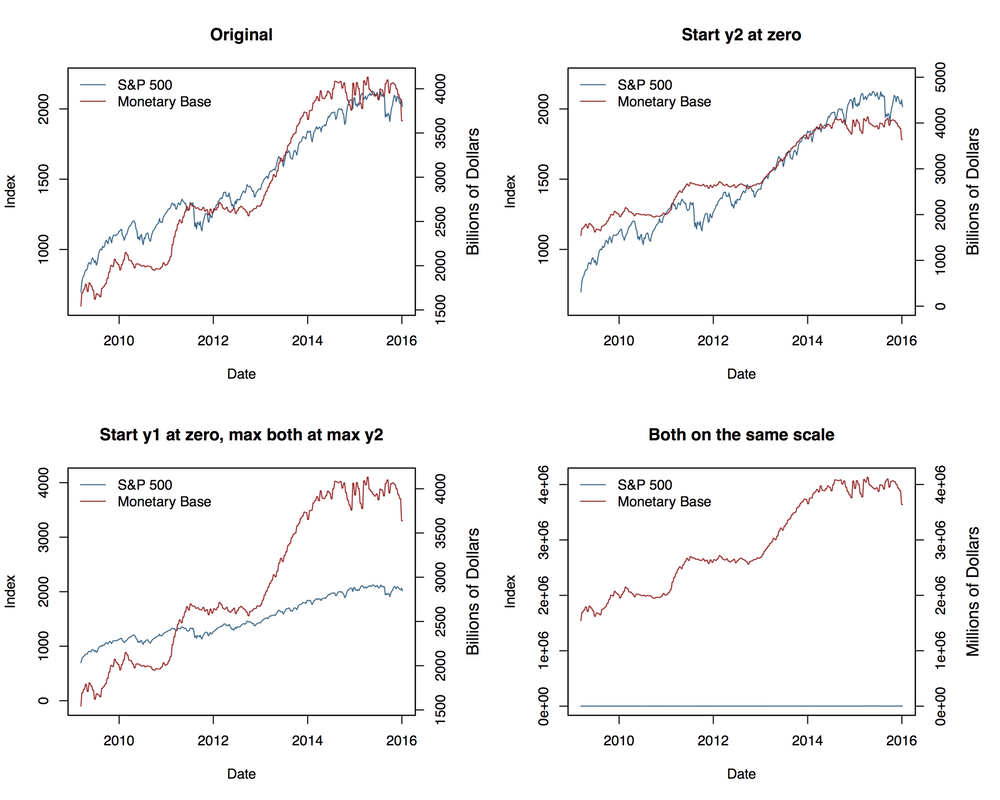
Four views of the same data
The one in the top left redraws the original figure, with the two series closely tracking one another. Notice that for the first half of the graph the red Monetary Base line tracks below the blue S&P 500 and is above it for the second half. We can “fix” that by simply deciding to start the second y-axis at zero, which shifts the Monetary Base line above the S&P line for the first half of the series and below it later on. The panel in the bottom left, meanwhile, adjusts the axes so that the axis tracking the S&P starts at zero. The axis tracking the Monetary Base starts around its minimum (as is generally good practice), but now both axes max out around 4,000. The units are different, of course. The 4,000 on the S&P side is an index number, while the Monetary Base number is 4,000 billion dollars. The effect is to flatten out the S&P’s apparent growth quite a bit, muting the association between the two variables substantially. You could tell quite a different story with this one, if you felt like it. Finally, we can kill the buzz altogether by going straight for the edge case and putting the two series on the same axis—that is, treating the S&P as if it were dollars, in effect. That shoves it down to the bottom, and keeps it there, as four thousand is a very much smaller number than four trillion. This of course removes the point of using two separate axes in the first place. It also raises the possibility of using a split- or broken-axis plot to show the two series at the same time. These can be effective sometimes, and seem to have better perceptual properties than overlayed charts with dual axes. They’re most useful in cases where the series you’re plotting are of the same kind but of very different magnitudes. That’s not the case here. But I’ve included an example in the GitHub repo all the same.
Another compromise, if the series are not in the same units (or of widely differing magnitudes), is to index each of them to 100 at the start of the first period, and then plot them both. Index numbers can have complications of their own, but here they allow us use one axis instead of two, and also to calculate a sensible difference between the two series and plot that as well, in a panel below. It can be quite tricky to visually estimate the difference between series, in part because our perceptual tendency is to look for the nearest comparison point in the other series rather than the one directly above or below. Here’s what the indexed plot looks like.
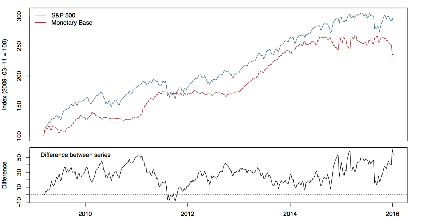
Here we index the first period of each series to 100, and add a panel showing the running difference between them.
Not bad. Note how, in this version, the S&P index runs above the Monetary Base for almost the whole series, whereas in the plot as originally scaled they crossed.
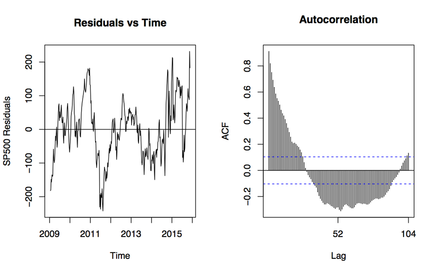
The broader problem is that the association between these variables is probably spurious. The original plot is enabling our desire to spot patterns, but substantively it’s probably that both of these time series are tending to increase, but they’re not otherwise related in any deep way. If we were interested in establishing the true association between them, we might begin by naively regressing one on the other—trying to predict the S&P index from the Monetary Base, for instance. If we do that, things look absolutely fantastic to begin with, as we appear to explain about 95% of the variance in the S&P just by knowing the size of the Monetary Base from the same period. We’re going to be rich!
Autocorrelation ruined my theory
Sadly, we’re probably not going to be rich. The dogs in the street know that correlation is not causation. With time series data we get this problem twice-over. Even just considering a single series, each observation is often pretty closely correlated with the observation in the period immediately before it, or perhaps with the observation some regular number of periods before it. A time series—for instance, the quarterly sales data for a computer company—might have a seasonal component that we’d want to account for before making claims about its growth, for example. And if we ask what predicts its growth, then we will introduce some other time series, which will have trend properties of its own. In those circumstances, we more or less automatically violate the assumptions of ordinary regression analysis in a way that produces wildly confident estimates of association. The result, which may seem paradoxical when you first run across it, is that a lot of the machinery of time series analysis seems to be about making the serial nature of the data go away.
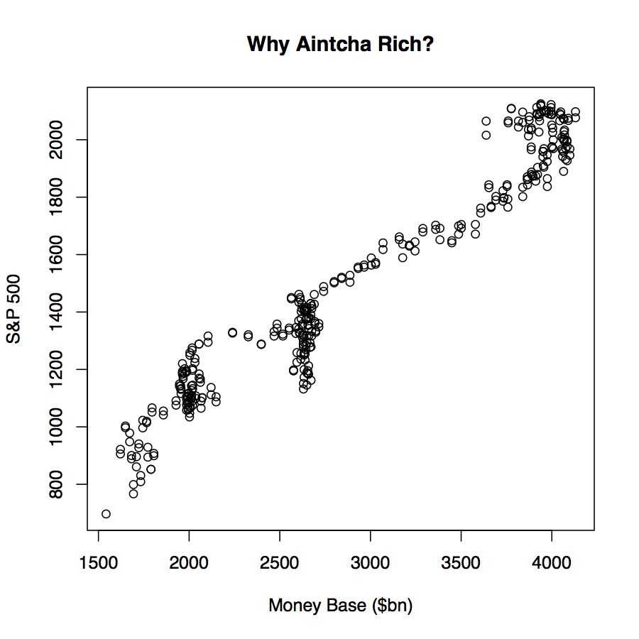
Use scatterplots to look at probably spurious associations instead
When you’re just looking at data, though, it’s enough to bear in mind that it’s already much too easy to present spurious—or at least overconfident—correlations. Scatterplots do the job just fine, as you can see. (Just don’t pay much attention to the sudden clumpy vertical bits in the plot.) Even here, we can make our associations look steeper or flatter by fiddling with the aspect ratio. Two y-axes give you an extra degree of freedom to mess about that, in almost all cases, you really shouldn’t take. Guidelines like this won’t stop people who want to fool you with charts from trying, of course. But they might help you not fool yourself.