Apple Sales Trends
Update (April 30th): I redrew the decomposition plots this morning, and added a couple more.
Another Twitter conversation, this time in the evening. Dr Drang put up a characteristically sharp post looking at sales trends in Apple Macs, iPhones, and iPads. He used moving averages to show long-term sales trends effectively, and he made a convincing argument that iPad sales are in decline. I ended up grabbing the sales data myself from barefigur.es and more or less copying him. Instead of a moving average, here’s a plot of the trends showing the individual sales figures with a LOESS smoother fitted to them.
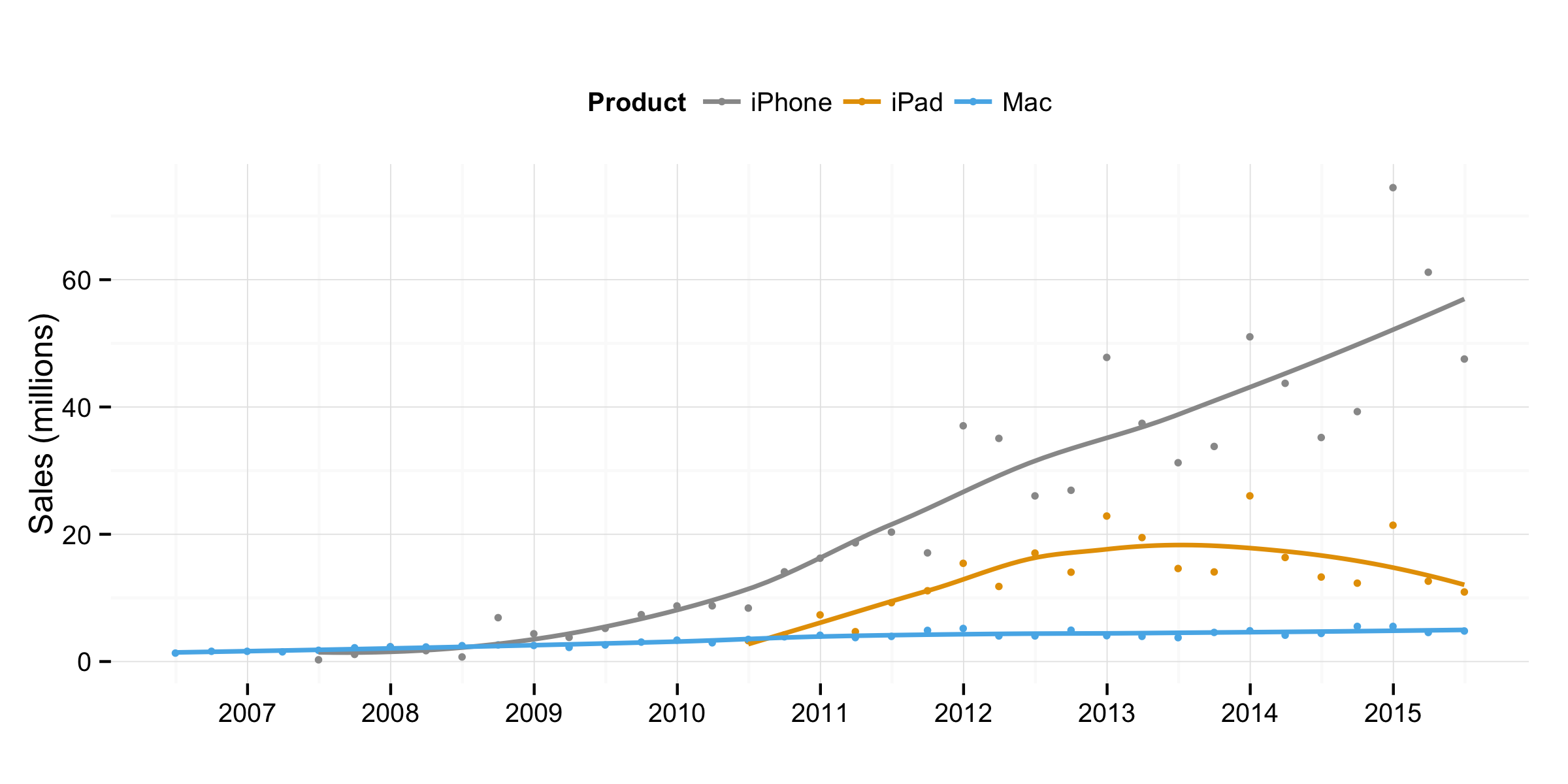
Quarterly sales data for Apple Macs, iPhones, and iPads.
The story is essentially the same as the good Doctor’s. Even though Mac sales have been growing, it’s hard to see that from the plot because the other products are on a different order of magnitude in sales. Here’s the Mac growth by itself (and for a longer time period).
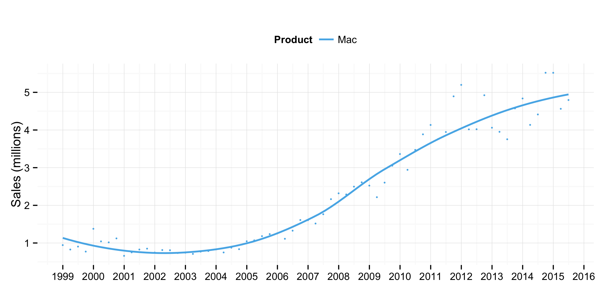
Quarterly sales data for Apple Macs.
LOESS smoothing can be extended to do a few more interesting things with time series. As described by William Cleveland in his great book Visualizing Data, and implemented by R’s stl function, we can use it to nonparametrically decompose the various time series into Seasonal, Trend, and Residual components. This is a useful technique for exploring data without too much in the way of modeling assumptions. (Time-series analysis can get pretty hairy.) In the plots below The seasonal line shows things like regular holiday sales spikes, the trend line is for overall growth, and the remainder (or residual) bars are good for picking out quarters where sales were unusually high or low net of expected growth and seasonal spikes. Following a suggestion from Dr Drang I show both the raw seasonal component, and seasonality standardized by the trend value.
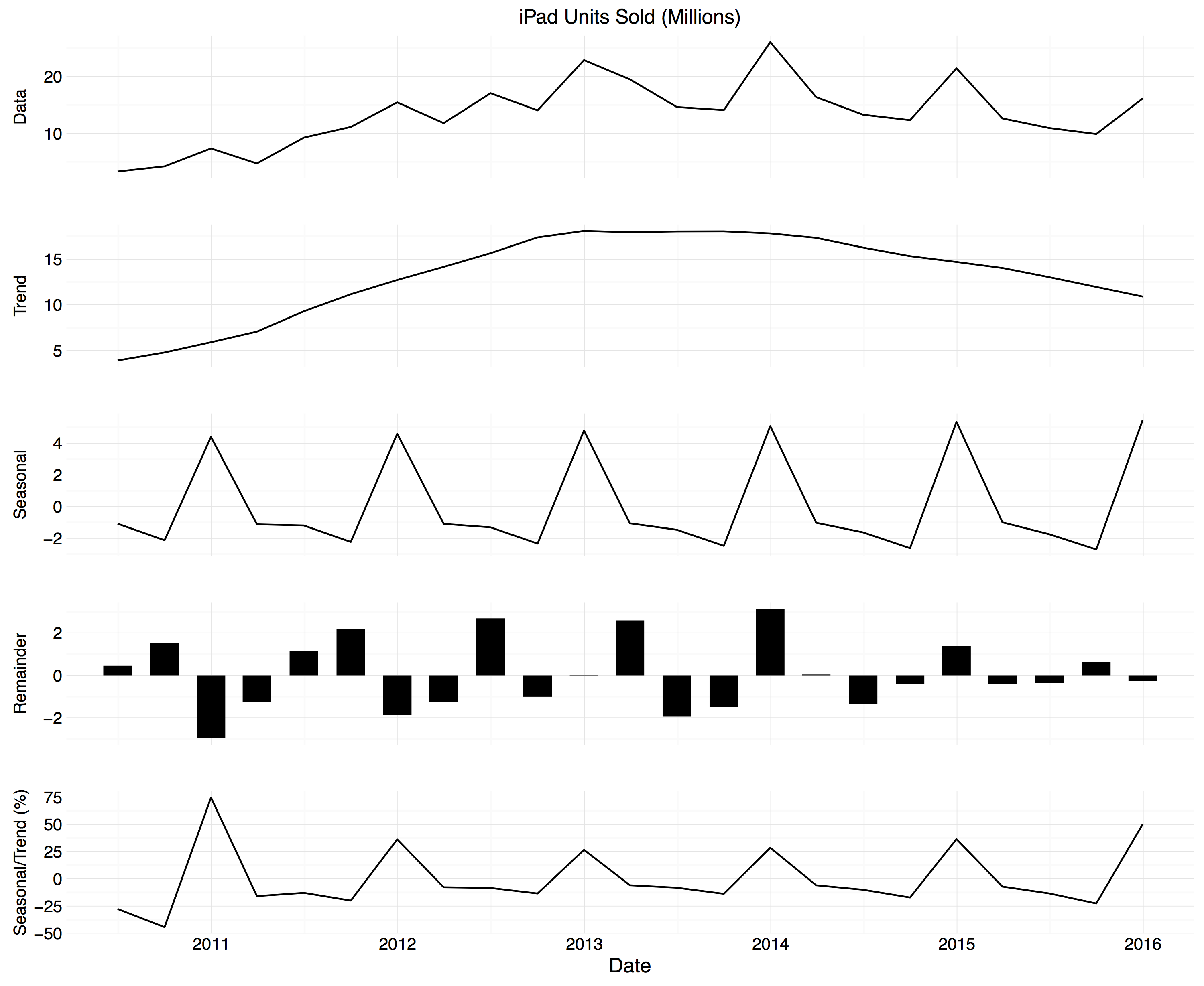
STL decomposition for iPad sales.
Again, Dr Drang’s initial views are confirmed. It also looks like the iPad is a Christmas present. Here’s the iPhone:
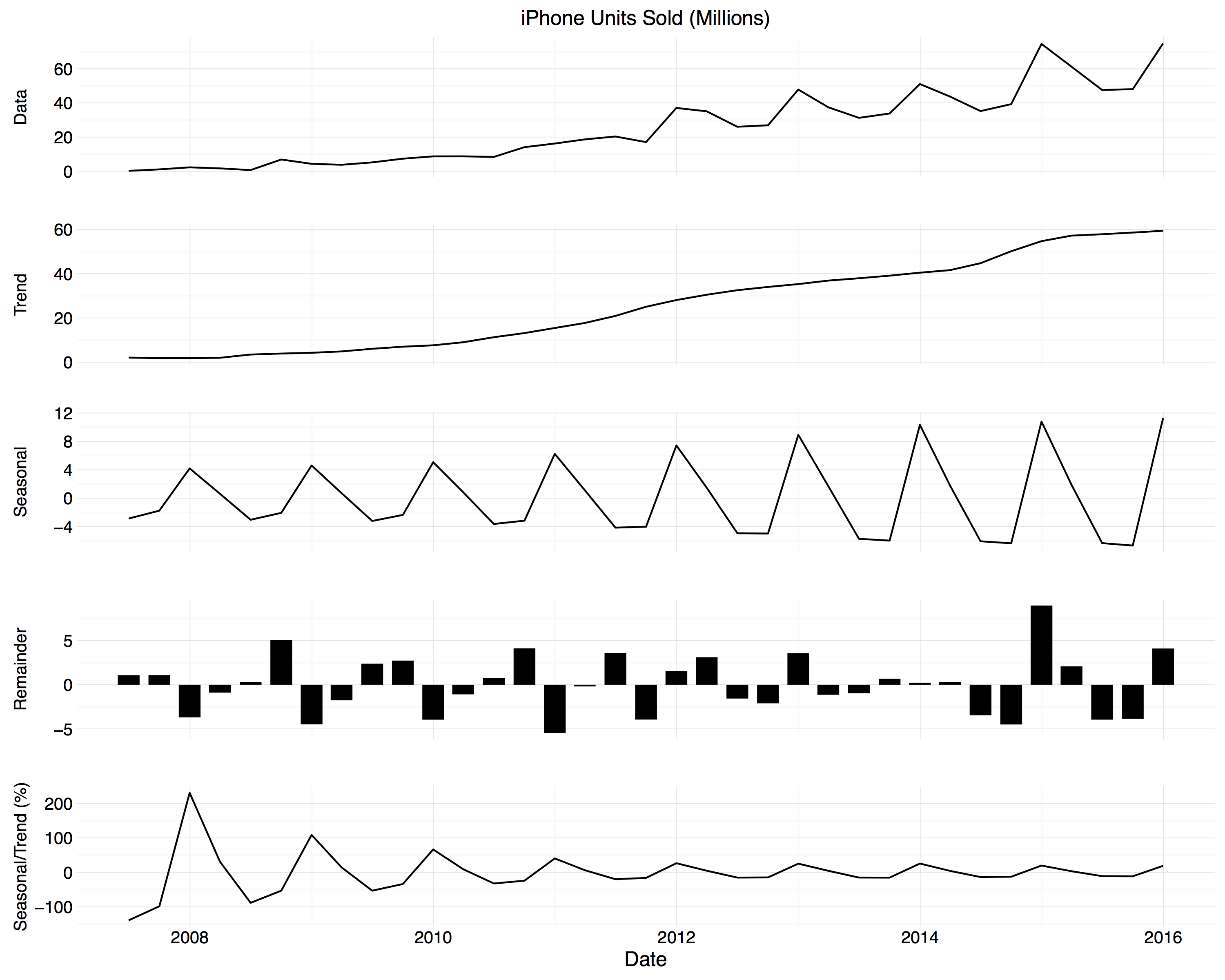
STL decomposition for iPhone sales.
Note that the time periods covered are not the same, as the iPhone has been on the market for longer. Strong seasonality again, as expected, but the normalized seasonal component suggests the seasonal swing is declining a bit, though it’s still very large. (Pay attention to the y-axis labels; the figures aren’t comparable: the range of the iPhone’s seasonal swing is declining but it’s still big.) And, covering the longest time-period of all, here’s the Mac decomposition:
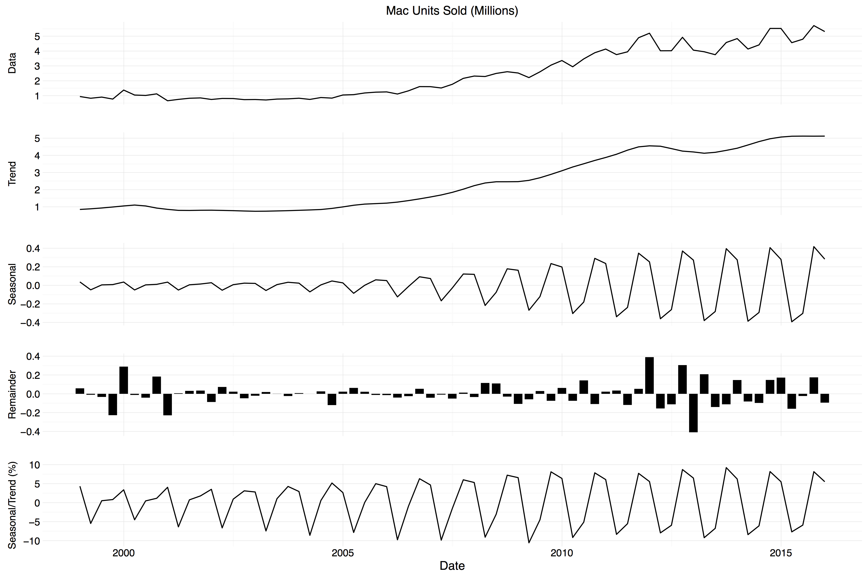
STL decomposition for Mac sales.
Much more stable. Note that the seasonal swing is regular but over a much smaller range than the other two. As Dr Drang notes in an update, you can also see a two-quarter seasonal peak for Macs—back-to-school and the holidays—compared to the one-quarter peaks for iPhones and iPads. I think you can see this seasonality emerge over time, too, as in earlier periods the Holiday peak is more pronounced than the back-to-school one.
For easier comparison, here are the trend-normalized seasonal swings for each product, this time on the same scale.
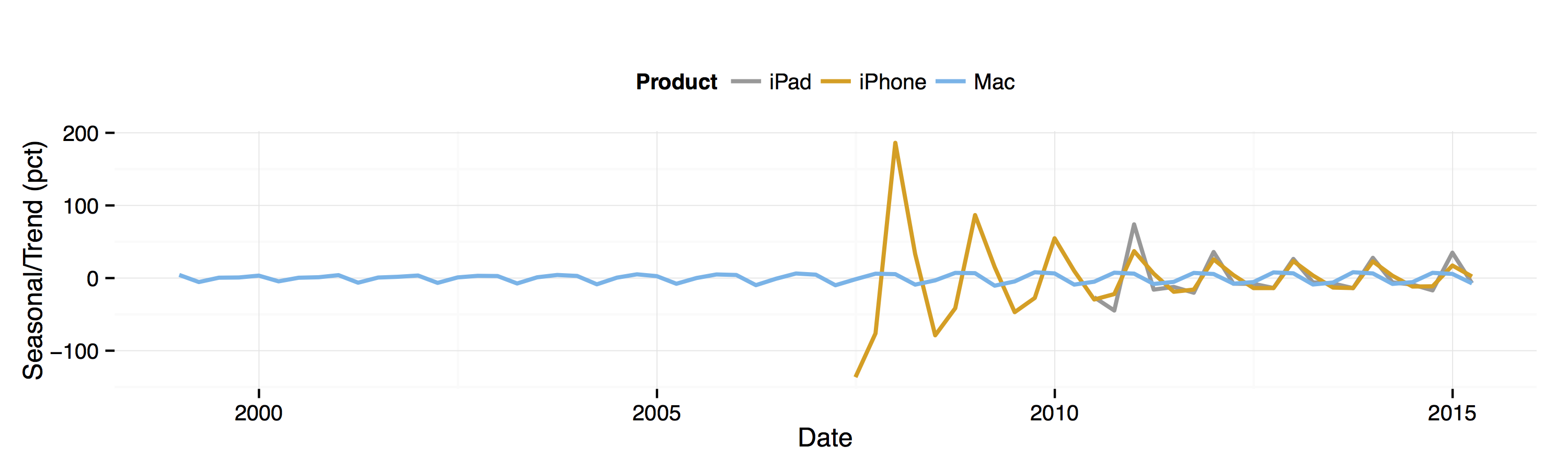
Trend-normalized seasonal swings for each product.
I think the interesting thing here is the hint that the iPhone’s swing is declining faster than the iPad’s, even though the phone started with a much higher level of seasonality.
This is all a rather hurried glance at the data. I have to put my career as an analyst on hold to bring the kids to school. In the meantime, if you’re interested, the code and data are on Github.