Visualizing Philosophy Rankings
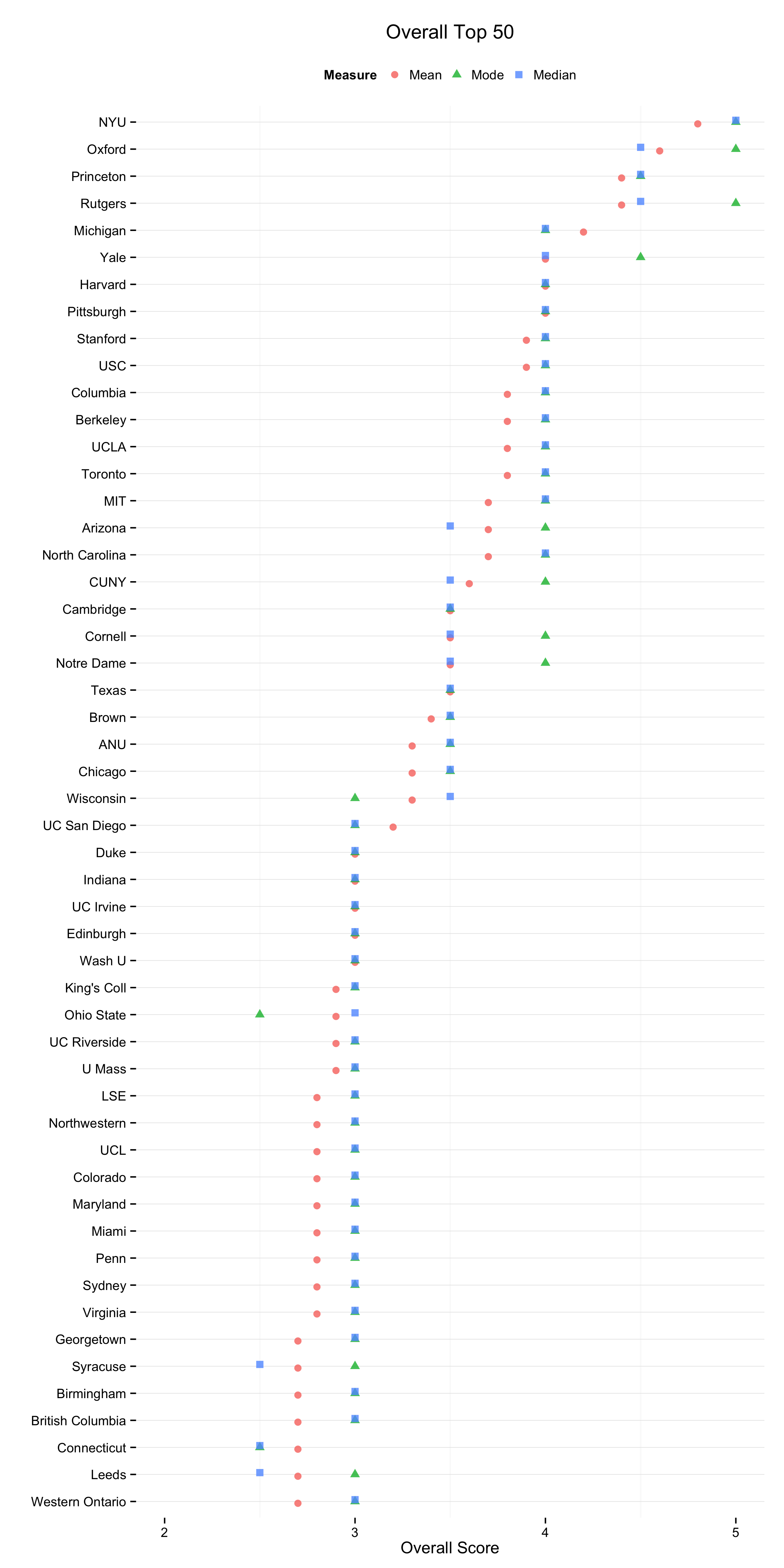
The new Philosophical Gourmet Report Rankings are out today. The report ranks a selection of Ph.D programs in English-speaking Philosophy departments, both overall and for various subfields, on the basis of the judgments of professional philosophers. The report (and its editor) has been controversial in the past, and of course many people dislike the idea of rankings altogether. But as these things go the PGR is pretty good. It’s a straightforward reputational assessment made by a panel of experts from within the field. Raters score departments on a scale of zero to five in half-point increments. The Editorial Board and the expert panel are both named, so you know who is doing the scoring, and people are not allowed to assess either their present employer or the school from which they received their highest degree. (These features already put it way, way ahead of the likes of US News and World Report.) The report has also historically been good about reporting not just average reputational scores but also the median and modal scores. This helps discourage the sort of invidious distinctions based on very small differences in average score that rankings tend to invite. This year the Editors wanted to give more information about the degree of consensus in the evaluator pool. They asked me to make some figures using the overall ranking data.
I began very simply with figures showing the Mean, Median and Mode scores, which they were already reporting numerically. I also made some small-multiple histograms which are good for showing the spread of votes within departments. For data like this, though, we are interested in a rank-ordered comparison of departments that can be taken in by scanning along a single axis. The tabular faceting of the histograms doesn’t quite facilitate this. So in addition to those I did kernel density plots of the various rankings as well. Here’s the one for the Overall Top 50 departments.
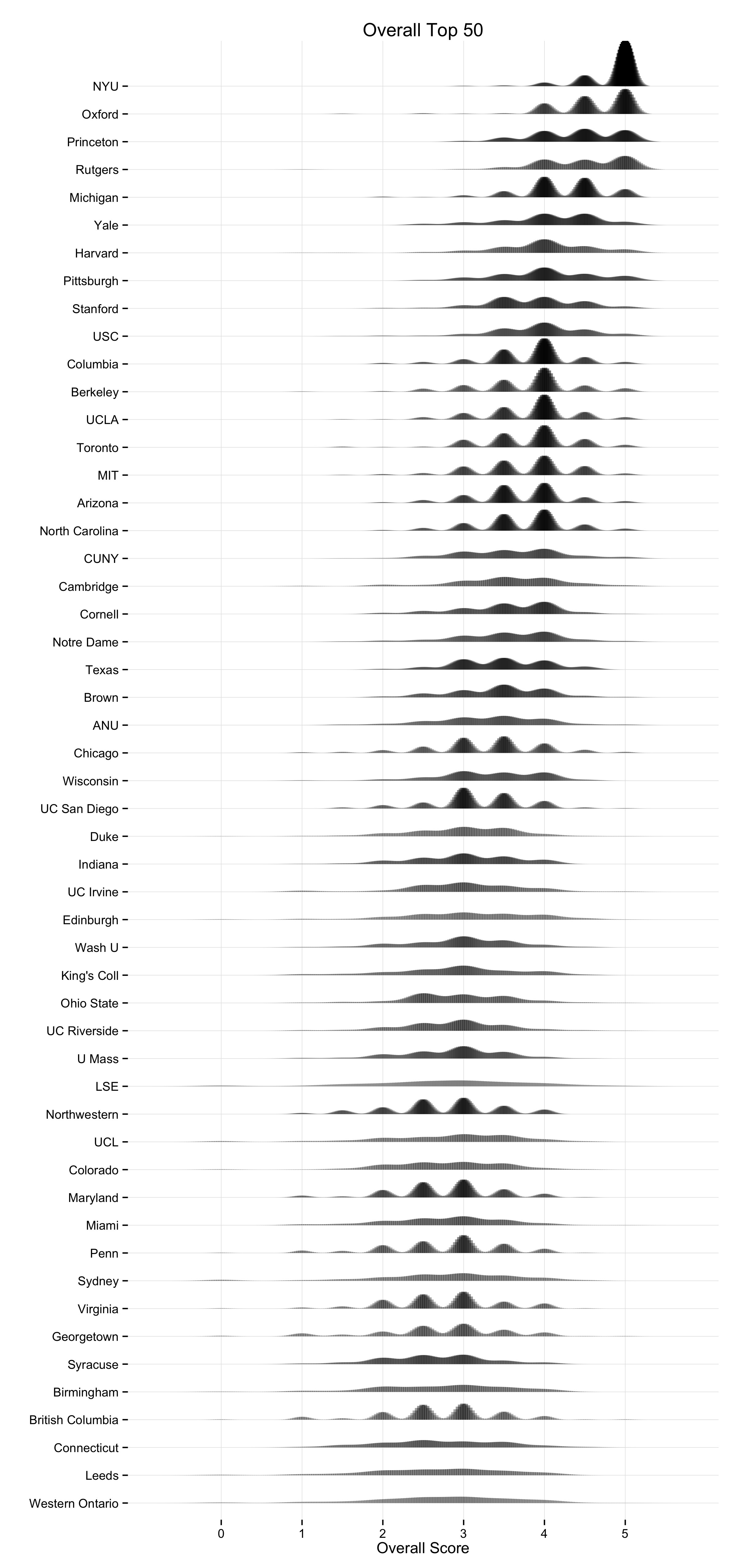
Kernel Density Plots of the 2014 PGR Top 50.
You can get a PDF version of this plot as well.
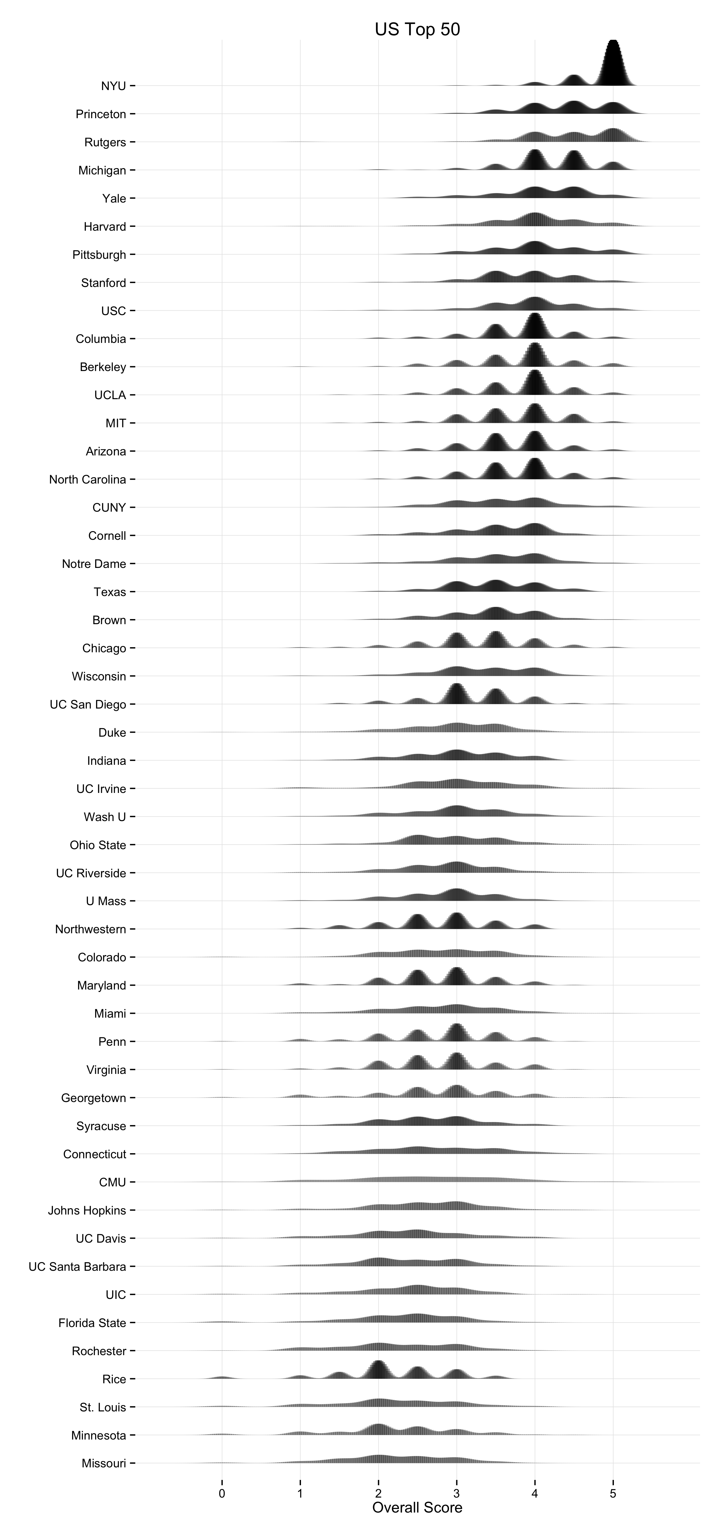
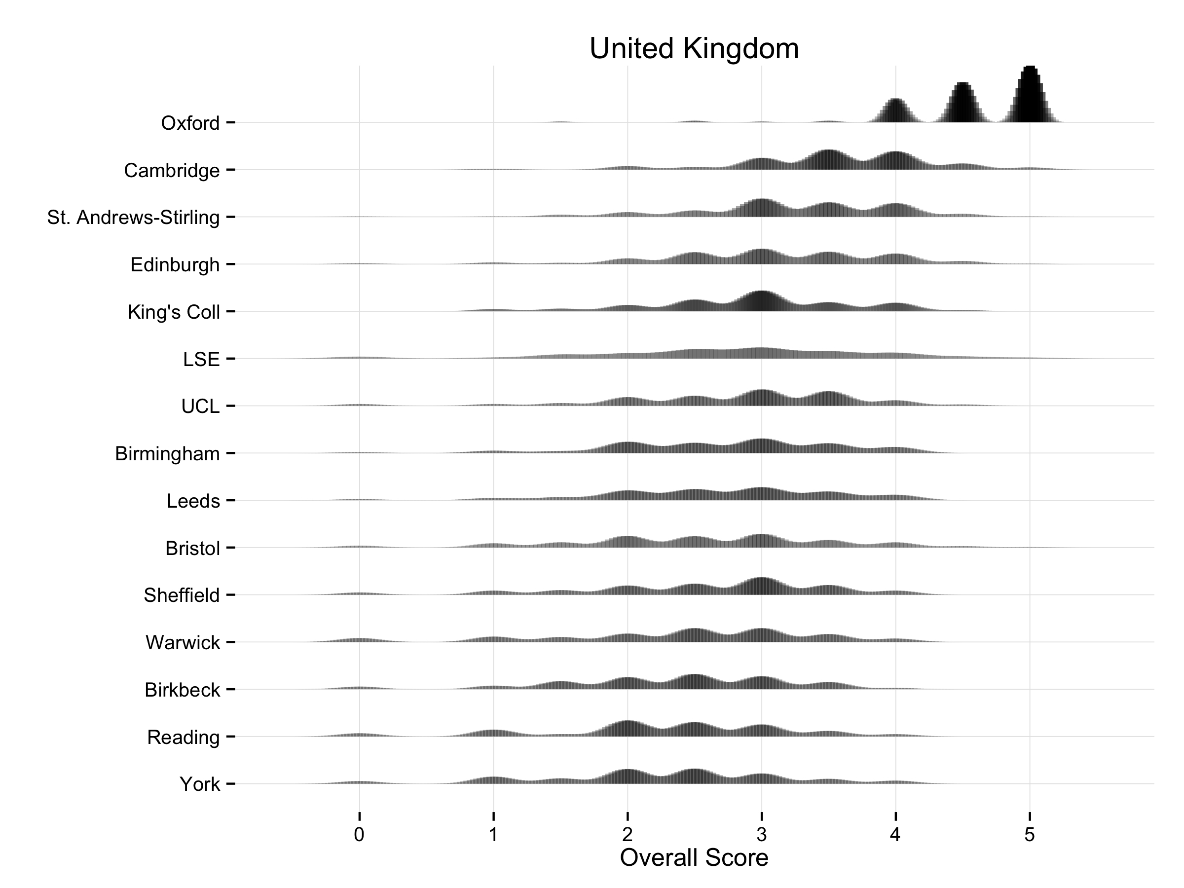
There are corresponding plots for the US Top 50 (PNG, PDF), the UK (PNG, PDF), Canada (PNG, PDF), and Australia/New Zealand (PNG, PDF).
A kernel density can be thought of roughly as a continuous version of a histogram. It is a smoothed, nonparametric approximation of the underlying distribution of scores. It gives an indication of where scores are concentrated at particular values (visible as peaks in the distribution). The total shaded area of the kernels is proportional to the vote count for that department. The height of the peaks corresponds to the number of times a department was awarded about that score by respondents. In addition, the shading is informative. Darker areas correspond to more votes. Higher-ranking departments do not just have higher scores on average, they are also rated more often. This is because respondents may choose to only vote for a few departments, and when they do this they usually choose to evaluate the higher-ranking departments. Hence higher-ranking departments may appear darker in color, and lower-ranking ones lighter, reflecting the fact that relatively fewer assessments are made about them. The absence of any clear peak in a department’s distribution indicates a more uniform distribution of scores awarded. The wider the spread, the wider the range of votes cast. Comparing down the column also gives a good indication of how much the distribution of expert opinion about departments tends to overlap across departments, and at what points on the scale votes are concentrated for different departments.
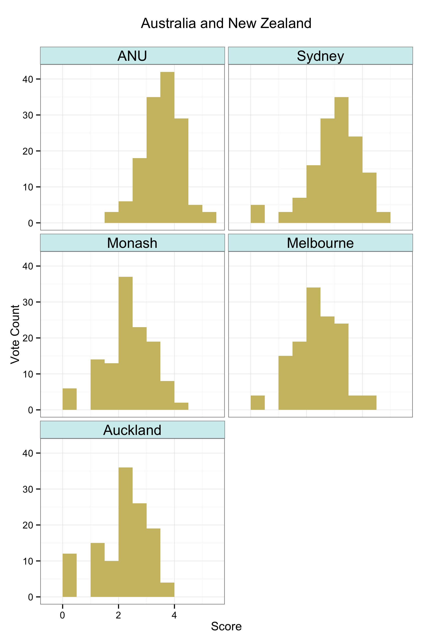
As with any visualization method there are trade-offs in presentation. This is why we show several different views of the data. An advantage of the kernel plots is that they are visually compact. When making them, it’s possible to tune them in various ways by varying the choice of kernel and its bandwidth, which affects the shape and relative smoothness of the output. In this case I wanted to highlight the discrete locations of the point scores awarded a bit more, rather than push things towards a very smooth estimation of an underlying spectrum of quality. The aim was to stay fairly close to the discrete scores awarded while getting the benefit of the kernel plot’s visual advantages. (This was also a reason against using boxplots and jittered points, although that looked OK as well.) I think the result does a good job of showing where and how opinion tends to overlap at various points in the ranking distribution. The histograms make some local comparisons a bit easier and show the data in bins that correspond directly to the response scale, but you can’t read departments straight down the figure. Here are the vote histograms for the Overall Top 50 departments:
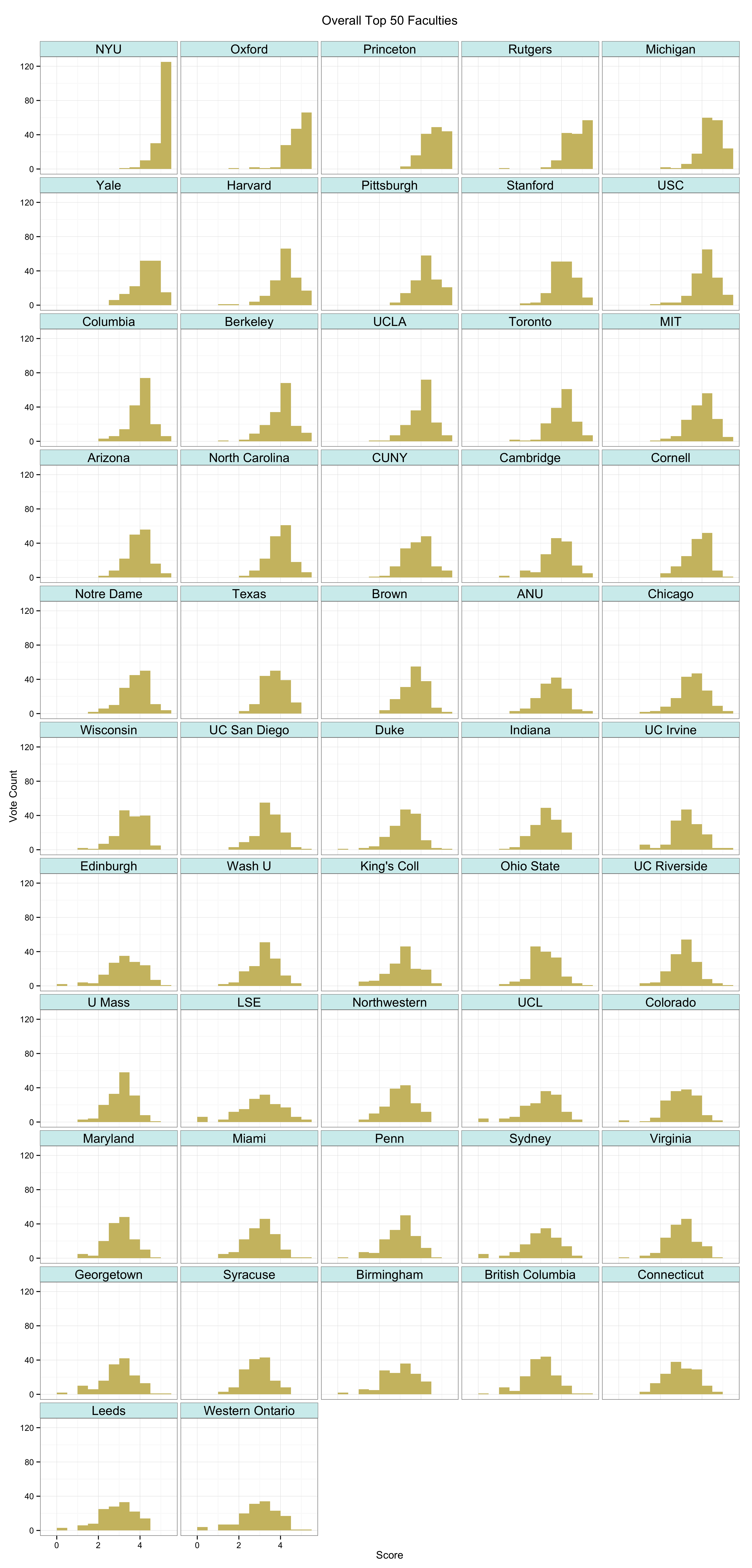
The 2014 PGR Top 50: Vote Distribution by Department.
You can get a PDF version of this plot as well. And once again there are also equivalent plots for the US top 50 (PNG, PDF), the UK (PNG, PDF), Canada (PNG, PDF), and Australia/New Zealand (PNG, PDF).