As I was saying the other day, calculating excess deaths can be a tricky business, especially if your focus is on understanding counterfactuals like how many people died of some cause who would not have died due to some other competing risk over the period of interest. Moreover, even setting the counterfactuals aside, the whole business of accurately counting and classifying deaths on the scale of a country as large and variegated as the United States is an enormous challenge in itself. The CDC has been putting out its own estimates of deaths due to COVID-19, and they make various efforts (such as weighting the estimates and so on) to account for delayed reporting and other issues.

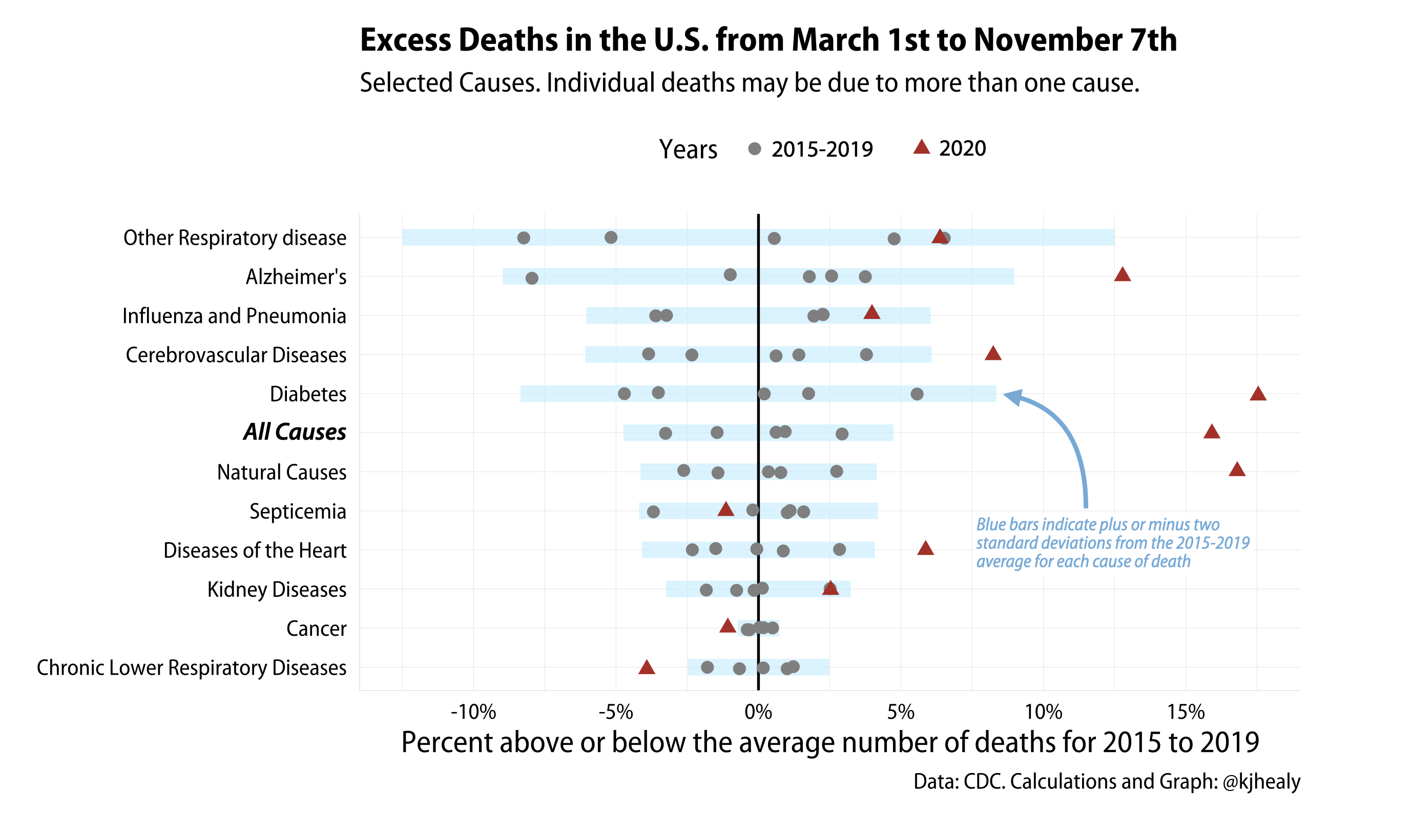
I’ll do something a little simpler here, but I think still useful. Using the weekly counts for 2019-2020 and the final counts for 2015-2019 we can examine selected causes for evidence of excess mortality beyond the baseline of expectations set by the past five years.

Here’s the overall figure.

Excess deaths by Cause

Excess deaths by Cause.

The idea here is to look at selected non-COVID causes of death (and also All-Cause mortality, i.e. everything) between March 1st and September 1st of this year, in comparison to the same causes between 2015 and 2019. We set the baseline as the mean number of deaths for each cause between 2015 and 2019. Then we calculate how far off each year is from that mean, for each cause. Obviously, it’s not going to be the case that exactly the same number of people die of a given cause each year. But the U.S. is a large country, so there’s a lot of stability from year to year, too. Most causes bounce around their average, but some are more variable than others. Cancer deaths, for instance, do not move around much from year to year. Others, such as Alzheimer’s, and infectious diseases like the ‘flu, are more variable. In the figure here, each gray dot is one of the years from 2015 to 2019, bouncing around that “No different from average” zero line. I’ve banded them with a blue bar showing twice the standard deviation from the mean. While not a super-formal test, anything outside two standard deviations from average is probably worth paying attention to here. We restrict ourselves to deaths that take place from March 1st to September 1st each year, as COVID wasn’t causing fatalities in the US before March. The September 1st cutoff is mostly because data after this point (right now) gets quite noisy, with some states, such as Connecticut and North Carolina, not providing timely provisional counts by cause to the CDC.

I think the patterns here are interesting, and pretty clear. Most of the variation is just bouncing around within five percentage points of the mean, and all of the 2015-2019 years are within two standard deviations of their means. But 2020 is clearly different for many causes. All Cause mortality is everything, and is way up, as are deaths attributed to Diabetes, Alzheimer’s, and Natural Causes. COVID isn’t on the graph as a cause because there’s no 2015-2019 baseline to compare it to, as it didn’t exist. But it is a cause in the 2020 data.

Here’s a closer look at the code and the tables the graph was produced from. As usual, I used R and the covdata package.

r
 1
 2
 3
 4
 5
 6
 7
 8
 9
10
11
12
13
14
15
16
17
18
19
20
21
22
23
24
25
26
27
28
29
 
start_week <- 9
end_week <- 34

df_yr <- nchs_wdc %>%
#  filter(jurisdiction == "United States") %>% 
  filter(year > 2014,
         week >= start_week & 
         week <= end_week) %>% 
  group_by(jurisdiction, cause, year) %>%
  summarize(period_deaths = sum(n, na.rm = TRUE)) 

baseline_deaths <- nchs_wdc %>% 
  #filter(jurisdiction == "United States") %>% 
  filter(year %in% c(2015:2019),
         week >= start_week & 
         week <= end_week) %>%
  group_by(jurisdiction, year, cause) %>%
  summarize(total_n = sum(n, na.rm = TRUE)) %>%
  group_by(jurisdiction, cause) %>%
  summarize(baseline = mean(total_n, na.rm = TRUE), 
            baseline_sd = sd(total_n, na.rm = TRUE)) 

df_excess <- left_join(df_yr, baseline_deaths) %>%
  mutate(excess = period_deaths - baseline, 
         pct_excess = (excess / period_deaths)*100, 
         pct_sd = (baseline_sd/baseline)*100) %>%
  rename(deaths = period_deaths)
  

The portion of our excess deaths table for the United States (covering March 1st to September 1st) now looks like this:

r
 1
 2
 3
 4
 5
 6
 7
 8
 9
10
11
12
13
14
15
16
17
> df_excess %>% filter(jurisdiction == "United States")
## # A tibble: 82 x 9
## # Groups:   jurisdiction, cause [15]
##    jurisdiction  cause        year  deaths baseline baseline_sd  excess pct_excess pct_sd
##    <chr>         <chr>       <dbl>   <dbl>    <dbl>       <dbl>   <dbl>      <dbl>  <dbl>
##  1 United States All Cause    2015 1318237 1359816       32421. -41579      -3.15    2.38
##  2 United States All Cause    2016 1338615 1359816       32421. -21201      -1.58    2.38
##  3 United States All Cause    2017 1367439 1359816       32421.   7623       0.557   2.38
##  4 United States All Cause    2018 1372444 1359816       32421.  12628       0.920   2.38
##  5 United States All Cause    2019 1402345 1359816       32421.  42529       3.03    2.38
##  6 United States All Cause    2020 1641133 1359816       32421. 281317      17.1     2.38
##  7 United States Alzheimer's  2015   51412   55788.       2684.  -4376.     -8.51    4.81
##  8 United States Alzheimer's  2016   55137   55788.       2684.   -651.     -1.18    4.81
##  9 United States Alzheimer's  2017   57448   55788.       2684.   1660.      2.89    4.81
## 10 United States Alzheimer's  2018   56828   55788.       2684.   1040.      1.83    4.81
## # … with 72 more rows
## 

We also make a little tibble of the medians and standard deviations to make drawing the bars more convenient.

r
 1
 2
 3
 4
 5
 6
 7
 8
 9
10
11
df_meds <- df_excess %>%
  summarize(med = median(pct_excess))

df_sd <- df_excess %>%
  filter(cause %nin% c("COVID-19 Underlying", "COVID-19 Multiple cause", "Other")) %>%
  group_by(cause) %>% 
  slice(1) %>%
  select(cause, pct_sd) %>%
  mutate(lwr = -2*pct_sd, 
         upr = 2*pct_sd) %>%
  left_join(df_meds)

The core of the plot is produced like this:

r
 1
 2
 3
 4
 5
 6
 7
 8
 9
10
11
12
13
14
15
16
17
18
out <- df_excess %>% 
  filter(jurisdiction == "United States") %>%
  filter(cause %nin% c("COVID-19 Underlying", "COVID-19 Multiple cause", "Other")) %>%
  mutate(yr_ind = ifelse(year == 2020, TRUE, FALSE)) %>%
  ggplot(aes(x = pct_excess/100, y = reorder(cause, pct_excess, median), color = yr_ind, group = year)) + 
  geom_linerange(data = df_sd, mapping = aes(xmin = lwr/100, xmax = upr/100, y = reorder(cause, med)), 
                 color = "deepskyblue1", alpha = 0.4, inherit.aes = FALSE, size = 3) + 
  geom_vline(xintercept = 0, color = "black") + 
  geom_jitter(size = 2, position = position_jitter(height = 0.05)) +
  scale_color_manual(values = c("gray50", "firebrick"), 
                     labels = c("2015-2019", "2020")) + 
  scale_x_continuous(breaks = c(-10, -5, 0, 5, 10, 15, 20)/100, labels = scales::percent_format(accuracy = 1)) + 
  labs(x = "Percent above or below the average number of deaths for 2015 to 2019", 
       y = NULL, 
       color = "Years", 
       title = "Excess Deaths in the U.S. from March 1st to September 1st",
       subtitle = "Selected Causes, arranged by median excess deaths.",
       caption = "Data: CDC. Calculations and Graph: @kjhealy")

COVID and All-Cause mortality

We can also take a look at the df_excess table to see what’s happening with All-Cause mortality and COVID-19 specifically. We need to wrangle the table a little to get the estimates side by side.

r
 1
 2
 3
 4
 5
 6
 7
 8
 9
10
11
12
13
14
15
16
17
18
19
20
21
excess_count <- df_excess %>%
  filter(year == 2020 &
           cause %in% c("All Cause", "COVID-19 Multiple cause")) 

excess_table <- excess_count %>%
  mutate(col_cause = janitor::make_clean_names(cause)) %>%
  select(jurisdiction, col_cause, deaths:pct_excess) %>%
  group_by(jurisdiction) %>%
  select(-cause) %>%
  pivot_wider(names_from = col_cause, values_from = deaths:pct_excess) %>%
  select(-pct_excess_covid_19_multiple_cause, -excess_covid_19_multiple_cause, -baseline_covid_19_multiple_cause, 
         -baseline_sd_covid_19_multiple_cause)

colnames(excess_table) <- c("jurisdiction", "all_cause", "covid", "baseline", "baseline_sd", "excess", "pct_excess")


excess_table <- excess_table %>%
  mutate(deficit = excess - covid, 
         pct_covid = (covid / all_cause) * 100, 
         pct_deficit = (deficit / all_cause) * 100) %>%
  select(jurisdiction, all_cause, baseline, baseline_sd, excess, covid, deficit, everything()) 

Which (finally) gives us this:

r
 1
 2
 3
 4
 5
 6
 7
 8
 9
10
11
12
13
14
15
16
17
18
excess_table %>% 
  filter(jurisdiction == "United States") %>%
  pivot_longer( all_cause:pct_deficit, names_to = "measure", values_to = "value")


## # A tibble: 9 x 3
## # Groups:   jurisdiction [1]
##   jurisdiction  measure          value
##   <chr>         <chr>            <dbl>
## 1 United States all_cause   1641133   
## 2 United States baseline    1359816   
## 3 United States baseline_sd   32421.  
## 4 United States excess       281317   
## 5 United States covid        179303   
## 6 United States deficit      102014   
## 7 United States pct_excess       17.1 
## 8 United States pct_covid        10.9 
## 9 United States pct_deficit       6.22

So in these data (remember, the numbers are updated regularly, we’re looking at March 1 to September 1 only, and this is a rough-and-ready calculation), we have 1,641,133 All-Cause deaths in comparison to a baseline 2015-2019 average of 1,359,816. In this period the raw excess is 281,317 deaths. COVID-19 was listed as a cause of 179,303 of these, leaving a deficit—a remaining excess—of 102,014. Overall excess mortality from March 1st to September 1st is 17.1% above the baseline, with COVID-19 accounting for 10.9 of those percentage points, with a 6.22 percentage point excess distributed across other causes.

Some proportion of the COVID-19 deaths would have succumbed to other causes of death this year. Some proportion of the non-COVID excess deaths are directly or indirectly attributable to COVID. Directly, for example, by someone dying of COVID in a care home, but having the cause recorded as Alzheimer’s or Natural Causes. Indirectly, for instance, by someone suffering a stroke or a heart attack but being reluctant or unable to seek treatment until it was too late. And COVID has also, weirdly, probably resulted in some lives saved as a result of, say, fewer car accidents as a consequence of lockdown. Parceling out these effects, or trying to, will be a job for demographers and public health people for some time to come. But the sheer size of the direct and indirect mortality shock due to COVID just seems undeniable, and my feeling is that it won’t be made to disappear even if its indirect and counterfactual effects get chiseled out or shifted a little at the margins as better data comes in and better estimates become possible.