Banking on it
A side-note to the enjoyable exchange with Dr Drang about sales trends in Apple products, which was picked up by John Gruber. The LOESS decompositions I posted looked like this:
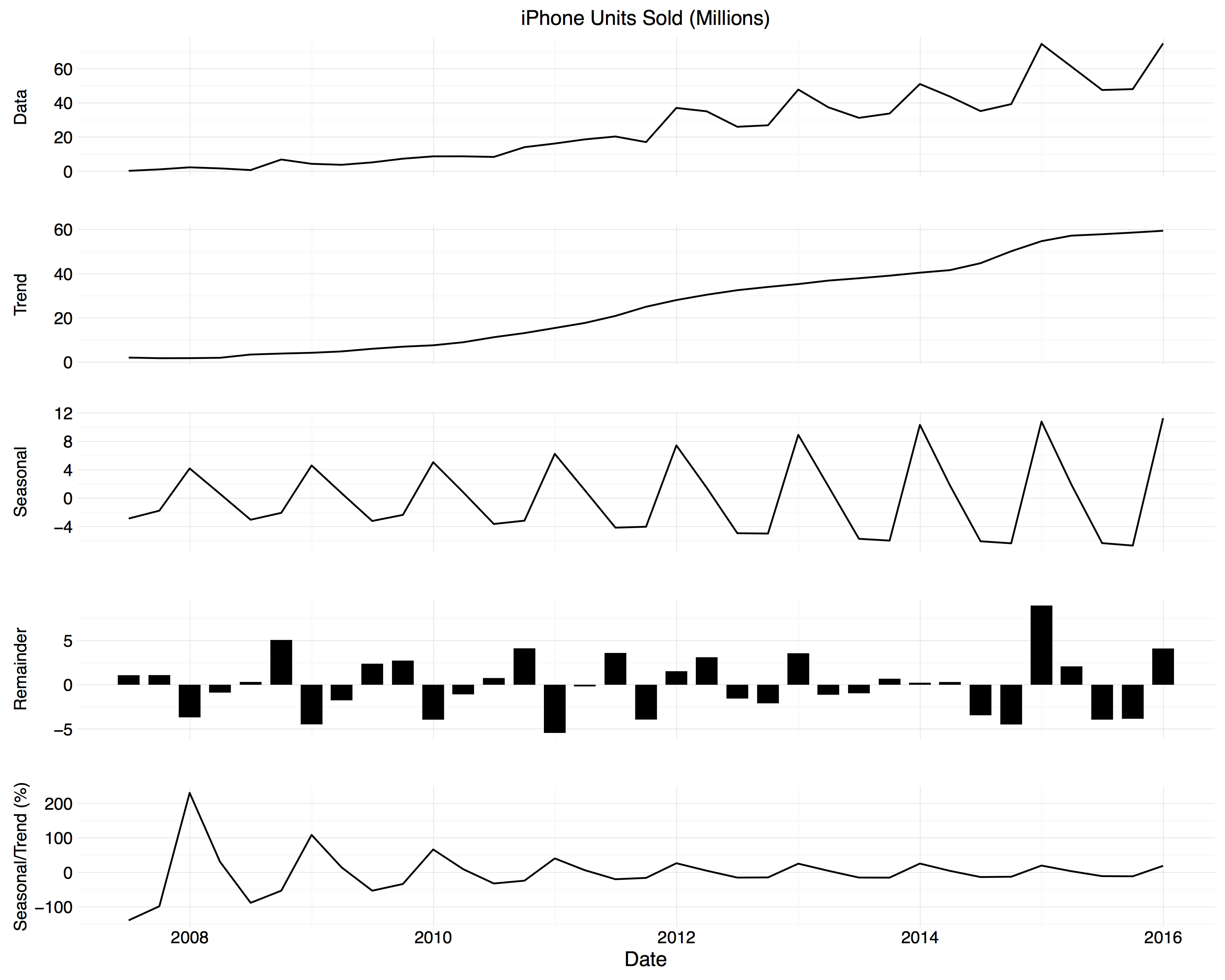
Quarterly sales decomposition for iPhones.
One or two people remarked that these figures were shorter and wider than they were used to seeing. I did this on purpose—following the approach taken by William Cleveland and others, the charts are banked, meaning the aspect ratio is set to make it easier to pick out trends. In Visualizing Data, Celveland notes that
Our perception of a curve is based on judgment of the relative orientations of the line segments that make up the curve. Suppose we measure orientation in degrees. A line segment with slope 1 has an orientation of 45°, and a line segment with slope -1 has an orientation of -45°. Typically, the judgments of a curve are optimized when the absolute values of orientations are centered on 45°, that is, when the location of the distribution of absolute orientations is 45°.
What this means in practice is that, even before getting to any smoothing or line-drawing at all, your perception of how much change there is in a trend is strongly affected by the aspect ratio of the figure. Here is the iPhone sales data by itself, banked to 45° in the way Cleveland describes.
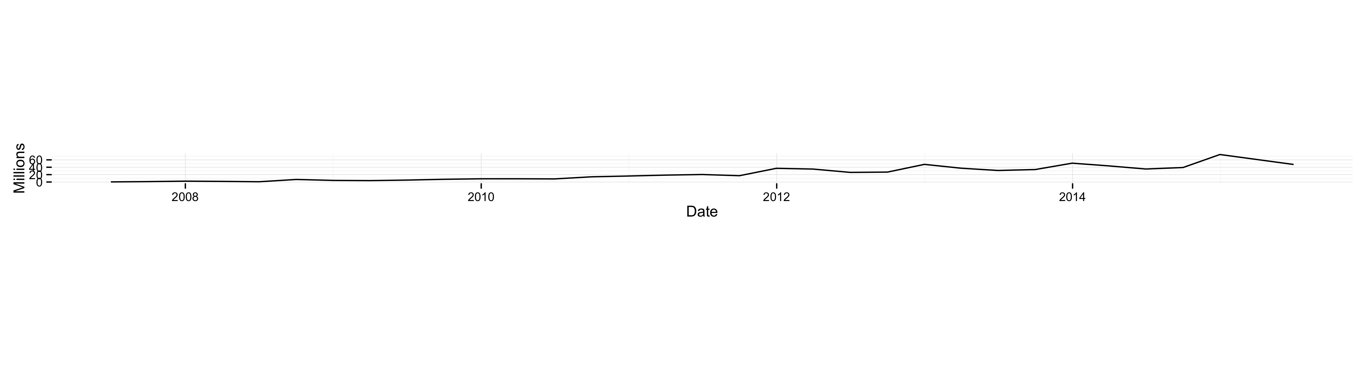
iPhone quarterly sales data, banked to 45 degrees.
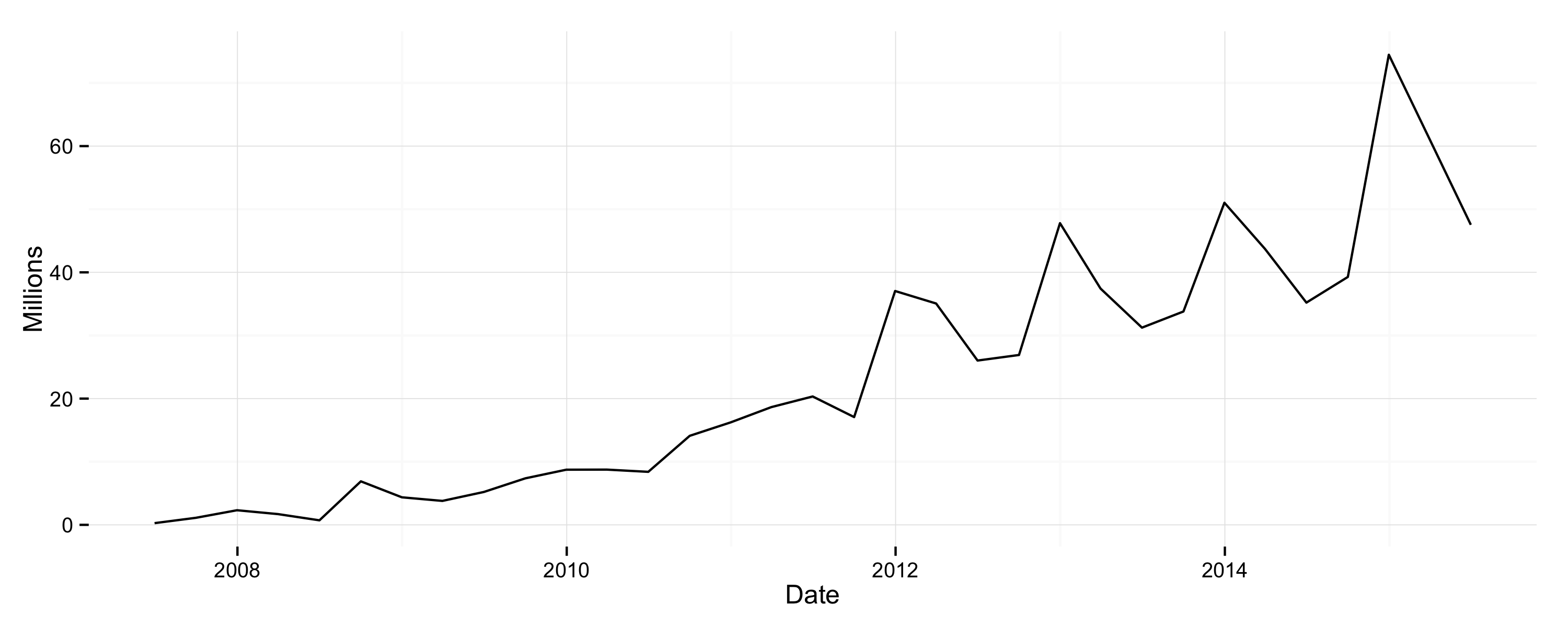
The banking here is much stronger than in the original figure. You can see the steady upward trend with occasional increases in growth rate. For comparison, here is the same data series with the aspect ratio compressed considerably (not to say excessively).

iPhone quarterly sales data with a compressed aspect ratio.
Now changes from quarter to quarter seem much more abrupt and the noisiness seems far worse. Finally, here’s the data again with a 4:1 aspect ratio.
iPhone quarterly sales data with a 4:1 aspect ratio.
In a way, properly banking a trend line is a little bit like imposing a smoother—whether by LOESS, moving average, or whatever you like—except you are not transforming the data directly. Instead you stretch it out via the axes, so that shifts from observation to observation seem less abrupt to the eye. In general, time series or trend figures that you see around the place could often do with a bit more banking. Choosing an appropriate ratio depends in part on the length of the series you’re exploring, as well as on the usual considerations about presenting data honestly, or not deceiving yourself if you’re exploring it.