A Visualization Error
My Annual Review piece with Jim Moody, Data Visualization in Sociology, was officially published just recently. Reaction to the article has been positive and hopefully people will find it useful. One theme of the article is that good use of visualization can help pick out unusual patterns in data and help researchers figure out errors or other anomalies in their data. So, life being what it is, naturally there’s a mistake in one of the figures.
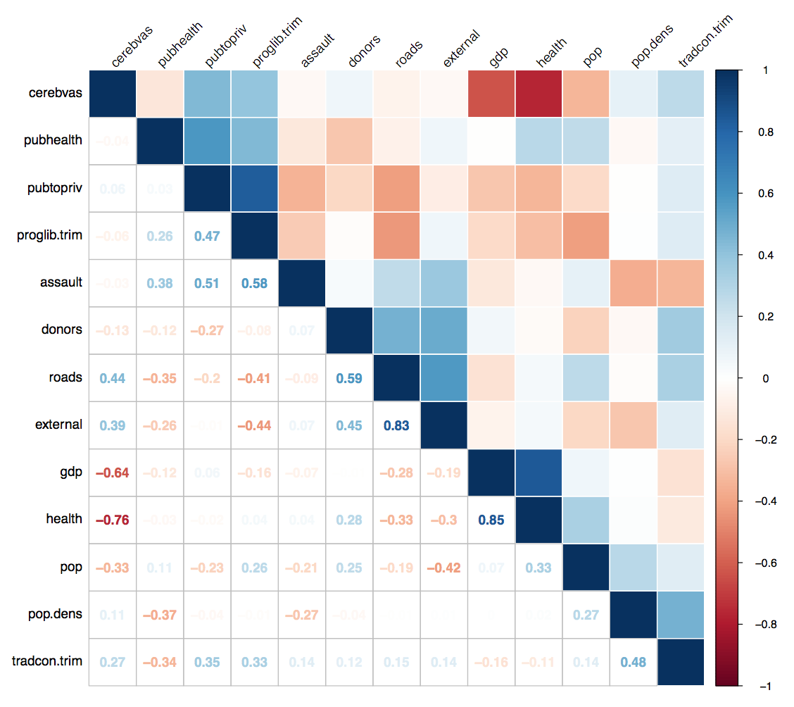
I didn’t spot it myself. I got a nice email from Thomas Wood at Ohio State’s Political Science department. He pointed out something odd in Figure 5, which shows a correlation matrix where the upper triangle is plotted as a heatmap and the lower triangle shows the corresponding numbers. It’s a nice technique that uses the lower triangle to show an extra bit of information. (If the whole thing were a heatmap the lower triangle would just be a mirror image of the upper.) Except in this case something is wrong.

In the published version of Figure 5, the lower triangle numbers do not correspond to the upper triangle heat values.
As you can see from the highlighted areas, the color mapping is off. The upper triangle says cerebvas shows a strong negative correlation with gdp and even moreso with health. The corresponding cells in the lower triangle say there’s no such association. What has happened?
Operator error, that’s what. I should say explicitly that my colleague and co-author Jim Moody bears no responsibility here. He didn’t do this bit of the paper. I wrote the code for Figure 5 using R’s corrplot library. You feed corrplot a correlation matrix and it draws you a figure. First you ask it to plot, say, a matrix where the whole thing looks like the upper right triangle heatmap—all solid colors representing the correlations in each cell. Then you tell it to redraw the lower triangle and use the numbers instead. The function has options for calculating different kinds of correlations (Pearson, Spearman, etc) and also choices for displaying the row and column orders differently. You can order the rows by clustering them, by the raw ranking of coefficients, alphabetically, and so on. Because you do the plot in two steps, you need to take care to get it to calculate and order the cells the same way. And this is where the error was in my code. The relevant snippet originally looked like this:
|
|
The first call draws a heatmap from c.mat, the second redoes the lower triangle to put in the numbers instead. And as you can see, it orders them differently. The upper triangle is ordered by a Ward clustering. The lower is ordered by the angular order of eigenvectors. What probably happened is that I was messing around with different ways of permuting the rows and columns, lost track of which one I’d settled on, and didn’t notice the two sorting methods used were different. The result is that in fact all of the numbers in the lower triangle are out of order, not just the ones that Tom Wood spotted. Note that when redrawing the lower triangle, the row and column labels aren’t touched, only the cell contents are redone. The result is you get the same labels but the wrong numbers. In future I should probably write a test to make sure the labels match up in the event of redrawing like this. In any case, fixing the error gives us a corrected plot:
The corrected correlation plot.
The irony of writing an article about data visualization that includes a plot with an internal error caused by one’s own bad code does not escape me. (“Data Visualization Article Contains Data Visualization Error.”) All the moreso because I evidently didn’t spot the problem myself when looking at the plot, which is supposed to be the point of the damn thing to begin with. My only mitigating plea is that I wasn’t actively analyzing the specimen data as part of writing an article—it was just something I had to hand to use as an example. But that is not much in the way of exculpation. More positively, my policy with this sort of thing is that mistakes happen in data analysis and presentation, and when you find them the best thing to do is to acknowledge them right away and then fix them. (It’s the intertemporal version of the Dad Policy: I’m not angry, past self, I’m just disappointed.) Of course we’d all like to spot and purge errors in advance and behind the scenes, but the next best thing is when people read your work and take the time to let you know about issues or problems they discover. So, thanks again to Professor Wood for his feedback. And now if you ever use the article in class, you have an additional wrinkle to talk about.